The network for creativity
Join 1.25M professional creatives like you
Connect with clients, get discovered, and run your business 100% commission-free
Creatives on Contra have earned over $150M and we are just getting started
Back to feedPost

Fairs Project:
Project Overview
A responsive web project focused on creating a clean and engaging interface for showcasing fairs and events. The project combines structured content, visual elements, and responsive layouts to provide a smooth browsing experience across different screen sizes.
What I Built:
1. Designed and developed the website interface.
2. Created responsive layouts for desktop and mobile screens.
3. Structured sections to present fair and event-related content.
4. Added interactive elements to improve the user experience.
5. Focused on clean styling, layout, and usability.
6. Deployed the project online for easy access.
Tech Stack:
HTML • CSS • JavaScript
Live Demo: https://fairs-project.vercel.app/


The network for creativity
Join 1.25M professional creatives like you
Connect with clients, get discovered, and run your business 100% commission-free
Creatives on Contra have earned over $150M and we are just getting started





Related posts

A landing page should continue the conversation started by the ad.
For Corpus, a Pilates and physiotherapy studio, I designed campaign-specific entry points. Pilates, physiotherapy and RPG each needed a relevant starting point, while sharing one visual system.
The page keeps the brand’s warm, editorial character through typography, photography and movement. Clear service information and WhatsApp calls to action give that visual experience a practical next step.
My role covered art direction, responsive web design, interaction and AI-assisted front-end development.
This clip shows the general version. The responsive layouts follow the same visual language across desktop and mobile.
When designing campaign landing pages, do you start with one master page or with the individual ad journeys?

The WhatsApp handoff could preserve the service context too. A prefilled message naming Pilates, physiotherapy or RPG would help the studio understand why someone arrived, without making them explain the ad they clicked. I’d measure that click separately from a confirmed booking.


The lime and purple pairing with the mono type works nicely for Remotlin.

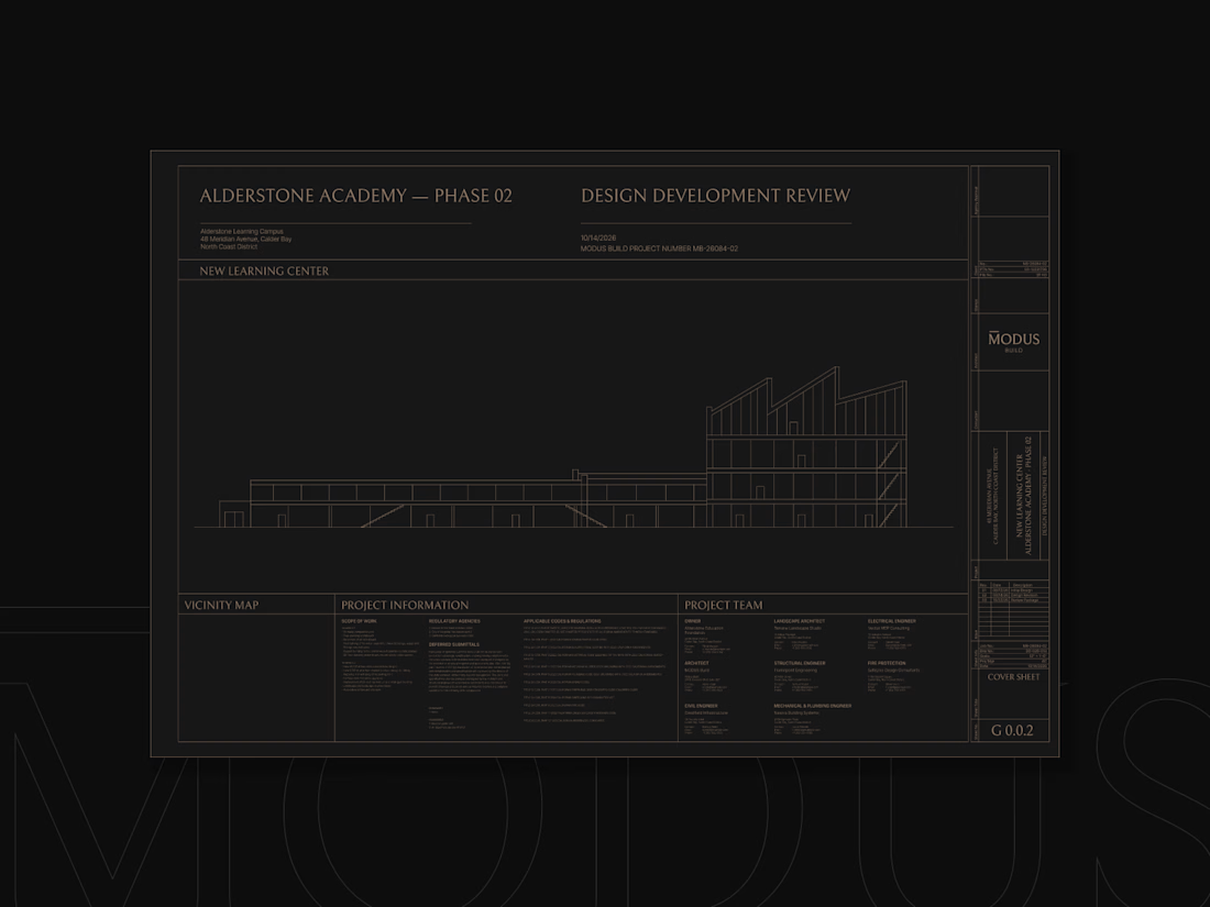
MODUS Build - Brand Identity & Web Design
Coming from an architectural background, I approached MODUS Build with a particular appreciation for precision, proportion, and thoughtful design.
The challenge was to create a distinctive identity that communicates these values without relying on conventional construction imagery.
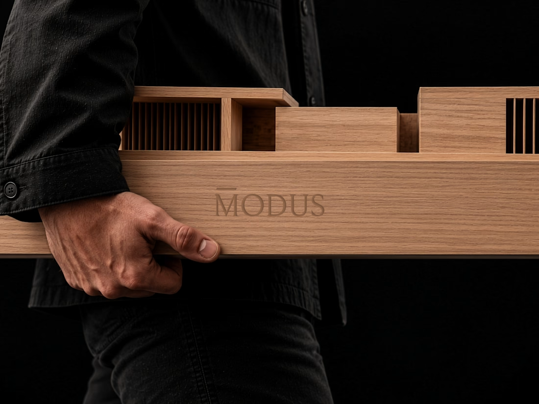
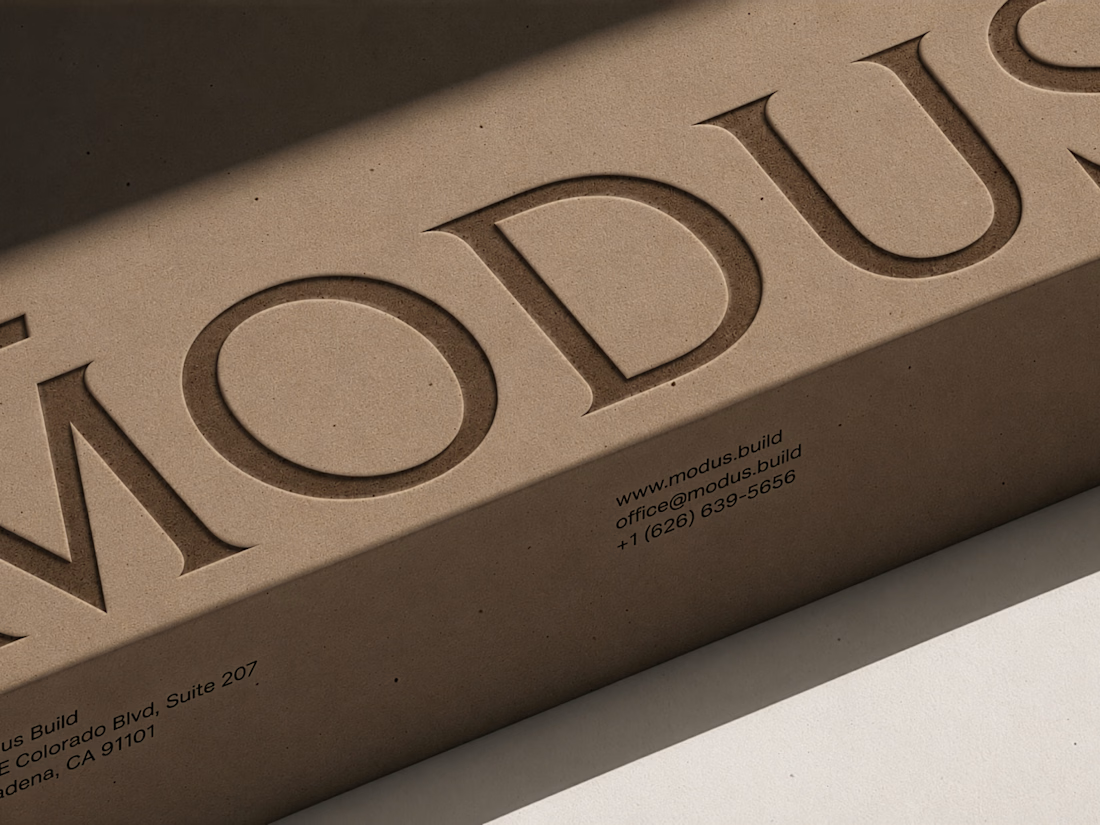
The concept was built around a simple typography idea: “The Measure of Good Building.” A small detail above the letter M represents a reference measure - a fixed length against which other dimensions can be measured. This subtle intervention gives the logo its meaning and connects it directly to the brand's philosophy.
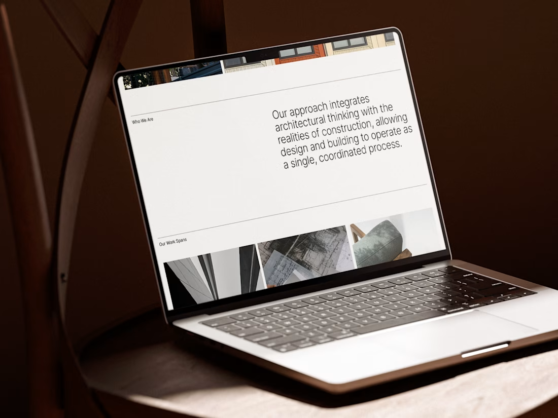
I carried this idea into a cohesive visual system, bringing together typography, graphic patterns, brand applications, and website design.
For me, the most rewarding part was creating something visually refined yet purposeful, where even the smallest detail has a reason to exist, keeping the same principle as in architecture.
#branding #logodesign #webdesign



Great brand design Alexandar wooden style is so premium🔥🔥