The network for creativity
Join 1.25M professional creatives like you
Connect with clients, get discovered, and run your business 100% commission-free
Creatives on Contra have earned over $150M and we are just getting started
Back to feedPost
This project feels like ages ago. Check it out
I recently revisited the identity system I designed for Keyline in 2012, and while there are choices I would approach differently today, a lot of the thinking still feels relevant.
A strong identity needs a clear idea, enough structure to remain consistent, and enough flexibility to feel alive across every application.
I’ve just published the complete case study here on Contra. Would love to know what you think still holds up.


fantastic design, the red accent pops out in the perfect places.

thanks Nicolette, glad you liked it
The network for creativity
Join 1.25M professional creatives like you
Connect with clients, get discovered, and run your business 100% commission-free
Creatives on Contra have earned over $150M and we are just getting started


Related posts

A little more about the inspiration behind Tindara.
I wanted the identity to have a connection to Tindari, Sicily. The Madonna di Tindari statue was the starting point for the symbol, while Sicilian decorative patterns inspired the graphics around it.
For the colors, I chose mustard yellow, deep green, and burgundy, balanced with cream. I wanted to bring some of that warmth and richness into the packaging, while keeping the different elements comfortable together.
For me, these references are what give the project its character and sense of place.



Your crypto landing page has 3 seconds to earn trust. Which direction gets it right?
One crypto homepage feels built for serious traders. The other makes crypto feel effortless.
Which one would make you click “Start Trading” without hesitation: #1 or #2?


10 voted
37%
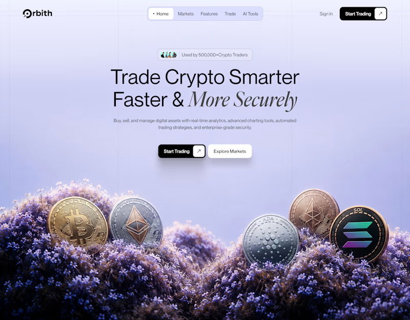
17 voted
63%
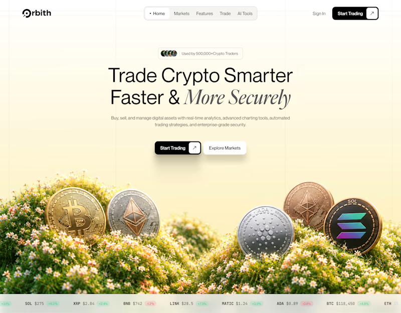
27 votes
Closed


Good morning, Designers.☺️
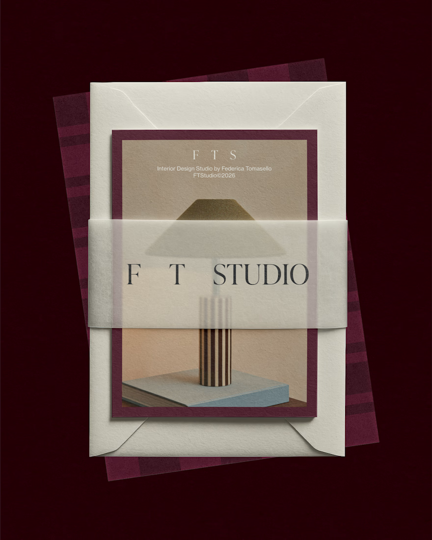
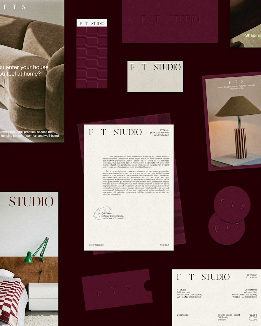
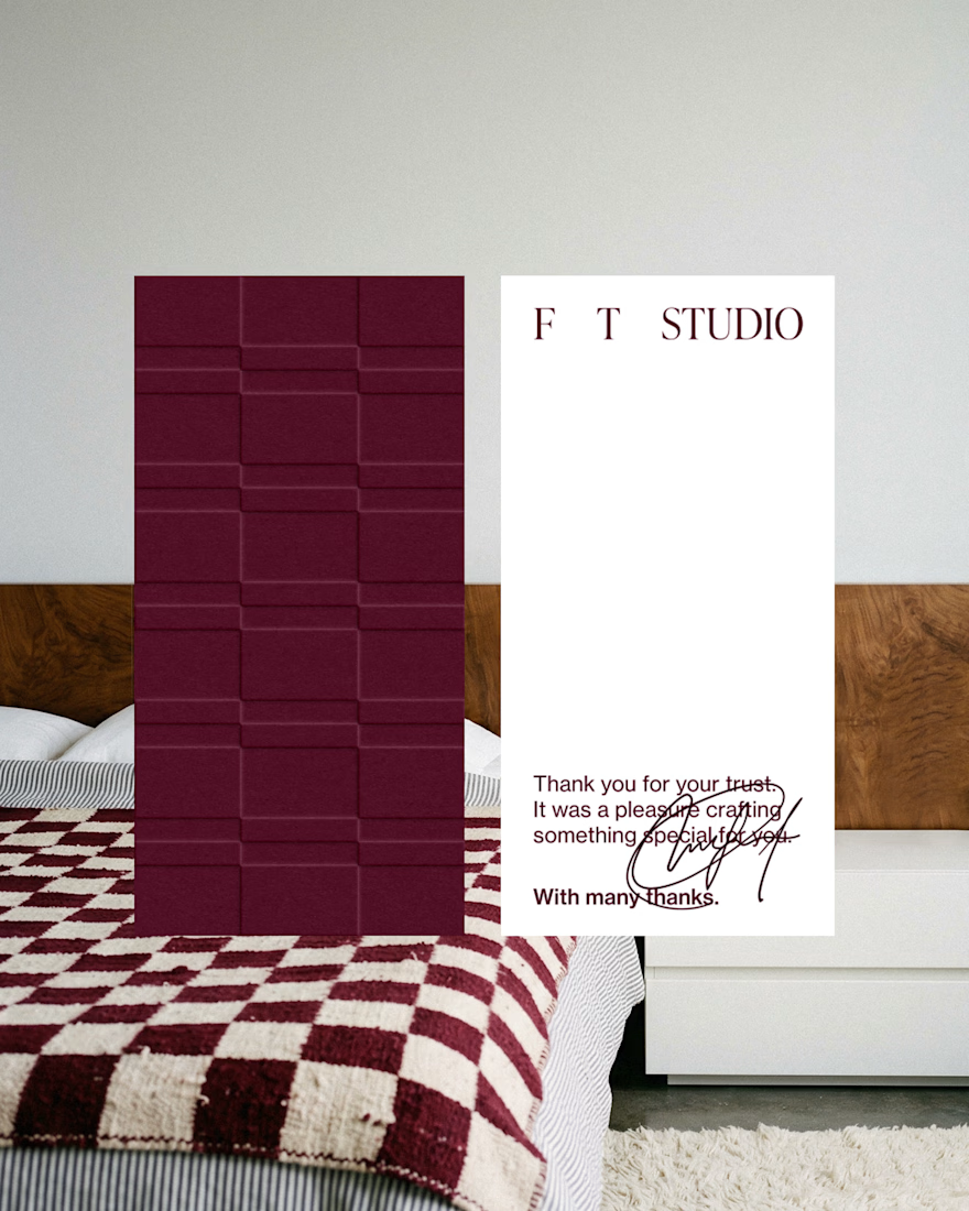
A second, closer look at the stationery design for FT Studio, Interior Design Studio by Federica Tomasello.
If the project sparks your curiosity and you'd like to learn more about the concept and other design aspects, here's the link to the case study: Let me check!
I'd be glad to hear your feedback!
Have a great day and happy designing, everyone.
alessia.

Amazing