The network for creativity
Join 1.25M professional creatives like you
Connect with clients, get discovered, and run your business 100% commission-free
Creatives on Contra have earned over $150M and we are just getting started
Back to feedPost
Good morning, Designers.☺️
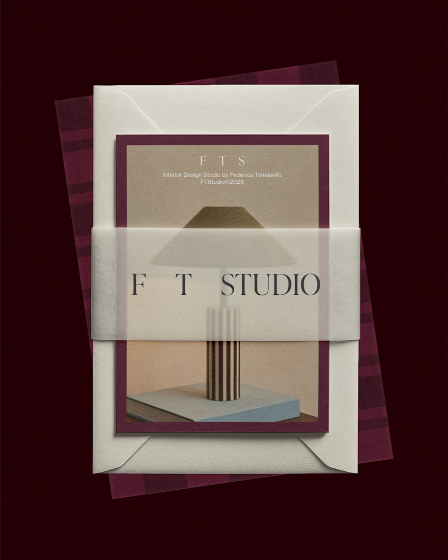
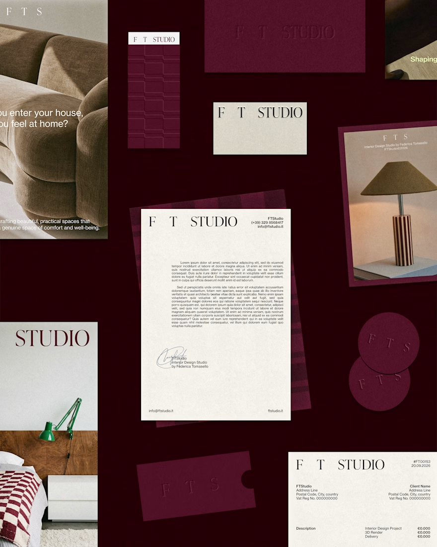
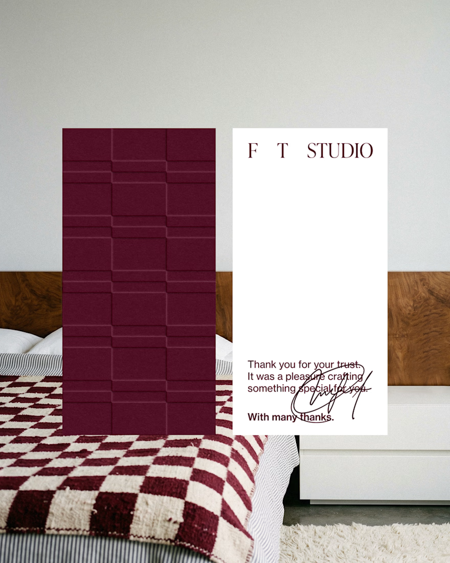
A second, closer look at the stationery design for FT Studio, Interior Design Studio by Federica Tomasello.
If the project sparks your curiosity and you'd like to learn more about the concept and other design aspects, here's the link to the case study: Let me check!
I'd be glad to hear your feedback!
Have a great day and happy designing, everyone.
alessia.


love it, looks great!

Thank you! 😄
The network for creativity
Join 1.25M professional creatives like you
Connect with clients, get discovered, and run your business 100% commission-free
Creatives on Contra have earned over $150M and we are just getting started



Related posts

☕ Meet DAYLO - A minimalist coffee branding concept featuring bold typography, warm neutrals, and soft colors designed to make every cup feel a little more special. 🤎
Explore the full project on my Contra profile and let me know your thoughts!


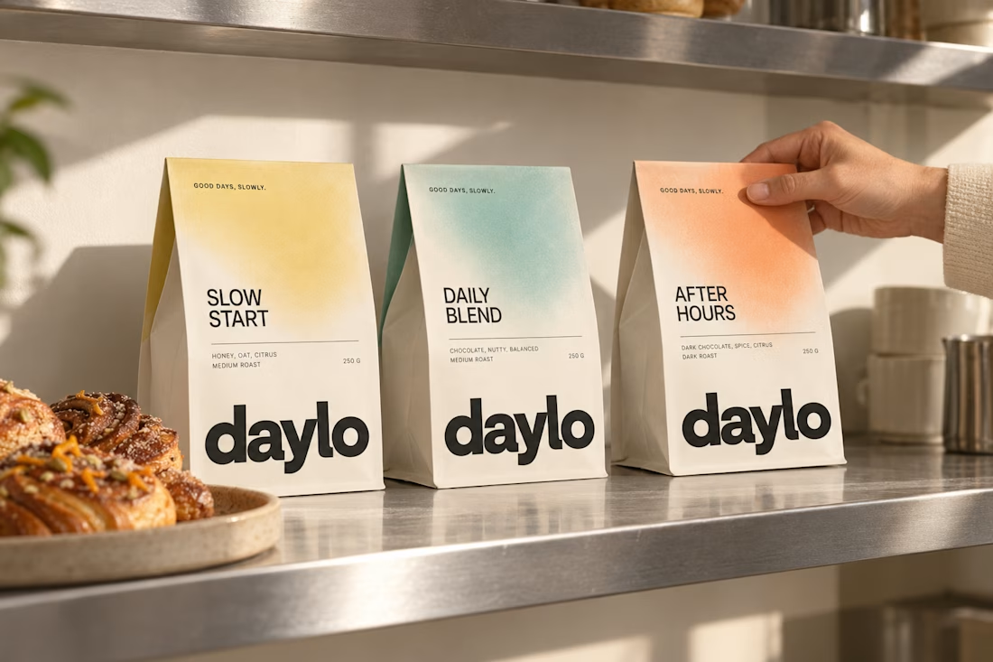
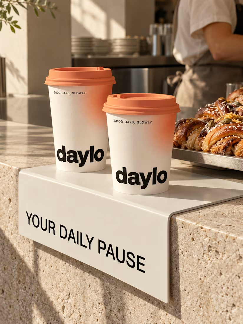
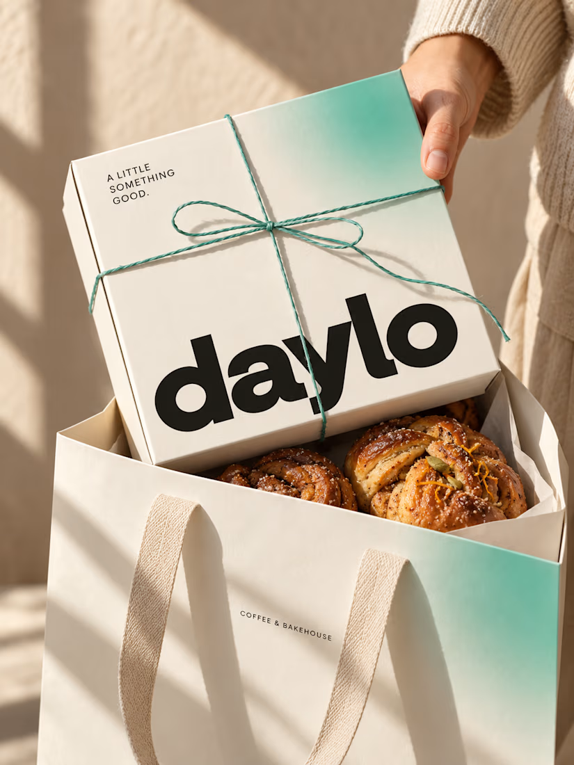


Good branding isn’t just about how a logo looks. It’s about what it represents.
Sharing one of our recent projects: NEXU, a fintech brand identity built around connection, trust, and opportunity.
The idea was to create a visual identity that makes finance feel more human and approachable. The symbol brings together the gesture of reaching out and the strength of a bridge, representing the connection between people, capital, and opportunity.
From the logo concept to the broader visual identity, every detail was designed to communicate confidence, clarity, and progress.
It’s always rewarding to see how a simple visual idea can tell a much bigger story.
Would love to hear what you think!
Check it out
#BrandIdentity #LogoDesign #Fintech #BrandDesign #ContraCommunity


Such a thoughtful concept! Making finance feel more human and approachable through design is a great way to build connection and trust.

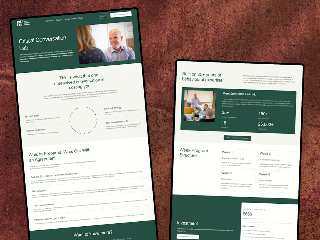
I’ve just wrapped up a new project with The Hidden Transit! 😊
I designed and developed a conversion-focused landing page for their Critical Conversation Lab programme, along with a few improvements to their existing website.
I’m happy to share the case study and give you a look at the work behind it!


Nice work on the Critical Conversation Lab landing page, Julia. Pairing a focused programme page with fixes to the existing site is often where the real conversion gains come from.