The network for creativity
Join 1.25M professional creatives like you
Connect with clients, get discovered, and run your business 100% commission-free
Creatives on Contra have earned over $150M and we are just getting started
Back to feedPost

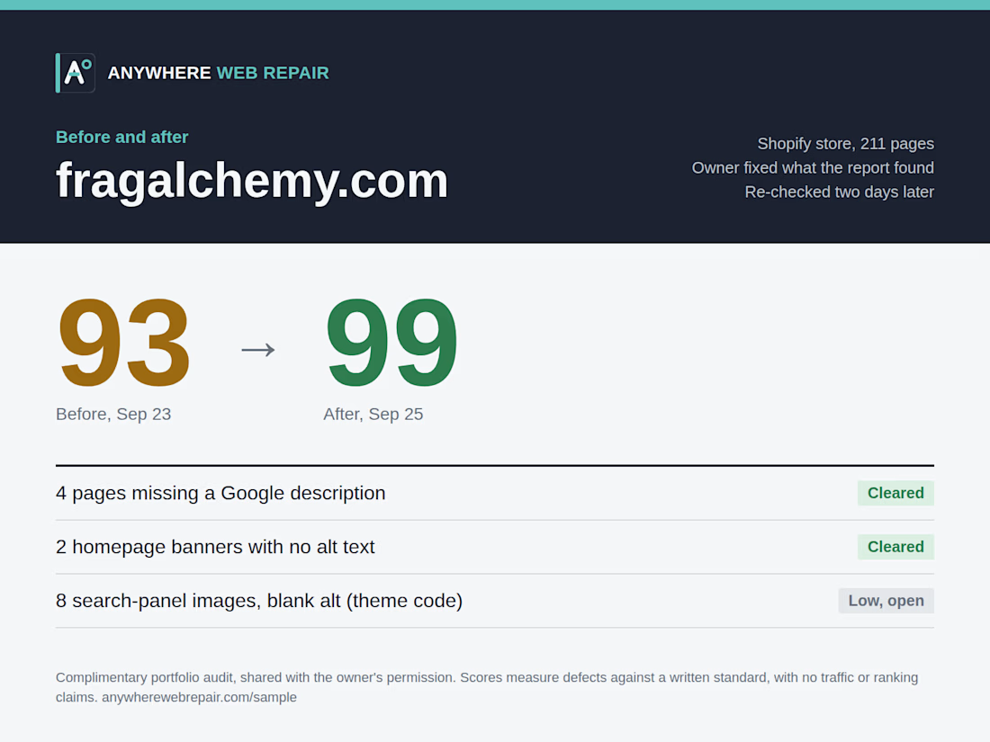
I ran a full audit of fragalchemy.com, a Shopify store that sells perfume samples and decants. I checked all 211 pages for page titles, Google descriptions, headings, mobile setup, broken pages, and image alt text. Each finding came with steps to fix it in Shopify.
The owner made the fixes himself using the report, and two days later I ran the same checks again. The score went from 93 to 99. Four pages that had no Google description now have one, and two homepage banners that had no alt text now describe what they show. The one item still open is eight search-panel images with blank alt text. That comes from the theme's code, and it's a low priority since the product name sits right next to each image.
This was a complimentary portfolio audit, shared with the owner's permission. The score measures problems against a written standard. It doesn't predict traffic or rankings.


The network for creativity
Join 1.25M professional creatives like you
Connect with clients, get discovered, and run your business 100% commission-free
Creatives on Contra have earned over $150M and we are just getting started








Related posts

Market Day — the 15-second ad every seller deserves
Small sellers pour everything into what they make, and then get two seconds of someone's scroll to show it.
Market Day is for that moment. A seller ties off a parcel, the stall lights flicker on, and they hold out a wooden tray toward you. Your product lands on it, a little kraft label hops up to say what it is, and your headline settles onto a frosted-glass card.
I built it as one SVGator template and dropped in three businesses to prove it bends without breaking:
🍕 Forno Lucia, a wood-fired pizza café
🕯️ Ember & Oak, a candle maker
☕ Clay & Co, a ceramics studio
Same animation every time. To make it yours, swap 5 lines of text, 2 images and 1 colour. Every layer is named, the motion lives on wrapper groups, and no keyframe needs touching. About five minutes.
All artwork was made for this template, the brands are fictional and the fonts are open source, so it's free to give away.
If you sell by hand, this one's for you. Which stall should I set up next? 👇
Template: https://app.svgator.com/editor/#/0c516a7c8d234b37bb98c8df7f0b4a29
@SVGator


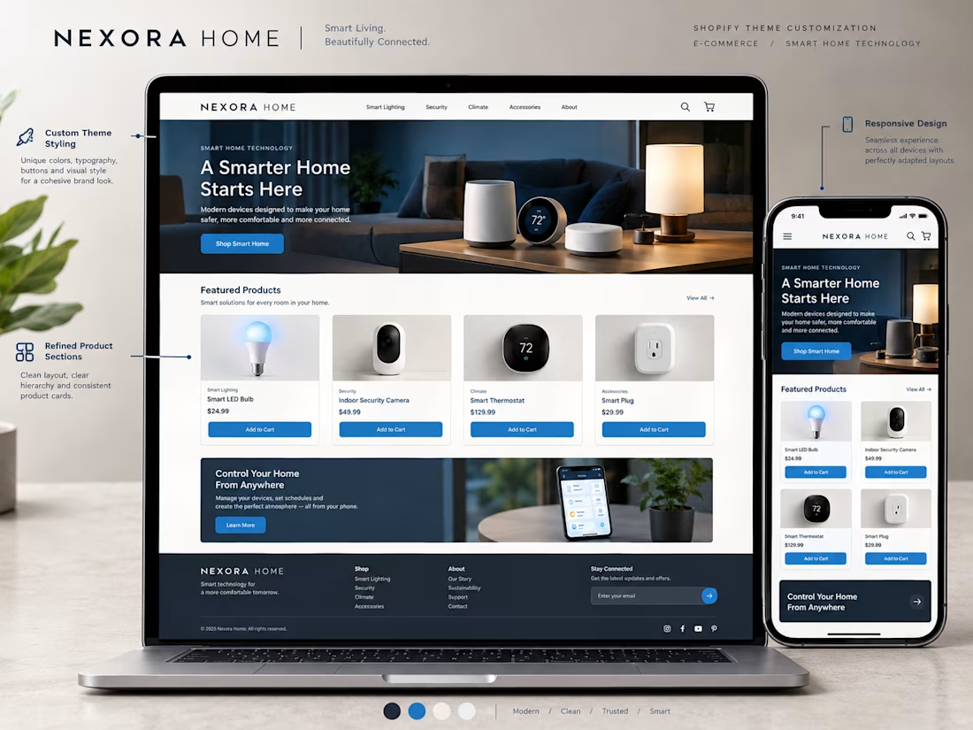
A Shopify theme gives a store its starting point, but customization helps make the experience fit the brand.
For this concept, I focused on how small design decisions can work together to create a more cohesive storefront.
→ Brand aligned colors and typography
→ A clear homepage structure
→ Consistent product cards
→ Refined buttons and section layouts
→ Better visual hierarchy
→ A responsive mobile experience
The goal isn't to change everything just for the sake of being different.
It's to make thoughtful adjustments that help the store feel consistent, professional, and easy to navigate.
Good theme customization brings the brand and the shopping experience together.
What would you customize first when adapting a Shopify theme for a new brand?


I'd start with the typography and colors. They set the tone for the entire storefront.

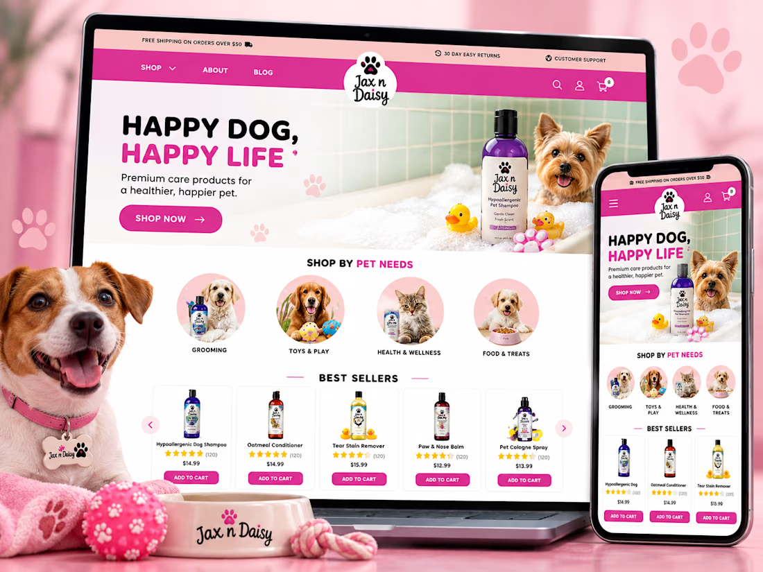
Jax n Daisy — Shopify E-Commerce Development
Developed and customized a responsive Shopify e-commerce storefront for Jax n Daisy, a pet care brand specializing in natural grooming, anti-itch, and antibacterial products for dogs. The project focused on creating a user-friendly shopping experience with engaging product displays, organized collections, promotional sections, and a vibrant design reflecting the brand's identity.
Work Included: Shopify Development · Custom Storefront Design · Responsive UI/UX · Homepage Customization · Product Collections · Product Page Customization · Promotional Banners · Mobile Optimization · E-Commerce Functionality · Performance Optimization.



This is very beautiful 😍