The network for creativity
Join 1.25M professional creatives like you
Connect with clients, get discovered, and run your business 100% commission-free
Creatives on Contra have earned over $150M and we are just getting started
Back to feedPost


What if redesigning a page section took one sentence?
I took an exploration I did and gave it 4 notes in Cursor's Annotate.
I clicked or drew around each spot and typed what I wanted and the agent took it from there
Try Annotate on a page of your own and show me your before and after. I want to see what you change 🙌


Pointing at the exact spot and saying what you want is so much closer to how a design review actually works than writing a long prompt. Curious how it handles notes that conflict with the design system, does it follow the note or the system?

redesigning a section with a few annotations is wild. did the agent get it right on the first try or did it need a few rounds?

Really impressive how accurately it mapped your brands existing assets into the new 2x2 card structure without breaking layout flow or token styles.

I find it harder to argue with a bot than to just do it myself simply because of hallucinations. Maybe i've yet to master the best AI skill, patience.

Pointing at the exact spot and leaving a note feels much closer to how designers actually give feedback than writing one long prompt. Curious how well it keeps spacing consistent with the rest of the page, Agustin.
The network for creativity
Join 1.25M professional creatives like you
Connect with clients, get discovered, and run your business 100% commission-free
Creatives on Contra have earned over $150M and we are just getting started



Related posts

Text on album covers is tacky? Whatever 🤌🏼 Vienna Starlight Boom 😒
Typography can ABSOLUTELY make an album cover.
During the pandemic, I got obsessed with album cover design. I'd spend hours looking at covers, researching the designers behind them, and trying to understand the decisions and creative processes that made them work.
It was one of those design rabbit holes I could never get tired of. 💀
I'm bringing that interest back with a new cover inspired by the music I love, including Neil Young's Harvest, Bandalos Chinos' Paranoia Pop and Uncle Acid & The Deadbeats' Vol. 1.
Looking at these alongside other great album covers, one thing stands out: typography CAN be the image!
I took inspiration and designed one as well!
What's an album cover where the typography is impossible to separate from the artwork? Show me your favorites.
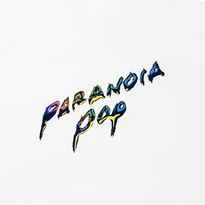
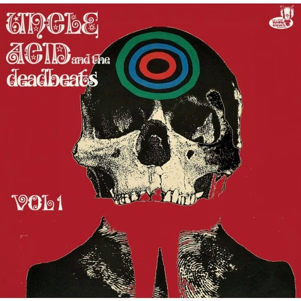
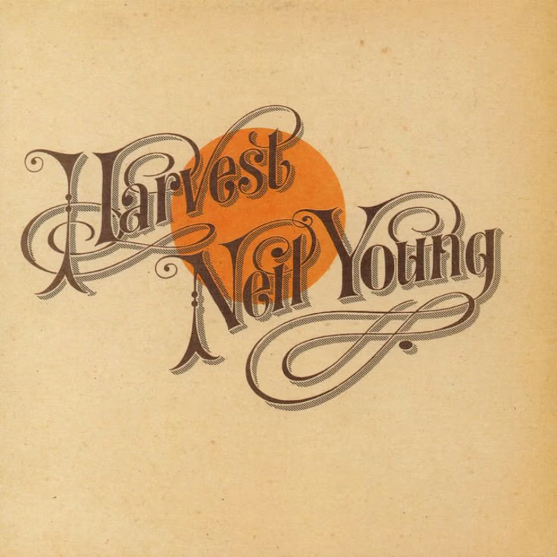
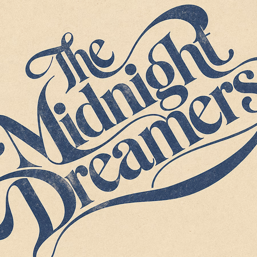

Reid Miles' Blue Note covers are my pick, where the cropped oversized lettering carries as much mood as any photo could. Your Paranoia Pop treatment has that quality too, the letterforms feel poured into the image rather than placed on it.


what do u collect?
i'm currently travelling the southern hemisphere, so I've been picking up loads of beautiful boarding passes, tickets and receipts from everywhere I've been.
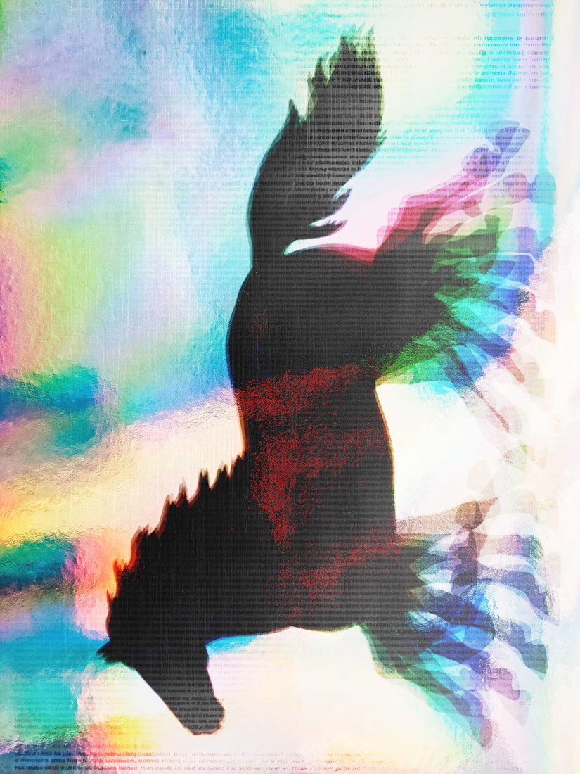
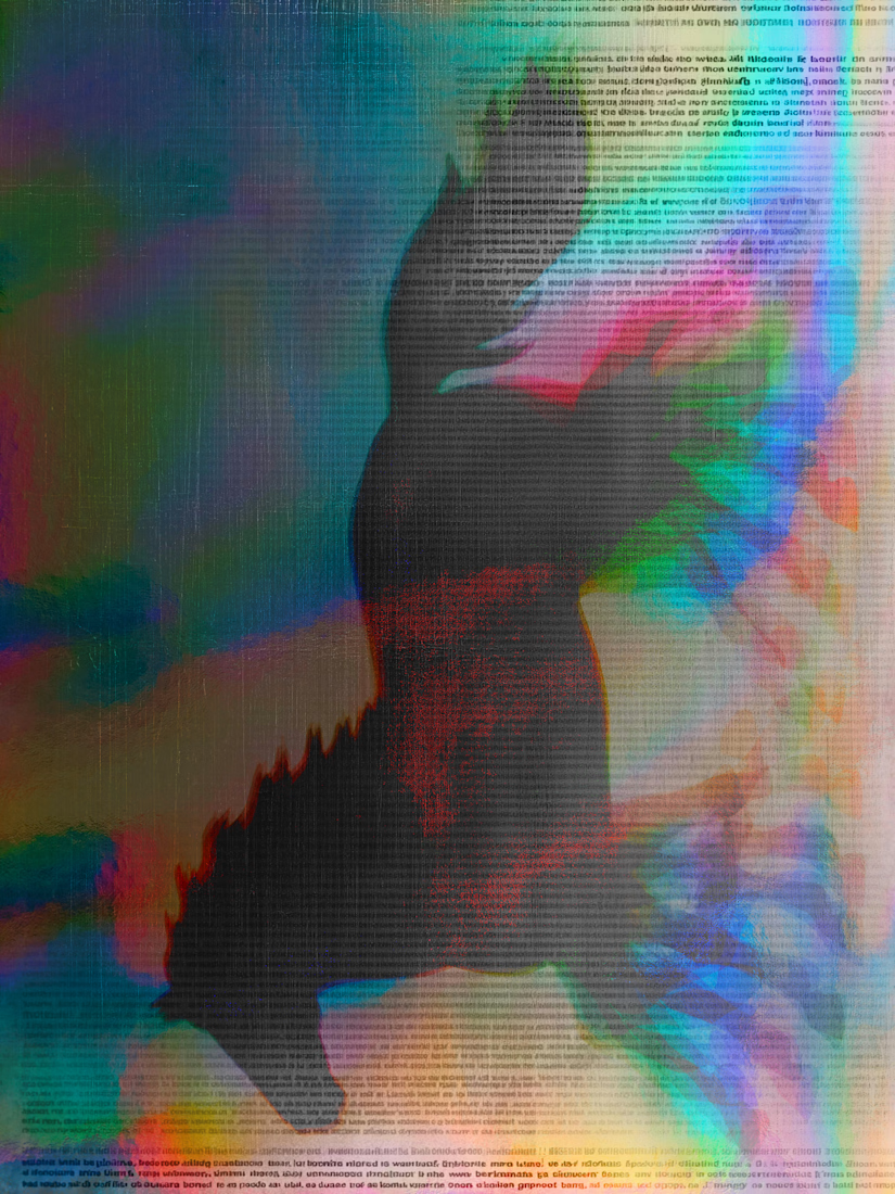
this morning i worked on these collaged animations in photoshop, inspired by the collection of receipts growing in my wallet + by this lovely holographic ticket animation by SHIROTA.
lots of texture + type always make for the prettiest animations.

Very nice

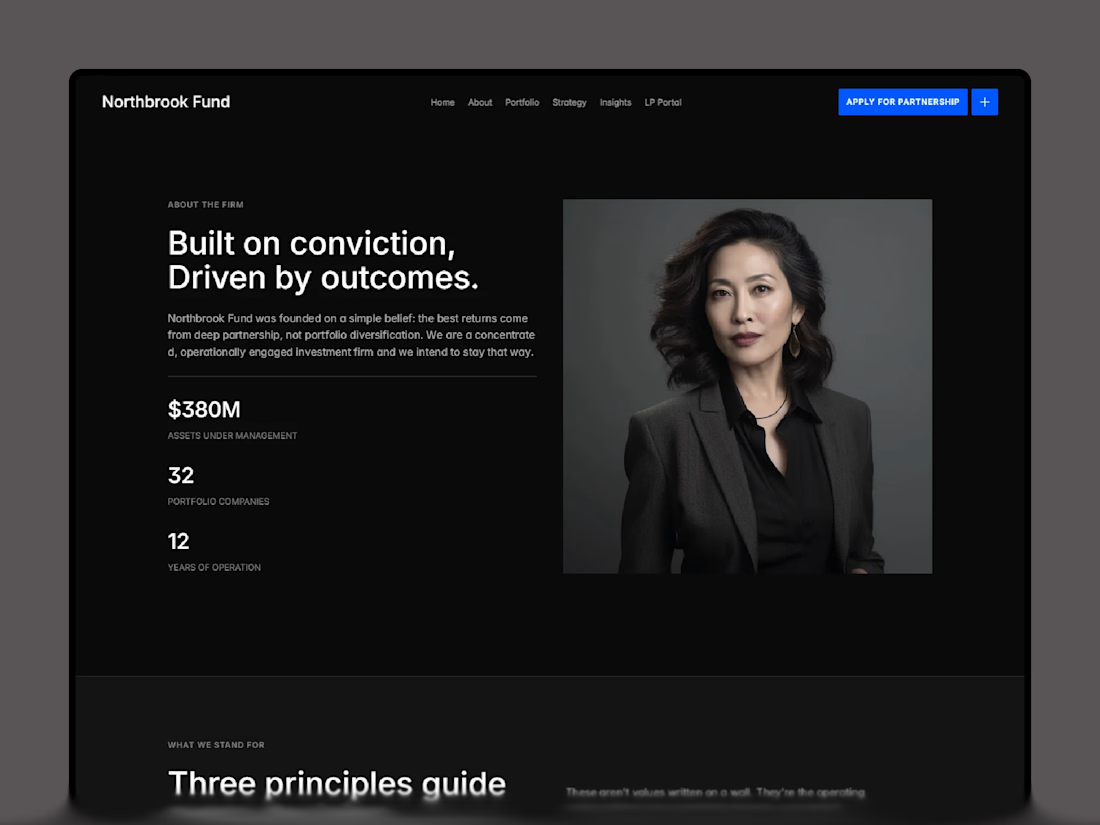
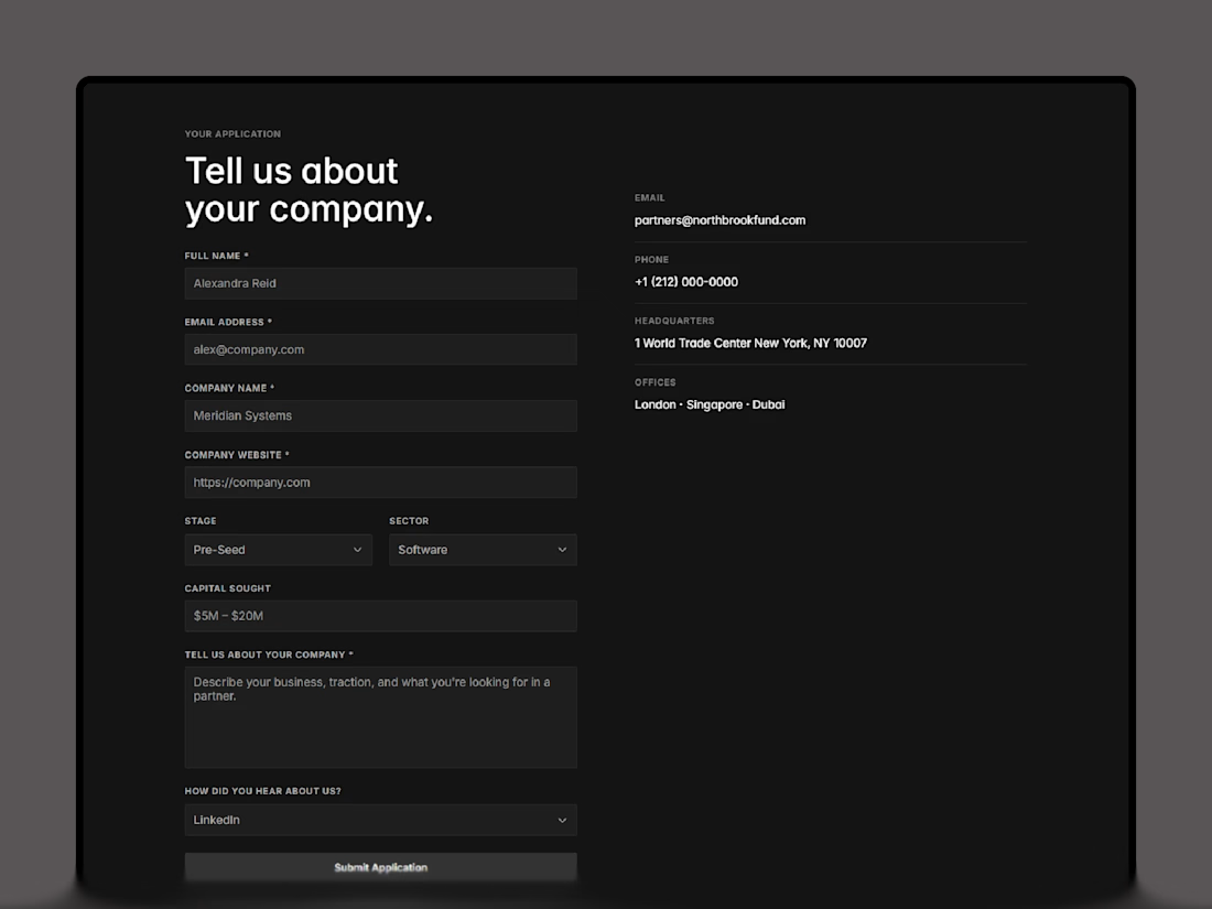
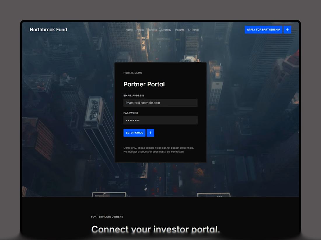
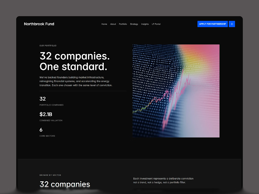
Just shipped a meaningful update to Northbrook.
It's now listed as an Agent Template on Framer. 🎉
I didn't want to add an AI label and call it done, so I spent time improving the actual template experience:
• A dedicated design system page
• Three project-specific Skills for design, CMS, and launch checks
• A walkthrough showing how everything is organized
Northbrook is still the same dark, editorial website for VC and private equity firms, with 12 designed pages and Portfolio and Insights CMS.
The goal is simple: make a template that's easier to customize, extend, and maintain after someone buys it.
Would love to hear what other creators are doing with Agent Templates.


Great 👍🏻