The network for creativity
Join 1.25M professional creatives like you
Connect with clients, get discovered, and run your business 100% commission-free
Creatives on Contra have earned over $150M and we are just getting started
Back to feedPost

I've been building Moonarc, motion components for Astro that keep working after every navigation, and cut a 12-second reel of it.
Everything in the reel is the library itself, running in a browser: the smoke, the liquid chrome, the silk, the plasma, the logo that turns liquid under the cursor, and the wall of all 11 GPU effects at the end.
The numbers, measured from a real build:
102 primitives under MIT, and 67 of them load no JavaScript
11 GPU effects in Pro, 10.2 to 13.1 kB raw each, counting everything they load
The reel is an Astro page filmed frame by frame in headless Chromium on a virtual clock. Timers, requestAnimationFrame and CSS animations only move when the next frame is asked for, so all 720 frames land on their exact instant. The figures on screen are read from the build report, so they can't drift from the library.
moonarc.dev
Open for work
Portfolio: zrior.tech
The network for creativity
Join 1.25M professional creatives like you
Connect with clients, get discovered, and run your business 100% commission-free
Creatives on Contra have earned over $150M and we are just getting started





Related posts

Which hero direction feels right for this founder-focused brand?
While working on the homepage for Sean Parsons, a brand focused on empowering non-technical founders to launch tech startups, I explored two different visual directions for the hero section. Same message, same structure, just a different mood and color system.
Option 1 - Warm Olive. Dark, grounded, and editorial, giving a warm, established, expert feel.
Option 2 - Light Purple. Clean, modern, and vibrant, giving a fresh, SaaS-like, approachable feel.
Would love your honest UX/UI take, which direction feels more trustworthy, engaging, and aligned with a founder-focused brand, and why?
25 voted
69%
11 voted
31%
36 votes
Closed

I like worm Olive most because it has different personality

Cleann🔥

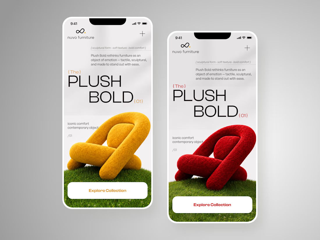
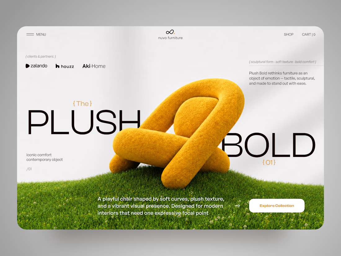
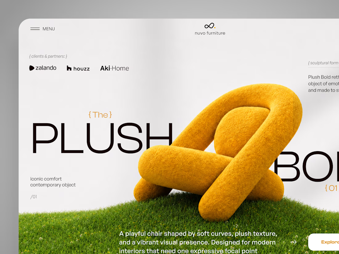
NUVO Furniture — Sculptural Furniture E-commerce Concept 🪑✨
NUVO is a contemporary furniture website concept built around one idea: let the product become the experience.
At the center of the concept is Plush Bold — an expressive statement chair designed to feel more like a...

I designed and engineered this interactive astronomical almanac for Ephemeris.
Blending nineteenth century celestial cartography with responsive data visualization required coordinating intricate astronomical calculations with period print typography. Programming a rotatable calendar dial that recalculates the night sky in real time, projecting accurate planetary alignments and lunar phases alongside a cataloged archive spanning 174 historical editions, turned complex ephemeris tables into an engaging visual experience.😊 👍


