The network for creativity
Join 1.25M professional creatives like you
Connect with clients, get discovered, and run your business 100% commission-free
Creatives on Contra have earned over $150M and we are just getting started
Back to feedPost

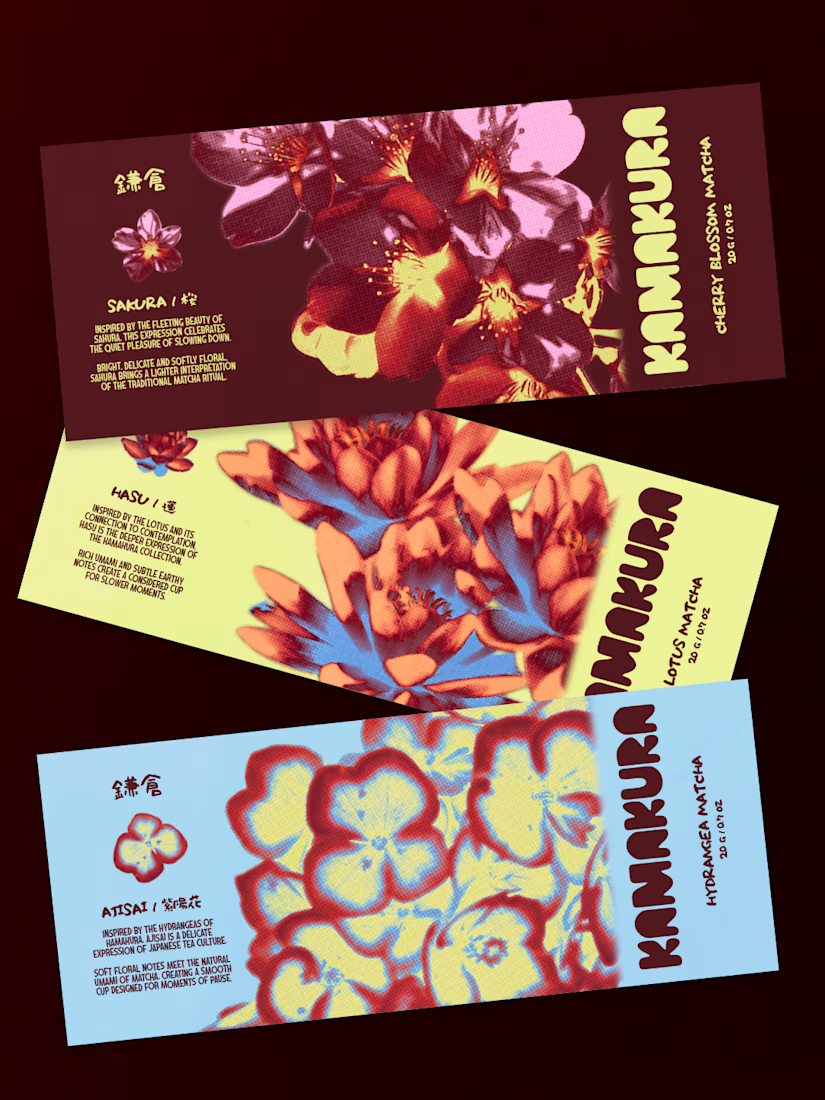
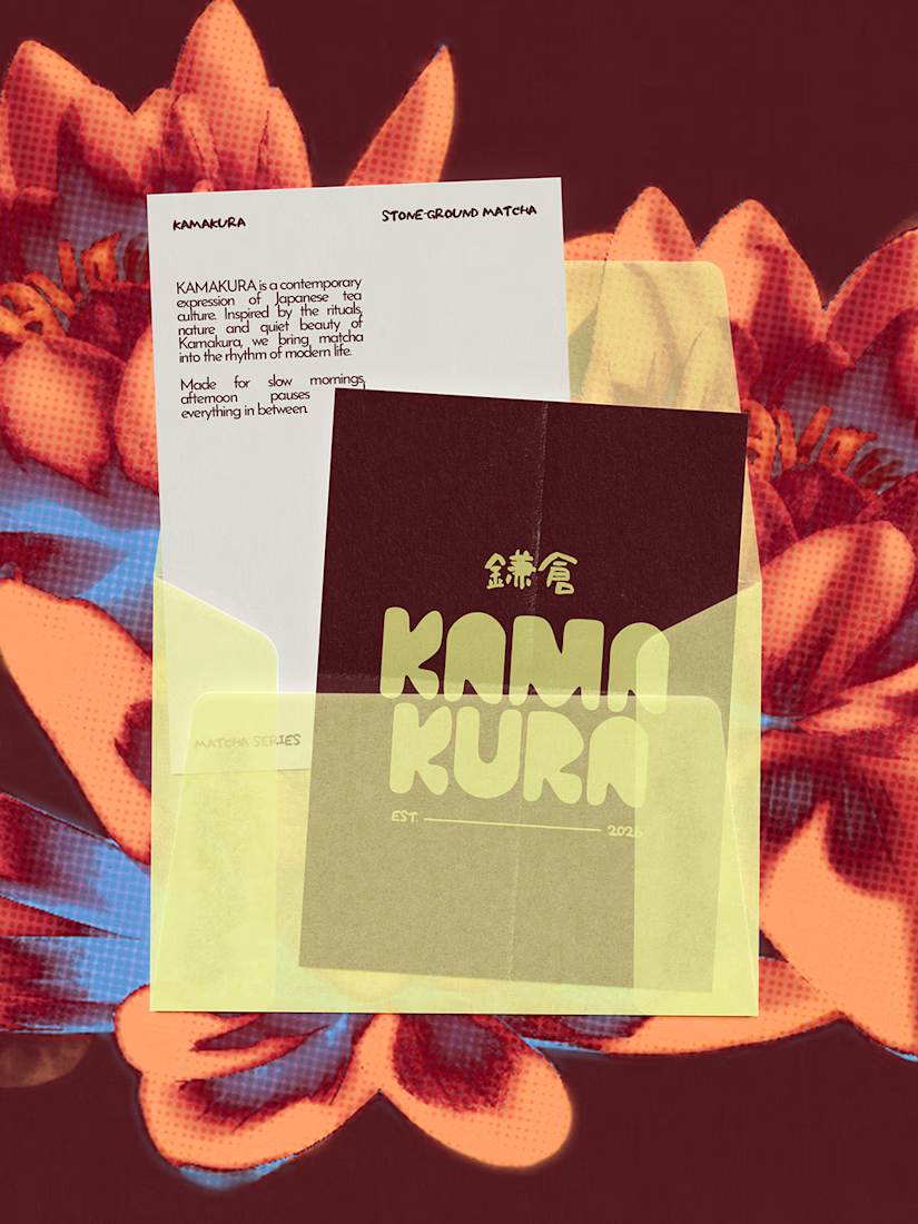
KAMAKURA is a Japanese matcha brand I designed to bring traditional matcha into everyday life. There are three flavours, each inspired by a flower: Ajisai (Hydrangea), Sakura (Cherry Blossom) and Hasu (Lotus).
I didn’t want the flowers to just sit there as decoration. So I started the whole identity from them. Their shapes and colours shaped the graphics and gave each flavour its own personality.
Then I added gradients. Petals are never one flat colour, so I wanted the design to shift the same way. It gave the brand some depth and made it feel a bit more artistic.
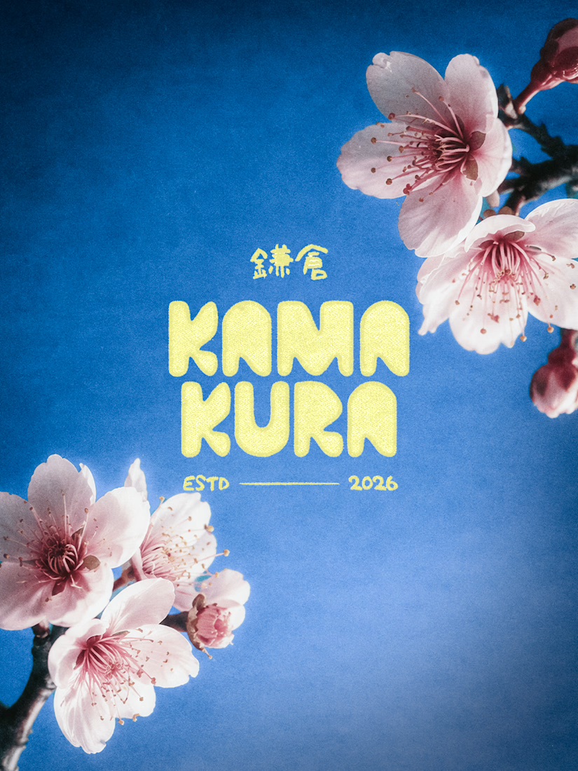
The final look is floral forms, soft gradients and bold type. Nothing like the green tins you usually see.
This was a collaborative project with my designer friend, Safna.
What do you guys think of the whole identity


The network for creativity
Join 1.25M professional creatives like you
Connect with clients, get discovered, and run your business 100% commission-free
Creatives on Contra have earned over $150M and we are just getting started



Related posts

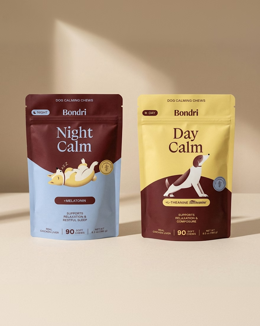
Bondri has been featured by 6 different curators in the past month and I’m still a bit in disbelief.😮
I put a lot of care into every detail of this one, from the illustrations to the packaging to how the day and night variants talk to each other. Seeing it recognized like this means a lot.
What makes you stop and really look at a project when you’re scrolling?
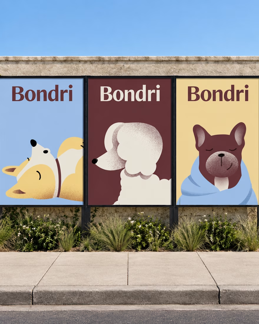
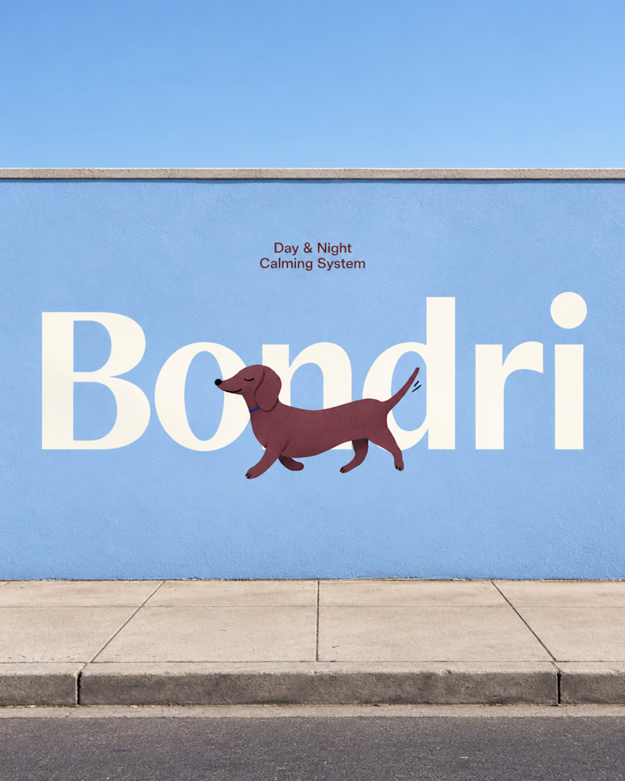

I think it’s the little details that make a project stand out. When everything feels intentional and tells a story, it naturally makes you want to stop and take a closer look. Love how much thought went into this! 👏
Well-done Chantal

Final direction picked! I love when brands use custom illustration as the main way to communicate with their audience.
Direction discovery should not take more than one week and it should be full of personality! Ready to upgrade your brand?
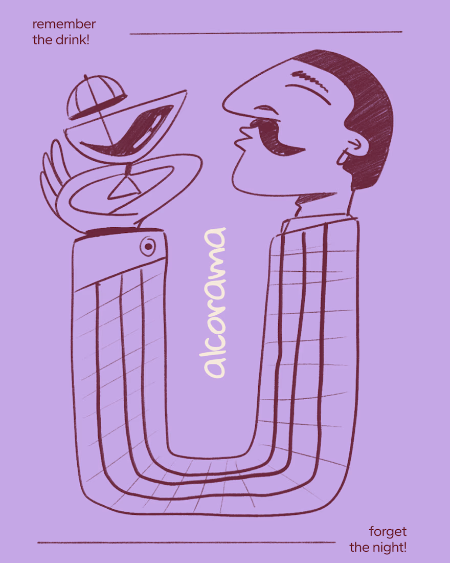
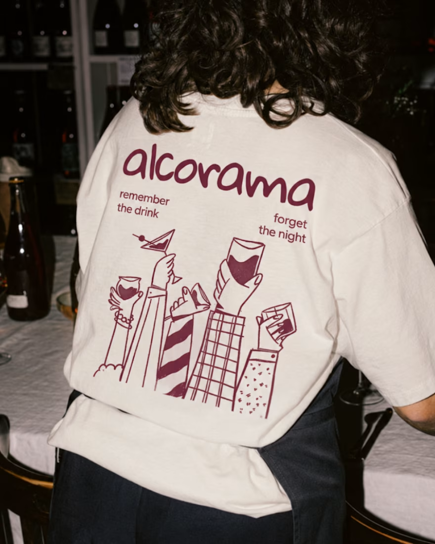

Amazing work!

generated these little fellas for a concept and now i want to build a whole brand around them.
if you're making something that helps people dream and aspire, they're looking for a home:)



adorable!🥹