The network for creativity
Join 1.25M professional creatives like you
Connect with clients, get discovered, and run your business 100% commission-free
Creatives on Contra have earned over $150M and we are just getting started
Back to feedPost

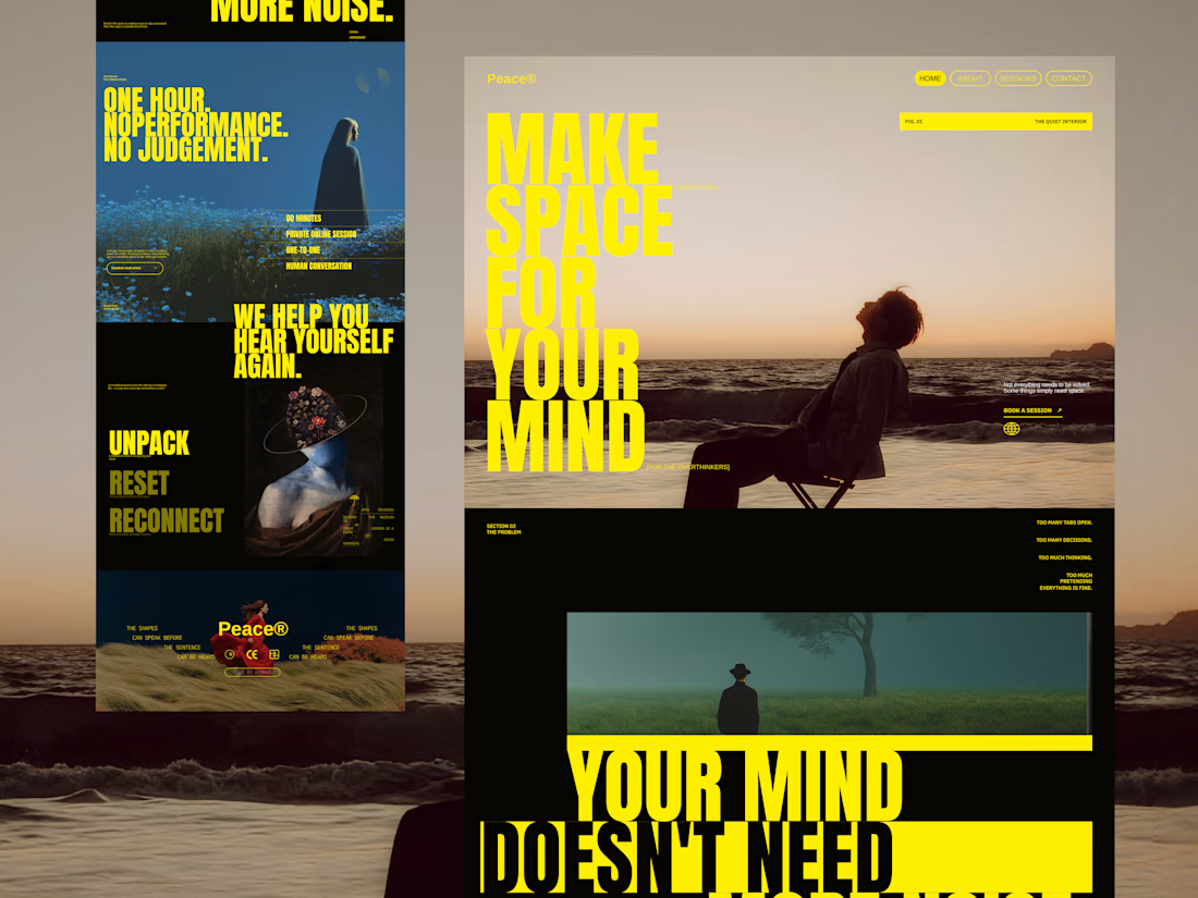
A visual exploration for Peace®, a modern mental peace and personal reflection platform.
The concept started with a simple question:
What if a mental wellness website didn't look like a typical mental wellness website?
Instead of relying on the familiar visual language of wellness products — soft gradients, rounded cards, pastel colors and overly minimal interfaces — I wanted to create something with more character, tension and editorial energy.
The visual direction combines:
Oversized typography Large condensed headlines become a major part of the interface, almost behaving like graphic elements rather than conventional website copy.
Cinematic photography Quiet landscapes, solitary figures and atmospheric scenes create an emotional layer around the experience.
Bold contrast A strong yellow, deep black and muted photographic palette gives the experience a distinctive visual identity.
Editorial composition Different content blocks intentionally break the conventional grid, creating something closer to a digital magazine or art-directed campaign.
Text as a visual element Instead of hiding content behind cards, I used generous amounts of copy and oversized statements to make the words themselves part of the design.
The Core Message
MAKE SPACE FOR YOUR MIND
The experience revolves around slowing down, stepping away from constant noise and creating a moment where you can simply hear yourself again.
The visual storytelling moves through ideas like:
UNPACK. RESET. RECONNECT.
And ultimately:
YOUR MIND DOESN'T NEED MORE NOISE.
It needs space.
Design Direction
Style: Editorial / Experimental / Premium Industry: Mental Wellness / Personal Development Typography: Bold condensed display type + small editorial typography Palette: Electric yellow, deep black, muted blue, warm neutrals Photography: Cinematic, atmospheric, introspective Mood: Quiet, bold, reflective, premium
This was primarily a visual design experiment exploring how typography, photography and storytelling can work together to create an emotional digital experience.
Designed to feel less like a wellness website — and more like a visual pause.
#WebDesign #UIDesign #UXDesign #LandingPage #EditorialWebDesign #Typography #CreativeDirection #MentalWellness #WebDesignInspiration #DribbbleShot #DigitalDesign #VisualDesign


The network for creativity
Join 1.25M professional creatives like you
Connect with clients, get discovered, and run your business 100% commission-free
Creatives on Contra have earned over $150M and we are just getting started

Challenges
View all


Related posts


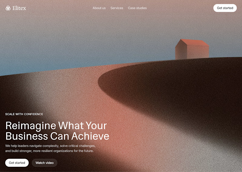
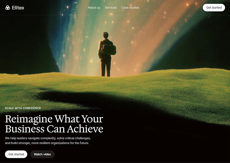

A feels more professional ❤️


Amazing work


In my INKFLESH identity work, the wordmark runs off the can's curve and gets partly hidden behind artwork on posters. That crop asks the rest of the identity to carry more recognition. The mark has a job when the name is only partly there.