
Razin hasnat
Framer expert | UI UX designer



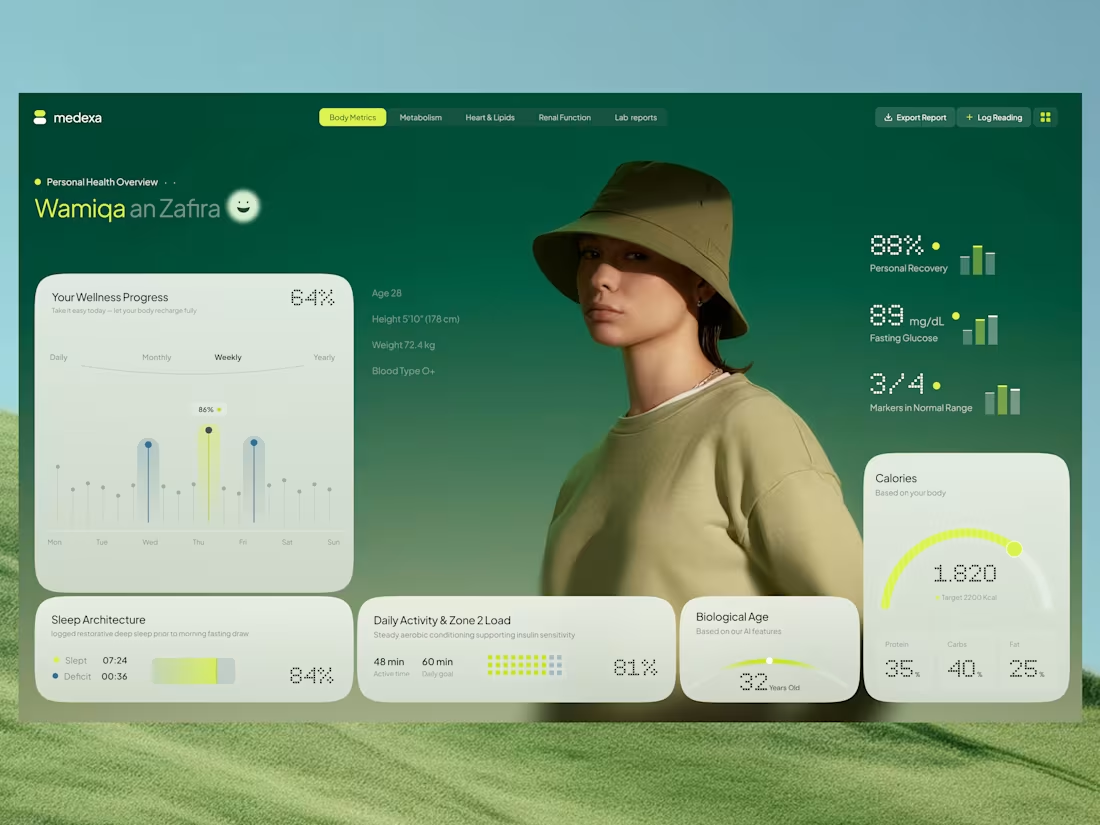
Introducing Medexa, a modern health dashboard concept designed to make personal wellness data easier to understand and explore.
The design combines a calming green palette, soft UI cards, and clear data visualizations to create a balanced experience between aesthetics and functionality.
✨ Design Highlights
📊 Wellness progress and activity tracking
💚 Health metrics with clear visual indicators
😴 Sleep architecture and daily activity insights
🔥 Calorie tracking with nutritional breakdowns
🧬 Biological age and recovery indicators
🎨 Minimal, modern interface with a nature-inspired visual style
The goal was to make complex health information feel approachable through thoughtful UI, clear hierarchy, and a smooth user experience.
I'd love to hear your thoughts and feedback! 💬
Designed with care for a healthier digital experience.
0
16
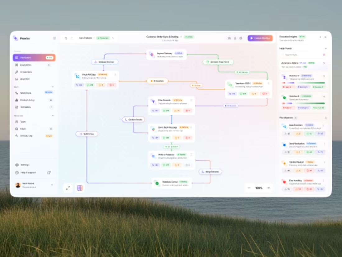
A modern SaaS dashboard concept designed for managing complex automation workflows in a more visual and intuitive way.
The interface brings together workflow building, API integrations, conditional logic, data transformation, notifications, database actions, execution status, and automation insights — without making the experience feel overwhelming.
Design focus: • Visual workflow builder • Real-time execution states • Automation health & insights • Error and retry handling • Clean SaaS dashboard system • Scalable information architecture
The goal was simple: turn complex automation into something users can understand at a glance.
What do you think? Would love to hear your thoughts and feedback. 💜
0
14
MAISON — Premium Shopify Store Design
Luxury jewelry, reimagined for Shopify.
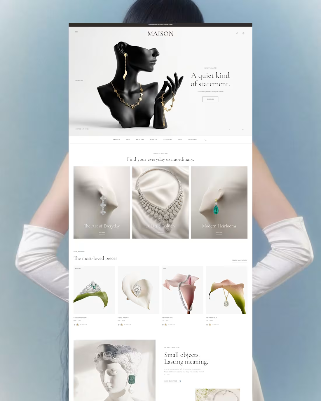
MAISON is a premium Shopify store design concept created for a modern jewelry brand.
The direction combines luxury editorial aesthetics with a clean e-commerce experience, creating a storefront that feels sophisticated while remaining easy to browse and shop.
✦ The Design Approach
The Shopify storefront was designed around three key principles:
Visual storytelling Large imagery and editorial layouts introduce the brand and collections before leading customers into the shopping experience.
Product-first browsing Clean product cards, clear pricing, category navigation, and curated collections make product discovery simple.
Premium simplicity Generous whitespace, refined typography, soft tones, and minimal UI elements create a high-end feel without unnecessary visual clutter.
💎 Shopify Store Sections
Hero Section A strong editorial hero introduces the latest jewelry collection with a focused CTA.
Featured Collections Curated categories help shoppers quickly explore different jewelry styles.
Best Sellers A clean product grid highlights the brand's most-loved pieces.
Brand Story Editorial imagery and storytelling add emotional depth beyond the standard e-commerce experience.
Product Discovery Simple navigation keeps categories, collections, and shopping actions accessible throughout the store.
🎯 Goal
The goal was to design a Shopify experience that feels less like a traditional online store and more like a digital luxury boutique.
Every element was kept intentional — from typography and spacing to product presentation and visual hierarchy.
Elegant. Minimal. Shop-ready.
Designed in Figma Concept for Shopify E-commerce
3
3
66
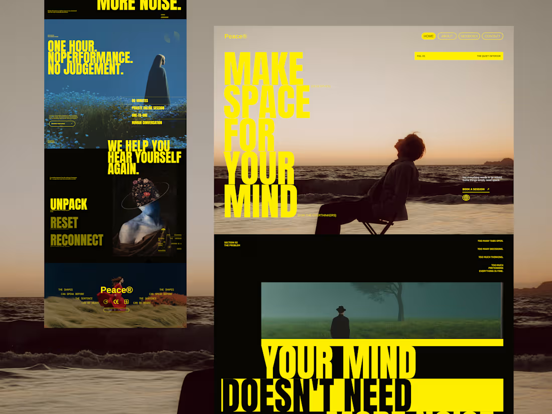
A visual exploration for Peace®, a modern mental peace and personal reflection platform.
The concept started with a simple question:
What if a mental wellness website didn't look like a typical mental wellness website?
Instead of relying on the familiar visual language of wellness products — soft gradients, rounded cards, pastel colors and overly minimal interfaces — I wanted to create something with more character, tension and editorial energy.
The visual direction combines:
Oversized typography Large condensed headlines become a major part of the interface, almost behaving like graphic elements rather than conventional website copy.
Cinematic photography Quiet landscapes, solitary figures and atmospheric scenes create an emotional layer around the experience.
Bold contrast A strong yellow, deep black and muted photographic palette gives the experience a distinctive visual identity.
Editorial composition Different content blocks intentionally break the conventional grid, creating something closer to a digital magazine or art-directed campaign.
Text as a visual element Instead of hiding content behind cards, I used generous amounts of copy and oversized statements to make the words themselves part of the design.
The Core Message
MAKE SPACE FOR YOUR MIND
The experience revolves around slowing down, stepping away from constant noise and creating a moment where you can simply hear yourself again.
The visual storytelling moves through ideas like:
UNPACK. RESET. RECONNECT.
And ultimately:
YOUR MIND DOESN'T NEED MORE NOISE.
It needs space.
Design Direction
Style: Editorial / Experimental / Premium Industry: Mental Wellness / Personal Development Typography: Bold condensed display type + small editorial typography Palette: Electric yellow, deep black, muted blue, warm neutrals Photography: Cinematic, atmospheric, introspective Mood: Quiet, bold, reflective, premium
This was primarily a visual design experiment exploring how typography, photography and storytelling can work together to create an emotional digital experience.
Designed to feel less like a wellness website — and more like a visual pause.
#WebDesign #UIDesign #UXDesign #LandingPage #EditorialWebDesign #Typography #CreativeDirection #MentalWellness #WebDesignInspiration #DribbbleShot #DigitalDesign #VisualDesign
0
85