
Razin hasnat
Framer expert | UI UX designer



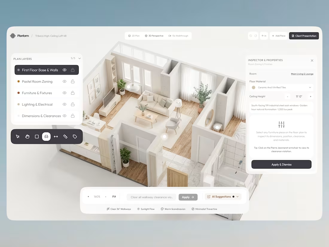
Exploring how interior design and digital tools can work together. ✨
A workspace concept for planning interiors with a furniture library, 2D floor plans, and a live 3D preview — all in one place.
Focused on making complex workflows feel simple and intuitive.
What do you think?
1
40
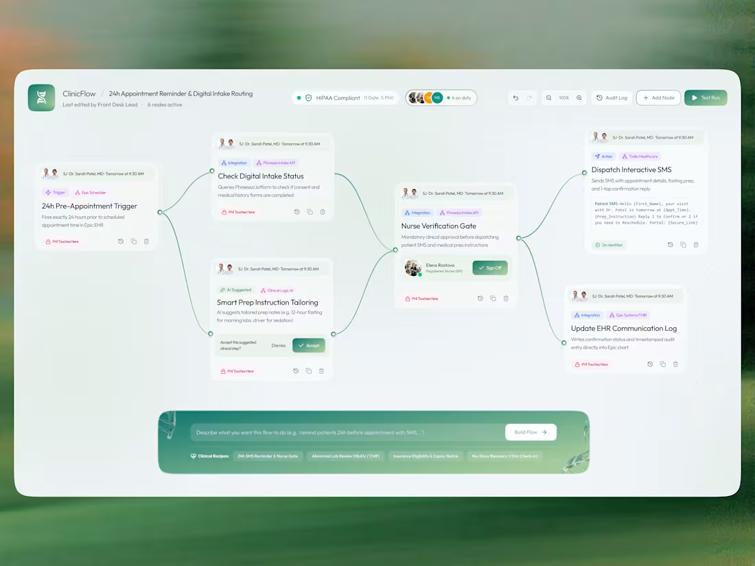
Working on a healthcare automation dashboard concept 🩺
The idea was to explore how complex clinical workflows could feel simpler, more connected, and easier to understand.
The challenge? Balancing multiple automation steps, patient information, approval gates, and EHR integrations without making the interface feel overwhelming.
My visual approach:
→ A node-based workflow to make the process easy to follow
→ Soft green tones to create a calm, healthcare-focused feel
→ Clear cards and visual hierarchy to separate each action
→ Small status indicators and approval states to improve clarity
→ A prompt-based flow builder to make automation feel more accessible
I wanted to explore how visual design can make even complex systems feel approachable.
Just a visual experiment exploring the intersection of UI design, UX thinking, and healthcare automation.
What would you improve in this workflow? 👀
#UIDesign #UXDesign #ProductDesign #HealthcareTech #DashboardDesign
2
1
58
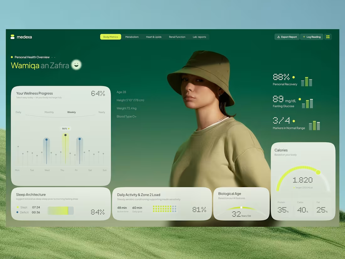
Introducing Medexa, a modern health dashboard concept designed to make personal wellness data easier to understand and explore.
The design combines a calming green palette, soft UI cards, and clear data visualizations to create a balanced experience between aesthetics and functionality.
✨ Design Highlights
📊 Wellness progress and activity tracking
💚 Health metrics with clear visual indicators
😴 Sleep architecture and daily activity insights
🔥 Calorie tracking with nutritional breakdowns
🧬 Biological age and recovery indicators
🎨 Minimal, modern interface with a nature-inspired visual style
The goal was to make complex health information feel approachable through thoughtful UI, clear hierarchy, and a smooth user experience.
I'd love to hear your thoughts and feedback! 💬
Designed with care for a healthier digital experience.
0
25
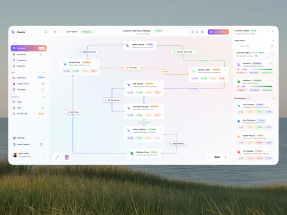
A modern SaaS dashboard concept designed for managing complex automation workflows in a more visual and intuitive way.
The interface brings together workflow building, API integrations, conditional logic, data transformation, notifications, database actions, execution status, and automation insights — without making the experience feel overwhelming.
Design focus: • Visual workflow builder • Real-time execution states • Automation health & insights • Error and retry handling • Clean SaaS dashboard system • Scalable information architecture
The goal was simple: turn complex automation into something users can understand at a glance.
What do you think? Would love to hear your thoughts and feedback. 💜
0
18