The network for creativity
Join 1.25M professional creatives like you
Connect with clients, get discovered, and run your business 100% commission-free
Creatives on Contra have earned over $150M and we are just getting started
Back to feedPost
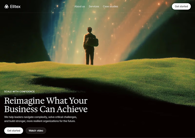
Taste Test


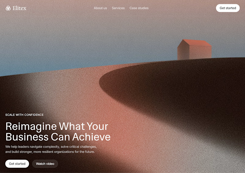


A is clean and Amazing 😻

Thanks, Rahul!

I like the B variant; which one do you like most?
Cool! I like both haha

A feels more professional ❤️


Thanks Mostafa! 🙌
Pardon ❤️

Wow
Thankss!

A 😍

I can go with option b
Yaay, why?
More human touch so
Got it, ty

Both look great, but if had to pick one, it would be A
The image iss waay powerful innit?

B from here
Cool, thanks, emmanuel.

Really liking B. Image matches the copy better imo.
Okay, thanks!

The A feels dreamy and peacefully clear
Niise, thanks for sharing your thoughts about them

image in the b button is amazing
Yeah right? haha

hard to choose, both looks clean and structured, would go with A for it's calmness feel
It matches better with the copy I think yeah
Yess

B tells a story right away. The person looking at the glowing light makes it feel inspiring, which matches the headline perfectly.
Got it, thanks!!

Both are good
Thaanks a lot

A for me. the muted tones let the headline breathe, B is gorgeous but the light rays fight the text a bit. would steal B for a section further down tho
Okaay, thankss!

Love seeing different hero directions explored before settling on the final design. Small changes in layout and visual hierarchy can completely change a website’s first impression. ✨
Could you give me an example?
For example, a bold headline paired with a rocket visual can make a brand feel energetic and action-driven, while the same headline with a minimal glass cube can feel more premium and refined. The layout stays consistent, but the visual direction changes the entire first impression.
Got it, I'll play around with that direction

Ty


voting B, the aurora colors pull more attention than the headline though
Yeah, I agree. Headline is B is less prominent :)

Both are strong but B has that extra punch for me. Really nice explorations
Thaaanks, Tabish!

Awesome!
Thank you!

Got it, thanks 😃
The network for creativity
Join 1.25M professional creatives like you
Connect with clients, get discovered, and run your business 100% commission-free
Creatives on Contra have earned over $150M and we are just getting started
Related posts

Your design has 3 seconds to earn attention. Which skincare brand wins?
A leads with confidence, energy, and aspiration. B builds trust through nature, freshness, and simplicity.
Great design doesn’t just look good. It makes people feel the brand before they read a word.
A or B? Which would make you stop scrolling?


30 voted
52%
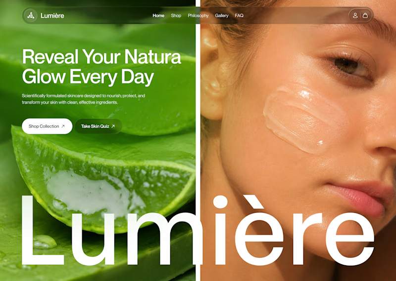
28 voted
48%
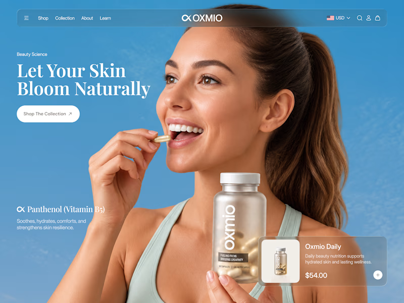
58 votes
Closed


B without questions


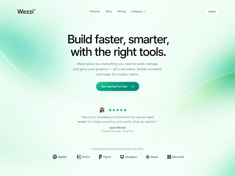
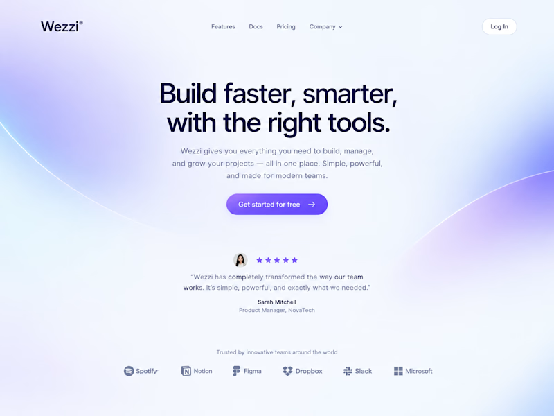
Same layout. Same copy. Completely different feel.
Swapping just the color palette and gradient glow changed the whole personality of this Wezzi hero section.
Which one fits a SaaS brand better? 👇

10 voted
50%
10 voted
50%
20 votes
Closed

Such a great demonstration Amina! It's amazing how just changing the color palette and gradient glow completely shifts the personality — same layout, same copy but totally different vibe. This Dreamy Haze version feels so soft, modern and perfect for a SaaS brand, very...