The network for creativity
Join 1.25M professional creatives like you
Connect with clients, get discovered, and run your business 100% commission-free
Creatives on Contra have earned over $150M and we are just getting started
Back to feedPost


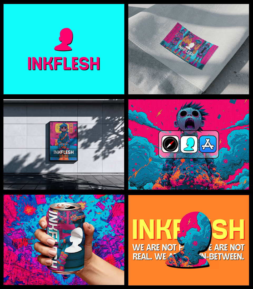
In my INKFLESH identity work, the wordmark runs off the can's curve and gets partly hidden behind artwork on posters. That crop asks the rest of the identity to carry more recognition. The mark has a job when the name is only partly there.


This is wonderful only

Great work 🔥

Love that idea. If the mark still works half hidden, it shows how strong the rest of the system is.

this is so cool!


that cropped wordmark on the can is sick

Nice work

Top notch

Love this approach to identity! Making the brand mark work harder through partial cropping creates a much more dynamic and memorable packaging feel.

Great Designs🔥

Love this approach! Letting the wordmark get cropped and hidden is risky but it makes the whole identity system stronger. The icon does the heavy lifting when the name is not fully visible - that's smart branding.
> The color palette and can mockup are 🔥


Good work🔥👏👏

Was the idea to make the identity recognizable even when the wordmark is partially hidden?
The network for creativity
Join 1.25M professional creatives like you
Connect with clients, get discovered, and run your business 100% commission-free
Creatives on Contra have earned over $150M and we are just getting started






Related posts

Had some fun with this one.
Exploring how typography, colour, and a few unexpected details can give a brand its own personality.
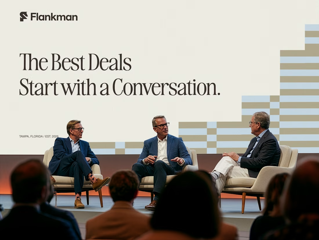
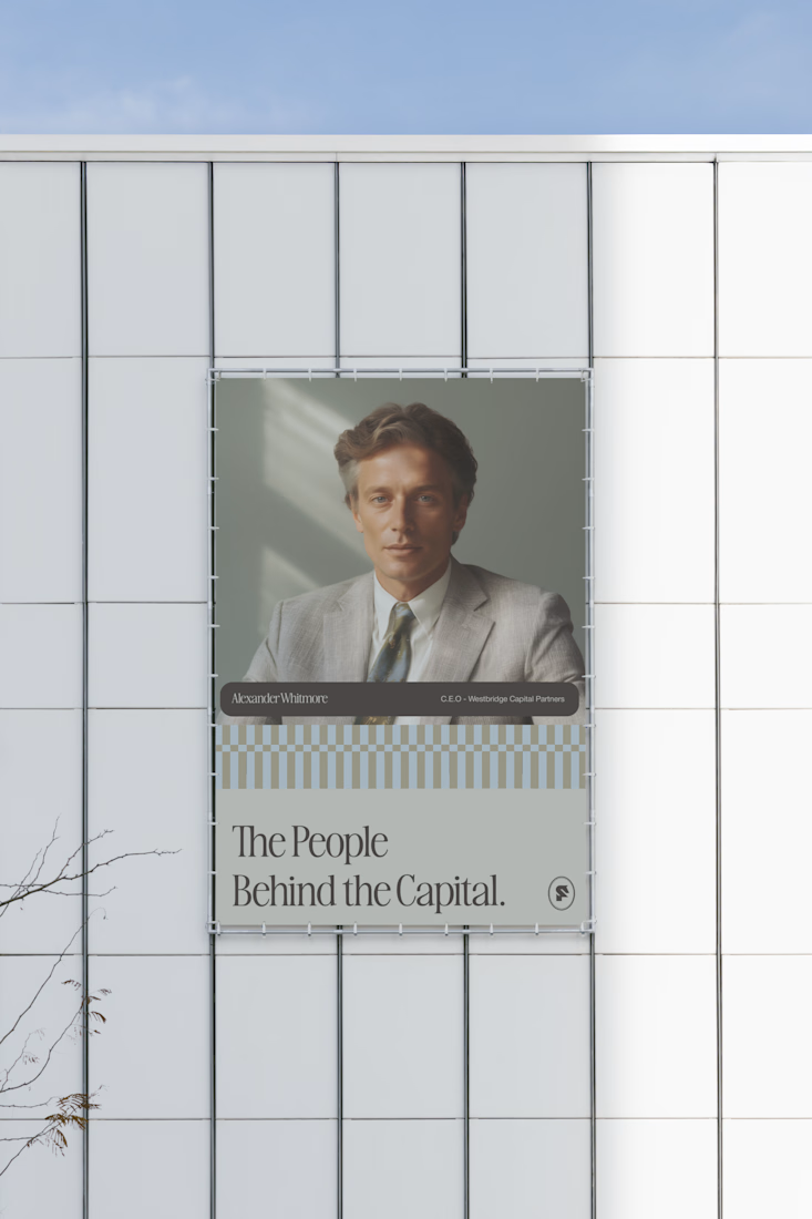
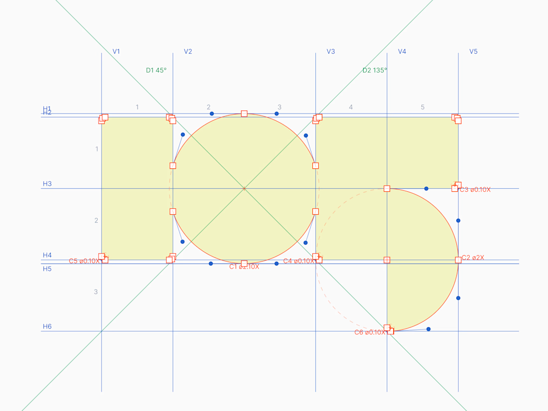
Meet Flankman. Full case study is live! ↓




clean


It looks so good


Really nice work. The simplicity works beautifully here.