The network for creativity
Join 1.25M professional creatives like you
Connect with clients, get discovered, and run your business 100% commission-free
Creatives on Contra have earned over $150M and we are just getting started
Back to feedPost

Your fashion identity is not finished when it looks good on clothing.
It is finished when it can own an entire space.
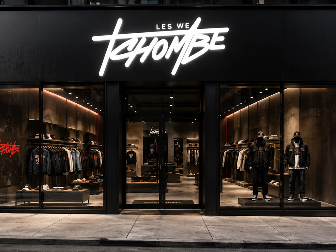
For LES WE TCHOMBE, that meant taking the same expressive wordmark off the garment and putting it above a physical storefront.
At that scale, there is nowhere for weak typography to hide.
The mark has to:
Stay readable from the street
Carry enough personality without extra decoration
Work against architecture and lighting
Still feel connected to the garments inside
That is why I like testing fashion identities beyond mockups of T-shirts and hoodies.
A serious brand eventually has to live on:
Retail signage
Packaging
Campaigns
Labels
Digital platforms
Physical environments
And every one of those applications should feel like the same company.
The goal was not to make LES WE TCHOMBE look like a streetwear project.
It was to make it look like a streetwear brand capable of becoming a real retail business.
Here’s the debate:
Does moving a streetwear brand into polished retail strengthen its credibility, or can it remove some of the raw culture that made it interesting in the first place?
I think the strongest brands evolve without cleaning away their personality.
What do you think?
If you are building a fashion brand with bigger ambitions than Instagram drops, I’d love to talk.
#RetailBranding #StreetwearBranding #FashionBranding #StoreDesign #BrandIdentity #VisualIdentity #CreativeDirection


The network for creativity
Join 1.25M professional creatives like you
Connect with clients, get discovered, and run your business 100% commission-free
Creatives on Contra have earned over $150M and we are just getting started


Related posts


Love a good all round project full of branding, merch, fitouts etc
Always fun!
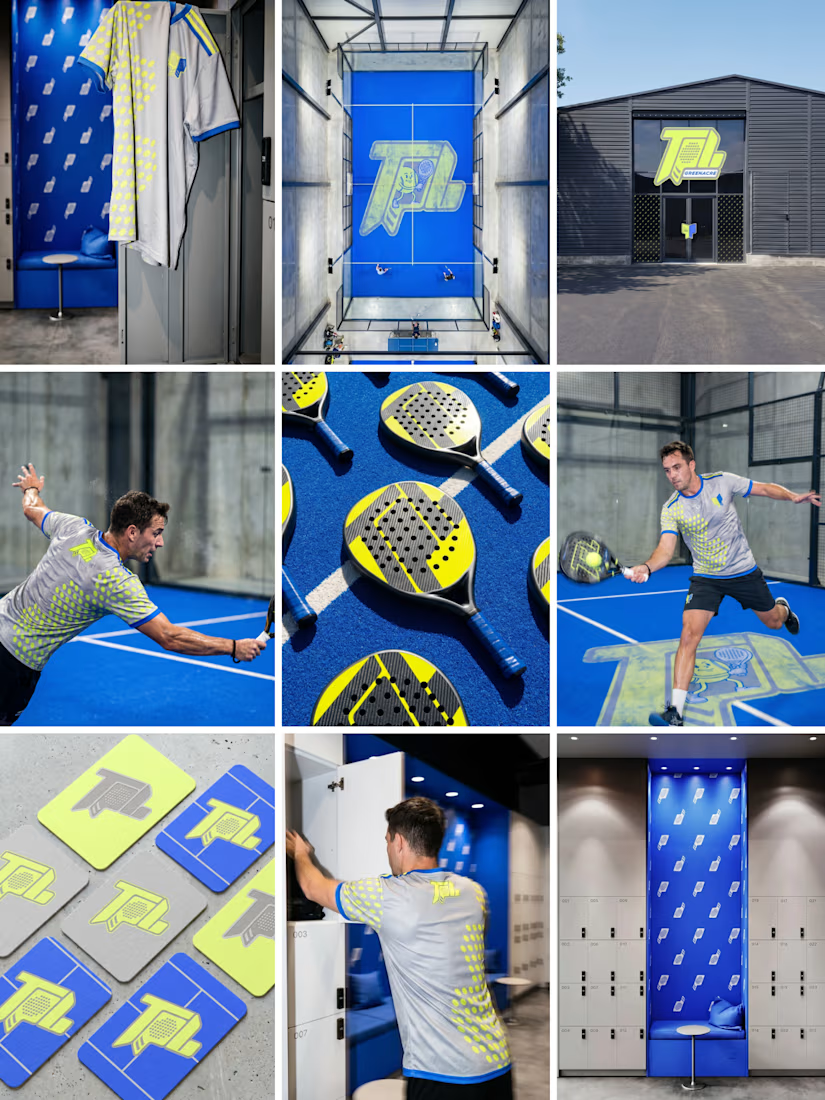

Branding across merch and fitouts looks wonderfully cohesive.

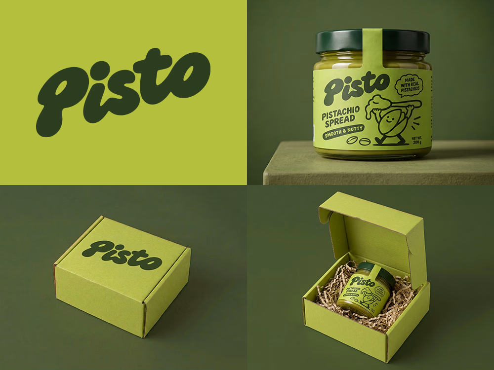
Can AI create a professional-looking logo?
I tried to create a logo concept for a pistachio spread brand using Recraft Logo Maker.
After answering a few questions about the brand and going through several variations, I finally landed on a logo that felt right and captured the fun, fresh personality I had in mind.
But I didn't want to stop at just the logo.
I took it a step further by exploring how the identity could come to life through product packaging and a branded mailer box.
A quick process video is included in the comments.
What do you think?


Label Design · Wine Branding · Malbec Gran Reserva · Mendoza


looks great