The network for creativity
Join 1.25M professional creatives like you
Connect with clients, get discovered, and run your business 100% commission-free
Creatives on Contra have earned over $150M and we are just getting started
Back to feedPost

Ballon De Cartier, reimagined with MiniMax H3


The network for creativity
Join 1.25M professional creatives like you
Connect with clients, get discovered, and run your business 100% commission-free
Creatives on Contra have earned over $150M and we are just getting started








Related posts


Mastering Claude + Figma MCP has been a process, but it’s already made iterating on brand assets significantly faster


Same here, once it clicks the iteration speed is wild. Would be cool to see how you set up your workflow.

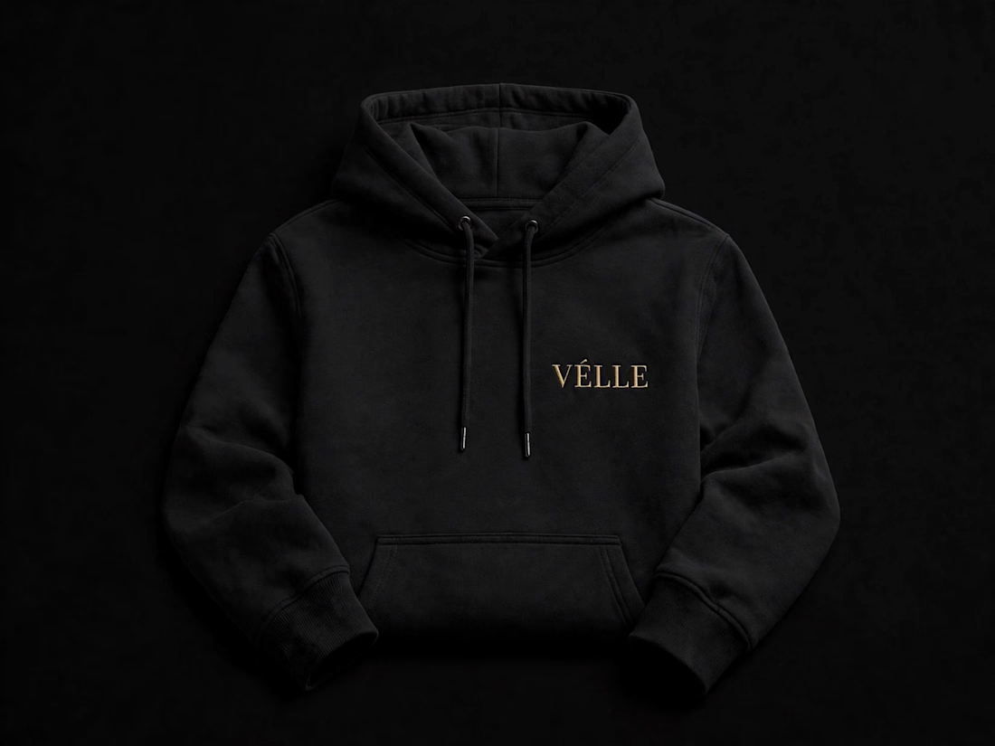
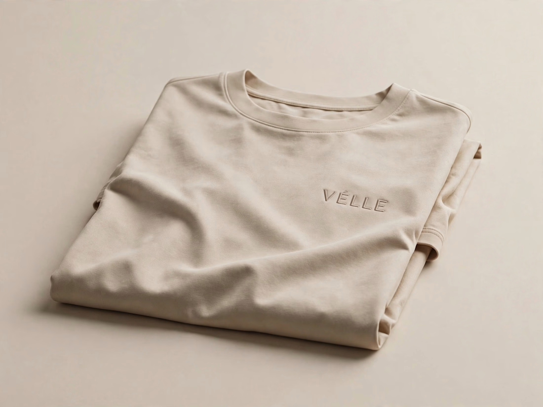
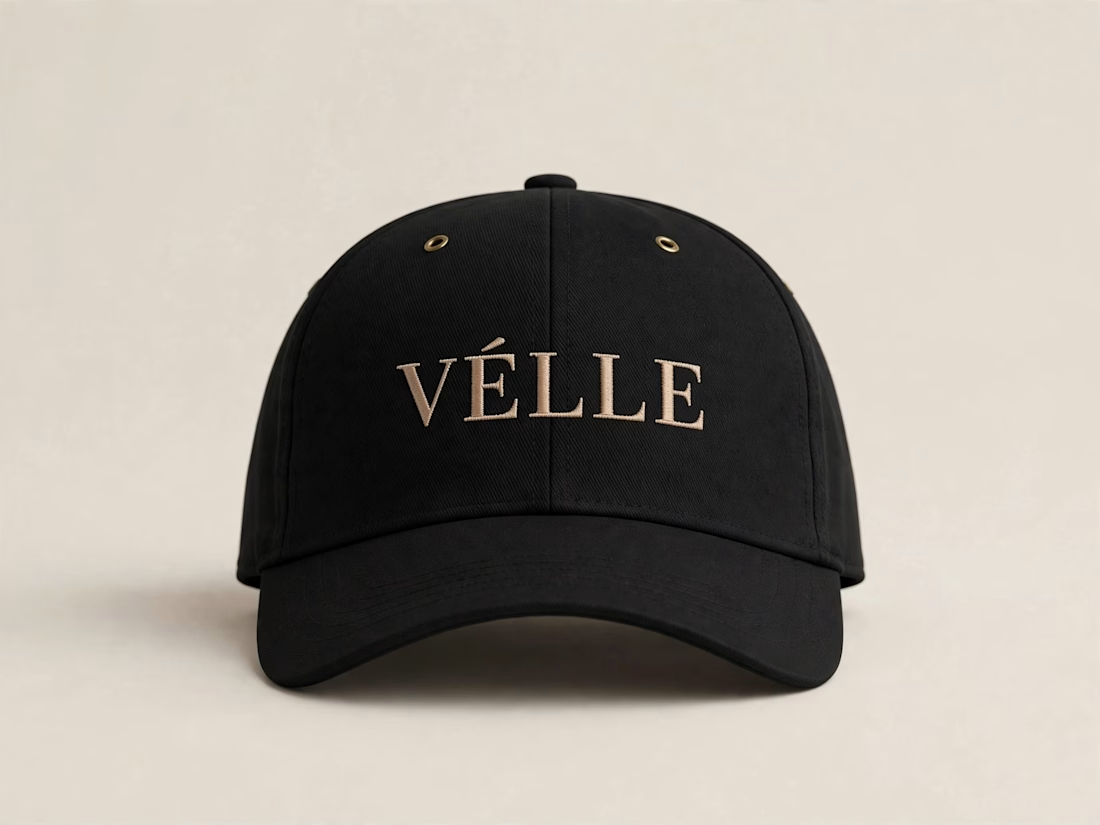
VÉLLE - Minimal Luxury Fashion Brand Identity
A conceptual fashion brand built on quiet luxury and timeless essentials.
What I did:
→ Logo Design (Primary + Secondary)
→ Brand Identity & Color System
→ Product Mockups (T-Shirt, Cap, Tote Bag)
Concept: Less is more. Clean serif typography with subtle accent for premium feel.
Palette: Beige #E8DDD0 / Black #0A0A0A
Full case study on Behance: behance.net/gallery/257321557
Open for freelance projects - DM for fashion branding.


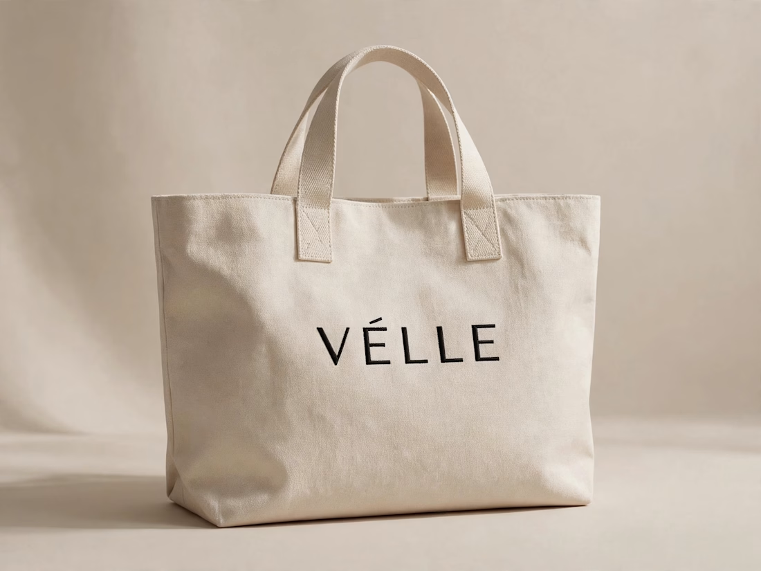

love the minimal direction on this. VÉLLE feels expensive but not loud, the tote and cap mockups are so good

Who gets the spotlight when the lead doesn’t show?
UNDERSTUDY is a theatre for the second cast, in hot pink Didone, pale sage and circles cut through faces.
Case study live soon.
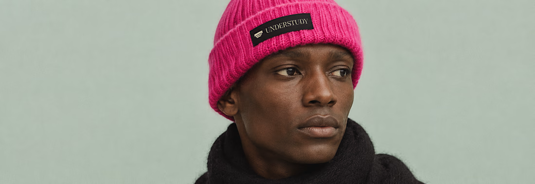

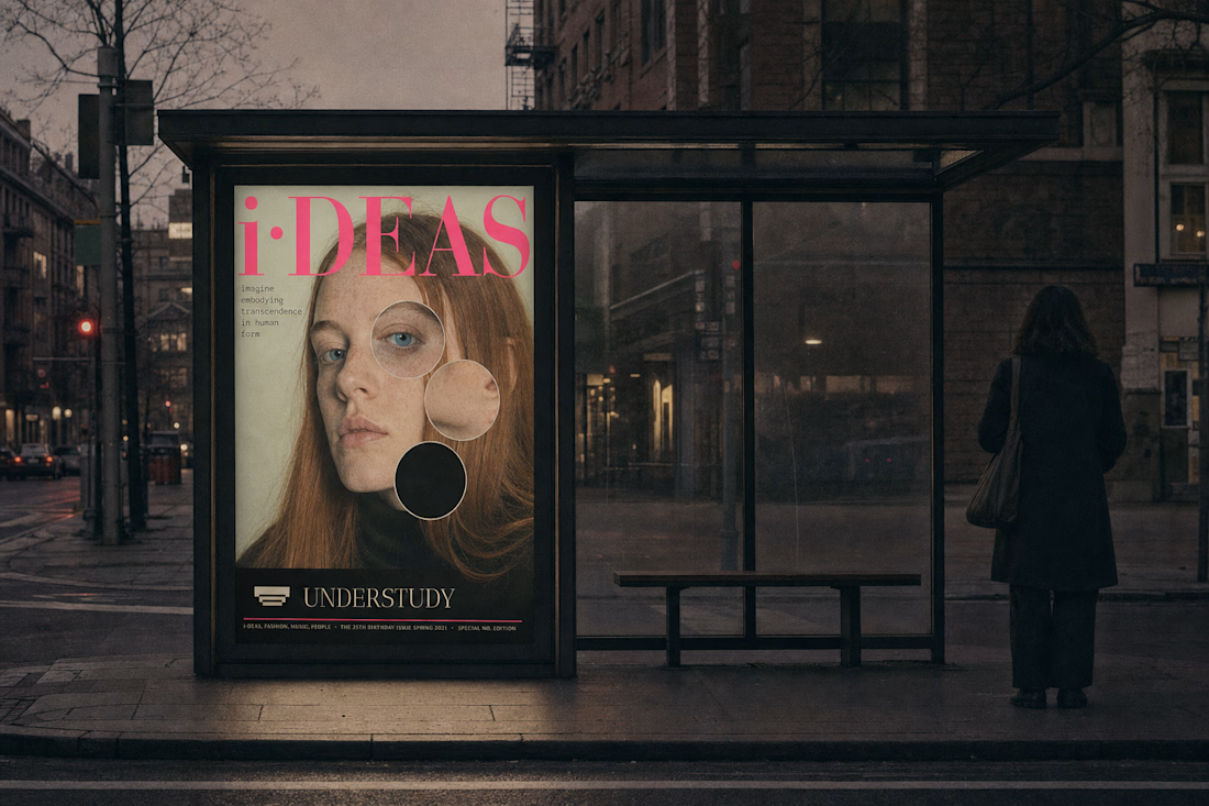

as a theatre BFA, i'm so fascinated by this concept & these visuals!