The network for creativity
Join 1.25M professional creatives like you
Connect with clients, get discovered, and run your business 100% commission-free
Creatives on Contra have earned over $150M and we are just getting started
Back to feedPost

Who gets the spotlight when the lead doesn’t show?
UNDERSTUDY is a theatre for the second cast, in hot pink Didone, pale sage and circles cut through faces.
Case study live soon.


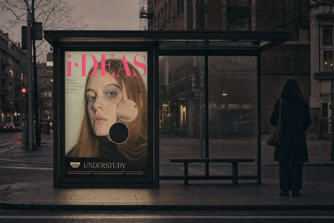

Circles cut through the faces make the second cast literal, and hot pink Didone on pale sage gives it the feel of a real theatre bill.


Really strong art direction. The palette choice — hot pink Didone + pale sage — and that repeated circle motif across the beanie patch, jacket patch, and poster feels super cohesive. Eager to see the full case study.

Great job Revolte🎉🎉🔥🔥

A theatre for the second cast is such a poetic concept. The hot pink Didone against pale sage sounds striking, and the circles cut through fabric feel like the perfect visual metaphor for stepping into the spotlight.

A theatre for the second cast is such a great concept. Hot pink Didone with pale sage is a combo I didn't know I needed.
The network for creativity
Join 1.25M professional creatives like you
Connect with clients, get discovered, and run your business 100% commission-free
Creatives on Contra have earned over $150M and we are just getting started








Related posts


Fresh case study 🚀🚀🚀
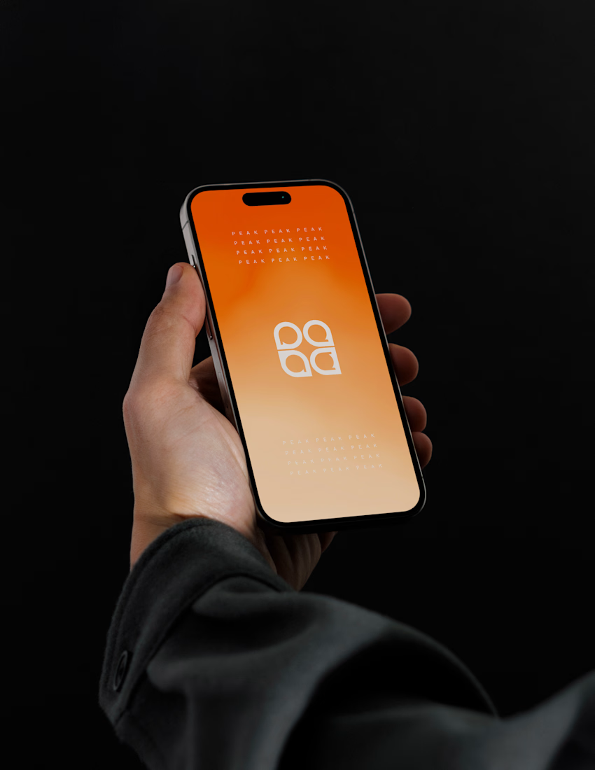
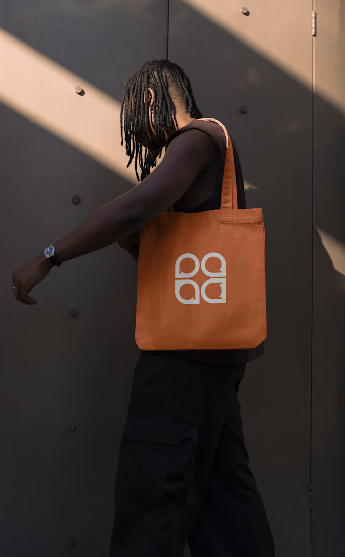
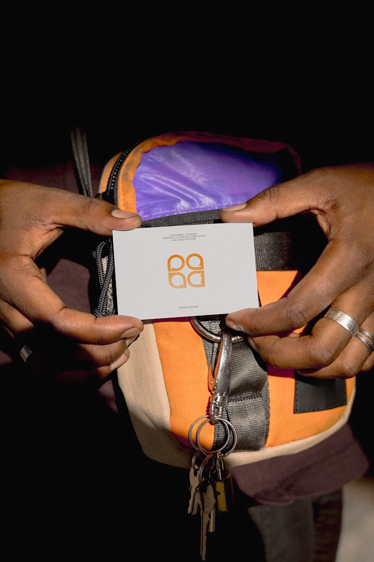
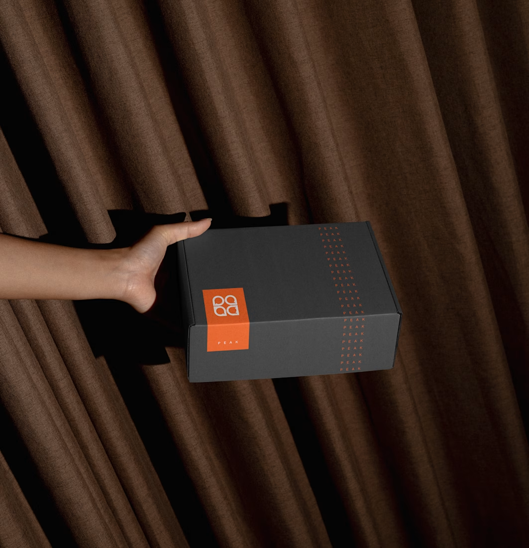
Brand identity for Peak, an all-in-one website builder for WordPress that I design and build. A four-letter mark, a warm paper-and-ember palette and one system that runs from the favicon to the packaging.


A four-letter mark that has to hold from favicon to packaging is a tough constraint. Did you draw one letterform first and build the other three from it, or design them together as a set from the start?

Beautyy

Recovery Brand Identity / Logo & Visual Direction
A new identity project for a recovery-focused brand that wanted to move away from the conventional clinical look of its category.
The direction combines clinical credibility with a more modern, movement- and performance-driven visual language.
First look at the logo. Full identity coming next.
Logo design and creative direction by Lepisov Branding
Social media Branding: collab with Mike Creative Mints


