The network for creativity
Join 1.25M professional creatives like you
Connect with clients, get discovered, and run your business 100% commission-free
Creatives on Contra have earned over $150M and we are just getting started
Back to feedPost
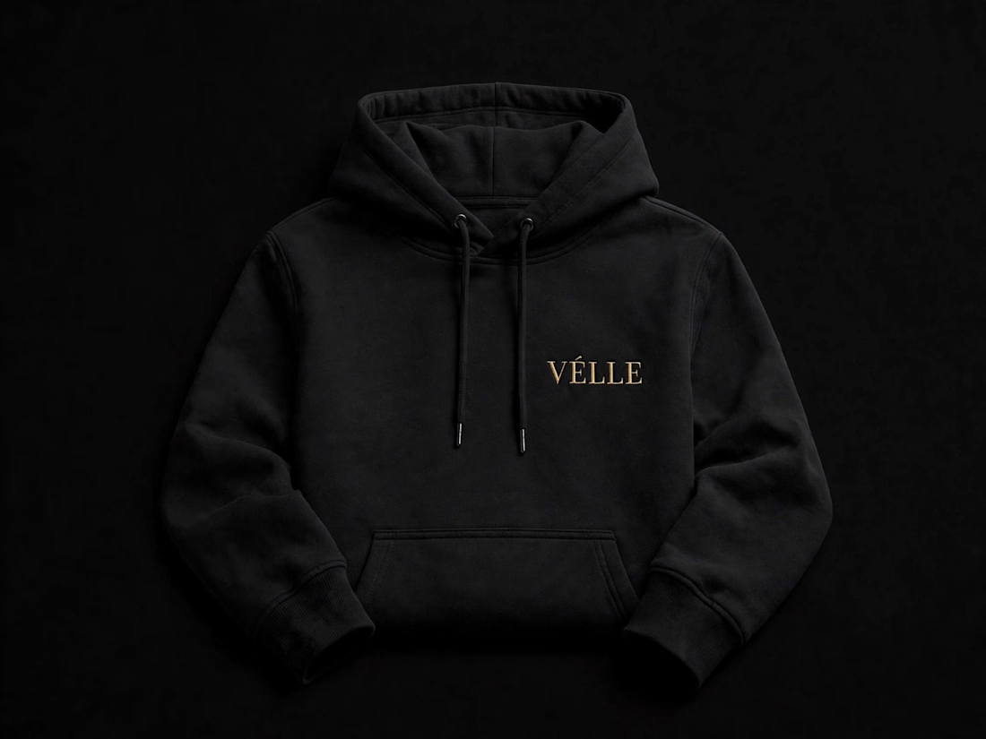
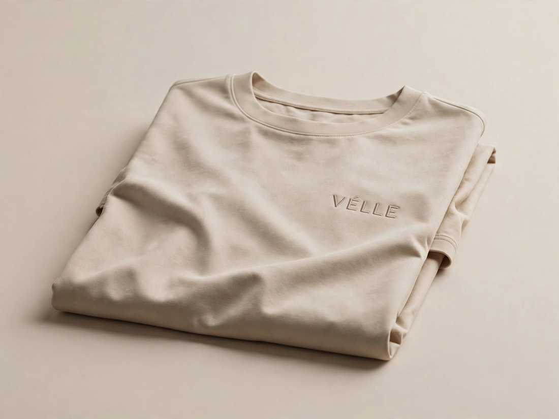
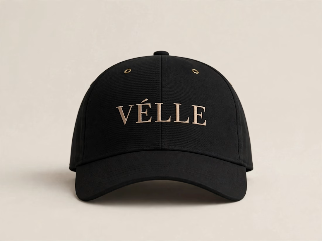
VÉLLE - Minimal Luxury Fashion Brand Identity
A conceptual fashion brand built on quiet luxury and timeless essentials.
What I did:
→ Logo Design (Primary + Secondary)
→ Brand Identity & Color System
→ Product Mockups (T-Shirt, Cap, Tote Bag)
Concept: Less is more. Clean serif typography with subtle accent for premium feel.
Palette: Beige #E8DDD0 / Black #0A0A0A
Full case study on Behance: behance.net/gallery/257321557
Open for freelance projects - DM for fashion branding.


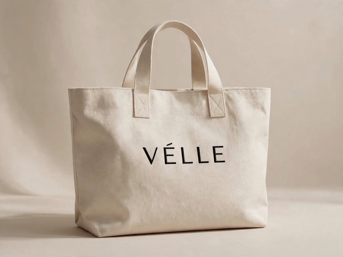

love the minimal direction on this. VÉLLE feels expensive but not loud, the tote and cap mockups are so good

Thanks a lot Ashik vai! Means a lot — tried to keep VÉLLE quiet but premium, happy the tote & cap translated well 🙏

Thank you Naim vai!

nice one naim, that black hoodie with the small gold logo is fire. simple but classy
Thanks Anisur! Yes that small gold embroidery was the key detail — less is more approach for quiet luxury 🔥

Thank you so much Mim! You caught exactly what I was aiming for — restraint, muted palette, clean serif. Really appreciate your detailed feedback!

This is how you do minimal luxury right. Less is more really works here, the primary + secondary logo system feels very considered and the product mockups sell the whole lifestyle. Super cohesive.
Thanks a lot Shishir! Appreciate that. Tried to make the primary + secondary logo system feel considered and the product mockups sell the lifestyle. Glad it feels cohesive.

So handsom dear♥️
Thanks! Sagar
Welcom dear♥️ islam

Honestly nothing but premium branding
Thanks a lot Manik bhai! Appreciate your kind words — means a lot 🙏✨
Its my pleasure and your work deserves these words

VÉLLE feels expensive but not loud, and that is exactly what quiet luxury should do. The clean serif in that beige and black palette across the hoodie, tee, cap and tote mockups sells the timeless essentials angle beautifully.
Thank you so much, Timothy! Really appreciate you catching the quiet luxury direction — that was exactly the vision for VÉLLE. Means a lot! 🙏

Gold serif on black and beige looks really classy. The cap is my favorite.
The network for creativity
Join 1.25M professional creatives like you
Connect with clients, get discovered, and run your business 100% commission-free
Creatives on Contra have earned over $150M and we are just getting started








Related posts


Design Sprint: ESCO Token
How do you build a brand for a business most people can't explain?
ESCO Token is built to become the standard behind Europe's Digital Product Passport: the system that will track what a product is made of, where it came from and where it goes next. Necessary, regulated, and completely abstract for most people.
One sprint. Zero to an identity that works:
- Micro-design style: restraint over noise, shaped by European design discipline.
- Wordmark and symbol built to hold up anywhere.
- Full brand identity.
- Landing page ready for the go-to-market.
When a business is hard to explain, the brand has to do the talking.
Teaser below.

Wonderful craftsmanship! 🎯


🌶️ Spicy take from my latest identity project
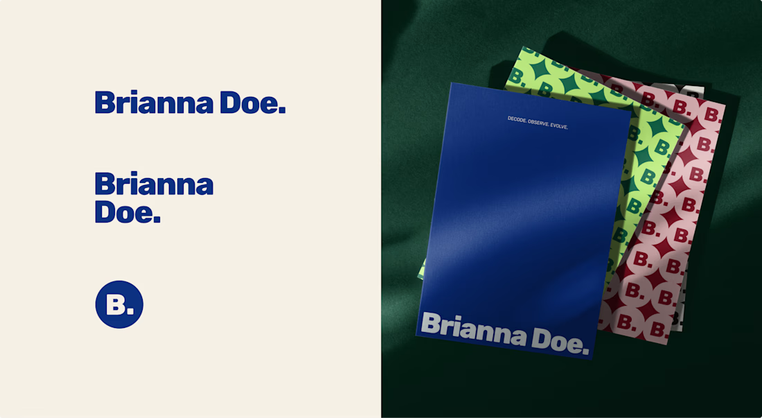
Brianna Doe’s entire logo is her name and a dot. And it does more work than most of the “unique” logos I scroll past on socials.
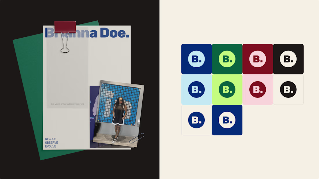
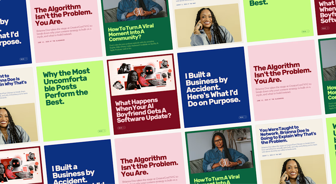
A logo only has to IDENTIFY a brand. Defining it is the job of everything else: creative direction, color & font systems, imagery.
Complicated logos impress other designers, simple ones work for the client.
Check out the full case study to see how a simple logo carries an entire brand identity
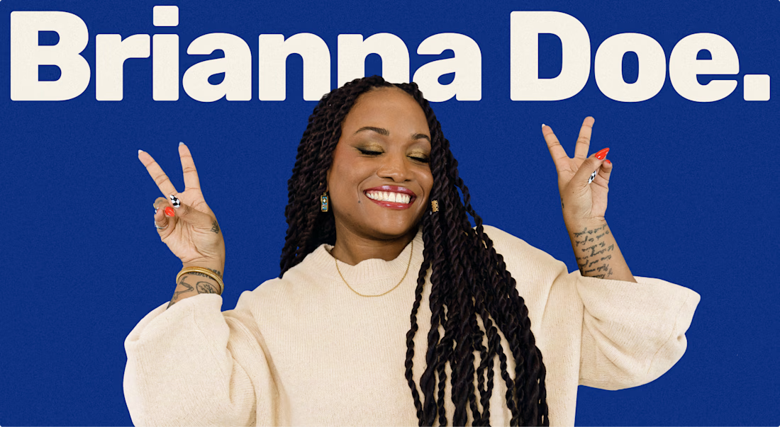

Lovely palette. I'm sure the client is stoked.

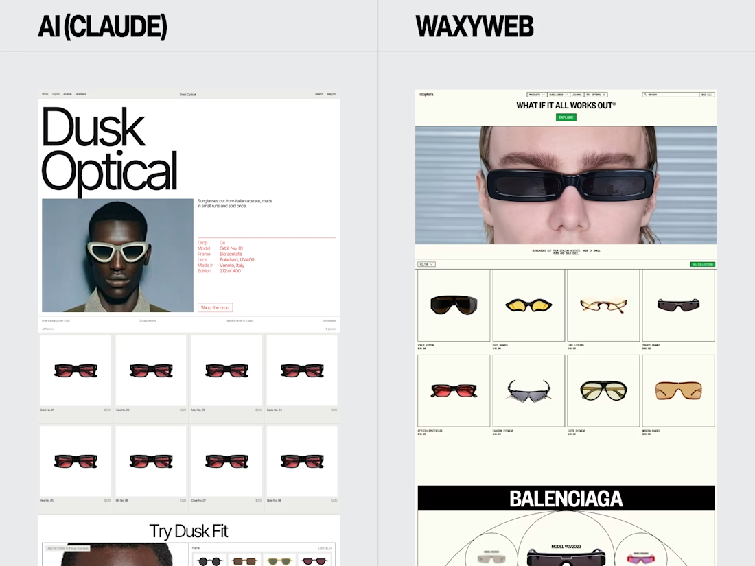
Eyewear Ecommerce Website Redesign — AI vs. WaxyWeb
A side-by-side design comparison exploring two approaches to an online eyewear store.
The WaxyWeb redesign focuses on the relationship between product presentation, collection browsing, editorial imagery, and the store’s visual identity.
Design considerations:
Eyewear product presentation
Ecommerce layout and hierarchy
Collection and product discovery
Fashion-focused visual direction
Consistent online shopping experience
For fashion, eyewear, and lifestyle brands, the goal is to create a store that presents products clearly while giving the brand a recognisable visual presence.
Website design and development: www.waxyweb.com


WaxyWeb