The network for creativity
Join 1.25M professional creatives like you
Connect with clients, get discovered, and run your business 100% commission-free
Creatives on Contra have earned over $150M and we are just getting started
Back to feedPost

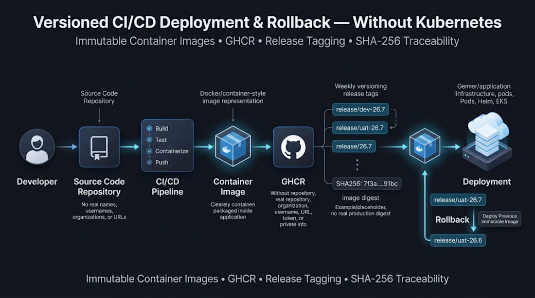
Case Study: Versioned Deployment & Rollback Pipeline (Without Kubernetes)
The Problem:
Many teams struggle with deployments that aren't traceable or reversible. Using latest tags creates ambiguity, you never know exactly which image is running, and rollbacks often mean rebuilding from scratch. This is costly and risky.
The Solution:
I designed a CI/CD pipeline that brings versioning, traceability, and fast rollback to a non-Kubernetes environment, proving that strong DevOps practices don't require heavy orchestration.
What I Built:
* Automated Image Pipeline
Application images are built and pushed to GitHub Container Registry (GHCR) automatically on every release.
* Structured Release Tags
Instead of latest, I used environment and release-based tagging:
release/dev-26.7
release/uat-26.7
Where 26 = year, 7 = month. Weekly versioning can be layered in when needed.
* Immutable Image Identification
Every deployment is tied to a SHA-256 image digest, an immutable reference to the exact image running in that environment. No more guessing what's deployed.
* Fast, Reliable Rollbacks
Since each release maps to a specific digest, rollback is instant, no rebuild required. Just point the deployment back to the previously verified image:
text
The Result:
A lightweight, production-grade deployment system with:
✅ Automated CI/CD
✅ Full deployment traceability
✅ Immutable image references
✅ Predictable, fast rollbacks
✅ No unnecessary orchestration overhead
Key Takeaway:
Reliable deployments aren't exclusive to Kubernetes. With the right container lifecycle design, even simple infrastructure can have versioning, traceability, and rollback, without the complexity.
Need a similar pipeline for your team?
I build secure, traceable CI/CD systems for teams that want reliability without over-engineering. Let's talk.


The network for creativity
Join 1.25M professional creatives like you
Connect with clients, get discovered, and run your business 100% commission-free
Creatives on Contra have earned over $150M and we are just getting started



Related posts

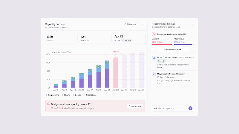
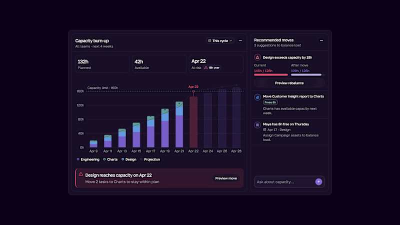
Capacity burn-up UI.
Track team workload, spot capacity risks early, and rebalance work before teams get overloaded.
Light & Dark modes.

2 voted
33%
4 voted
67%
6 votes
Closed

This is the kind of dashboard that actually gets used — the burn-up chart makes overload visible at a glance instead of hiding it in a table somewhere. I like that the point is spotting the risk early, not just reporting it after the fact. Both modes read well, though the dark one makes the chart pop a bit more for me.

I shouldn't have been able to make this from my desk. 👁️🗨️
Game is entirely rewritten. How are you leveraging next-gen tools in your freelance stack?


Cinematic!

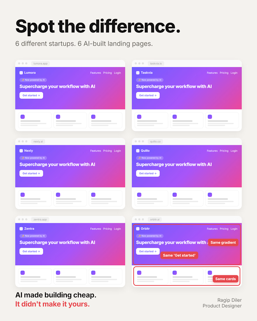
You can spot a vibe-coded app in 2 seconds.
Same gradient. Same cards. Same “Get started.”
It’s not a coincidence.
When you ask AI to “make it look modern,” it gives you the average of every landing page it has seen. The average is safe. It’s also invisible.
And it costs you more than looks:
→ Visitors can’t tell you apart from the 10 other tools they opened today.
→ “Supercharge your workflow” says nothing about the problem you solve.
→ A generic page feels like a weekend project. People don’t trust weekend projects with their data or their card.
The good news: you don’t need to rebuild anything. Three changes go a long way:
Write the headline yourself. Name your user and their problem in plain words.
Pick one thing only your product does and make it the first thing people see.
Replace the three feature cards with a real screen of your product.
AI can build the page in minutes. Deciding what it should say is still your job.
What’s the first thing you’d change on your own landing page?