The network for creativity
Join 1.25M professional creatives like you
Connect with clients, get discovered, and run your business 100% commission-free
Creatives on Contra have earned over $150M and we are just getting started
Back to feedPost

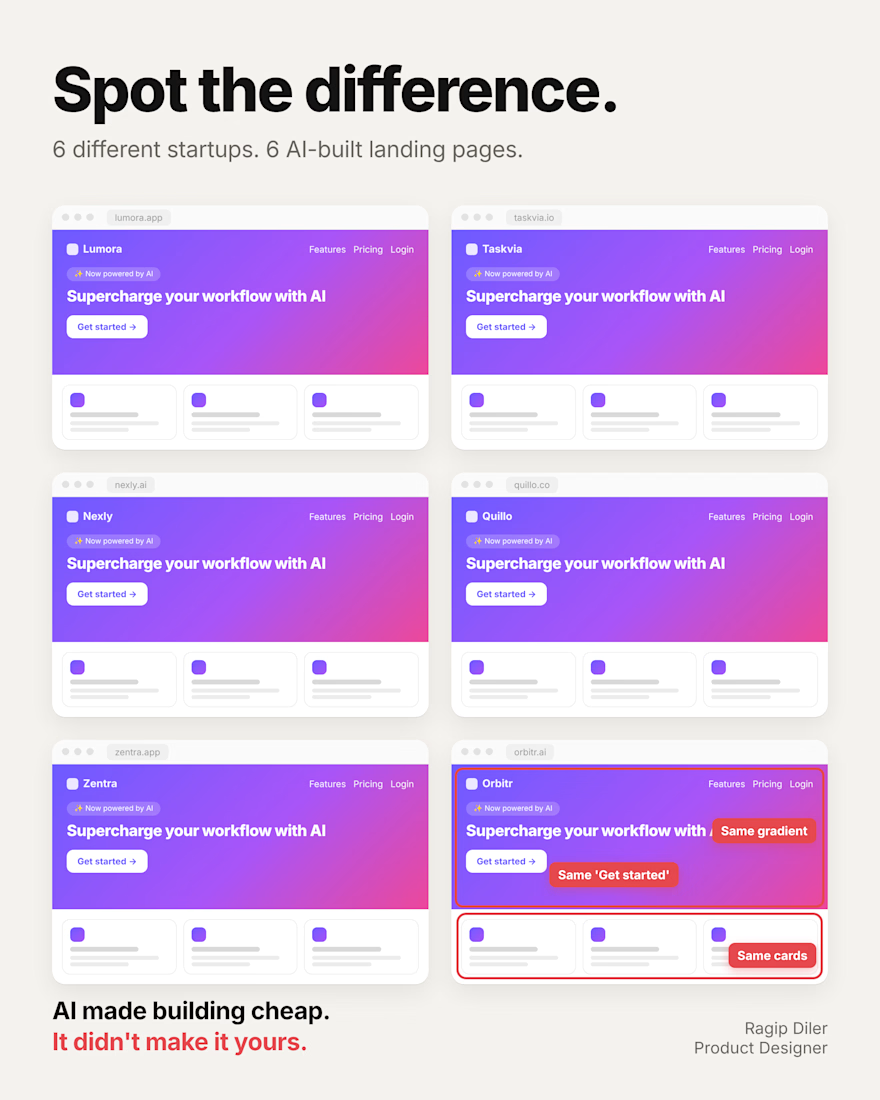
You can spot a vibe-coded app in 2 seconds.
Same gradient. Same cards. Same “Get started.”
It’s not a coincidence.
When you ask AI to “make it look modern,” it gives you the average of every landing page it has seen. The average is safe. It’s also invisible.
And it costs you more than looks:
→ Visitors can’t tell you apart from the 10 other tools they opened today.
→ “Supercharge your workflow” says nothing about the problem you solve.
→ A generic page feels like a weekend project. People don’t trust weekend projects with their data or their card.
The good news: you don’t need to rebuild anything. Three changes go a long way:
Write the headline yourself. Name your user and their problem in plain words.
Pick one thing only your product does and make it the first thing people see.
Replace the three feature cards with a real screen of your product.
AI can build the page in minutes. Deciding what it should say is still your job.
What’s the first thing you’d change on your own landing page?
The network for creativity
Join 1.25M professional creatives like you
Connect with clients, get discovered, and run your business 100% commission-free
Creatives on Contra have earned over $150M and we are just getting started



Related posts

Rebuilt my portfolio with AI and added new case studies.
Brand, web, and product UI. All custom coded, all in one page.

One page with brand, web and product UI together is a strong move. Clients see the range without clicking around. Rebuilding mine with AI coding tools taught me the same thing: the speed lets you spend the saved time on the case study writing, which is what actually wins work.


With AI, anyone can make a decent-looking screen now. So a lot of the work is knowing what to cut.
If you one-shot it with AI, it usually looks like everyone else's, because it learned from everyone else's.