The network for creativity
Join 1.25M professional creatives like you
Connect with clients, get discovered, and run your business 100% commission-free
Creatives on Contra have earned over $150M and we are just getting started
Back to feedPost
Taste Test

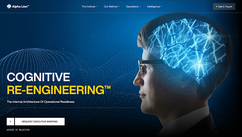
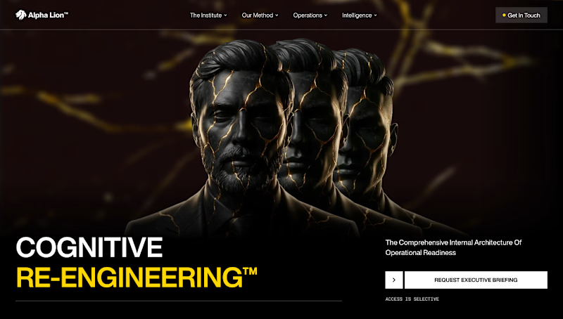
Testing two hero section concepts to find the strongest first impression🤔
.
.
I’m on X too, mostly thinking out loud ideas, problems, and good people to follow https://x.com/rightnextstep?s=11

4 voted
29%
10 voted
71%
14 votes
Closed

Hero section here is the winner, it has more contrast and leads the eye where its supposed to go, but if you position the headline, subtext and button a bit higher or in the middle on hero section 1 it would be a clear winner. Nice work.

Hero section 2 is much better. 👍
Hero section 1 is normal.

Hero section 2


Love seeing active visual iterations in Framer! It’s always fascinating to see how shifting typography balance and media placement completely changes the mood of the headline.

Neither to be honest. Both feel very artificial, though I don't know the project and perhaps that's what's needed


Hero 1 has stronger impact. The layout is cleaner.

Dark one is so solid

Both are 🔥 🔥

The network for creativity
Join 1.25M professional creatives like you
Connect with clients, get discovered, and run your business 100% commission-free
Creatives on Contra have earned over $150M and we are just getting started

Challenges
View all


Related posts


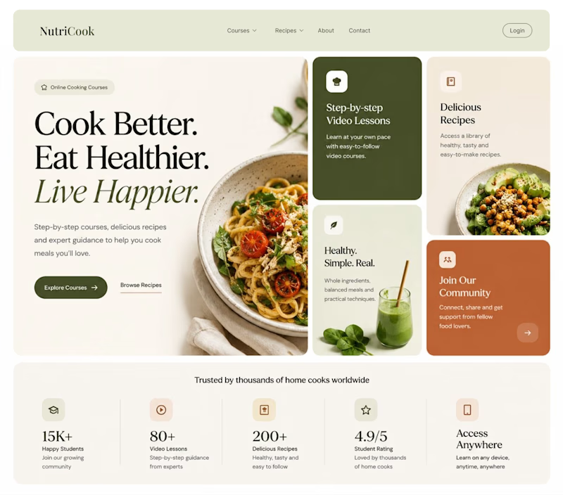
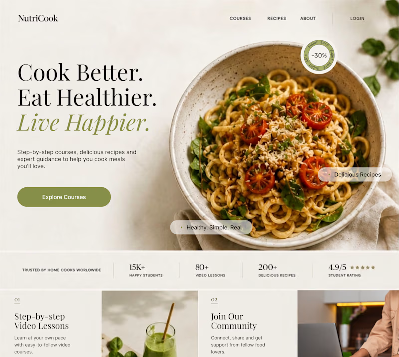
Same content. Two completely different vibes.
What happens when you keep the course content the same, but change the structure, typography, and color palette?
Two hero sections. One course. Two different visual experiences.
Which one would you choose? 1 or 2?
29 voted
41%
42 voted
59%
71 votes
Closed

Option 1 works well , the heirarchy and card layout on the hero is very smart
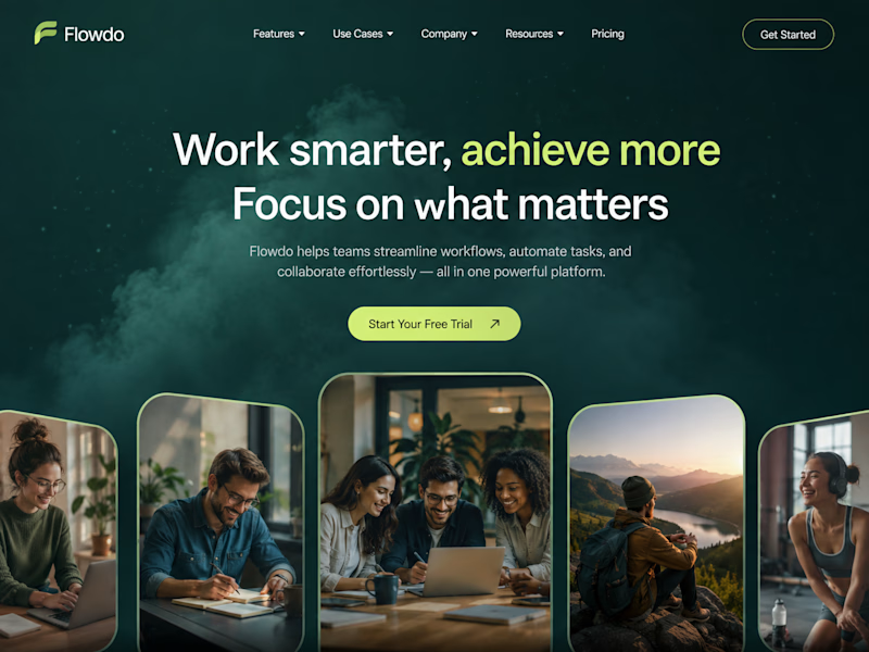
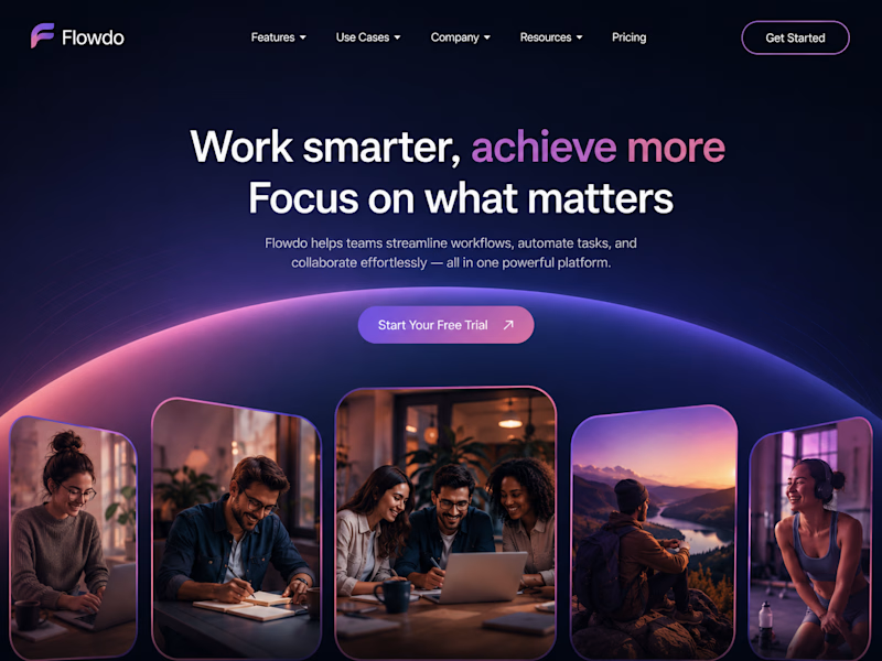
One header, two color stories.
Green: cool tones, feels productive and safe
Purple: gradient glow, feels modern and premium
Same words. Different first impression.
Which one would make you click "Get Started"?

26 voted
59%
18 voted
41%
44 votes
Closed

Went with calm and focused. The copy is literally asking people to focus on what matters, so a header that competes for attention with a glow works against its own message.
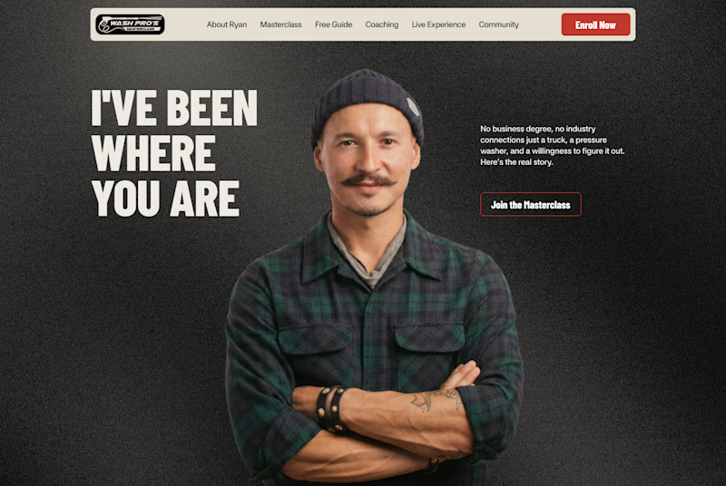
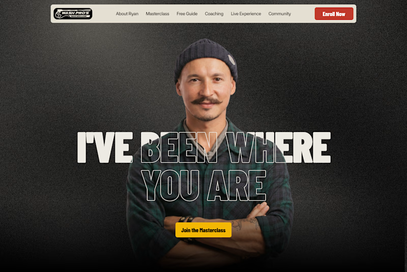
Which layout is better?
.
.
Curious which one wins? Follow along for more tests like this x.com/rightnextstep
20 voted
67%
10 voted
33%
30 votes
Closed
Hero 1 shows the hero text very well but you might need to work on the Hero CTA for "join the masterclass", I will probable miss it as a key action if I was a regular user