The network for creativity
Join 1.25M professional creatives like you
Connect with clients, get discovered, and run your business 100% commission-free
Creatives on Contra have earned over $150M and we are just getting started
Back to feedPost


Great Milestone, Congrats!
Thanks!

Congratulations @Anders Bragee
Thanks!

Congrats @Anders Bragee 🎉
Thanks!

Congratulations🎉
Thanks!

Congratulations!!

Congratulations @Anders Bragee 🎉

congrats @Anders Bragee

Congrats 👏

Congrats my bro!

congratulations!

Congrats @Anders Bragee 🔥

Congratulations!

congrats

🎉 🎉 🎉

Congo Anders! onto $100k this year?

Keep Growing 🤝💪🏻💪🏻

CONGRATSSSSSSSSSSSS🙌🙌

Congrats @Anders Bragee !


Silent progress, loud results. Well done anders


Congrats!


Congratulations 🎊

Congrats! 😃

congratulations Anders $100k is done already, any contra tips to land jobs here

Congratulations

Congratulations

What to go to tip to aquire clients or finding new one ,happy to know .Thank you

Well done, Anders, major milestone. And the fact that you're doing it silently its definitely a plus
The network for creativity
Join 1.25M professional creatives like you
Connect with clients, get discovered, and run your business 100% commission-free
Creatives on Contra have earned over $150M and we are just getting started







Related posts

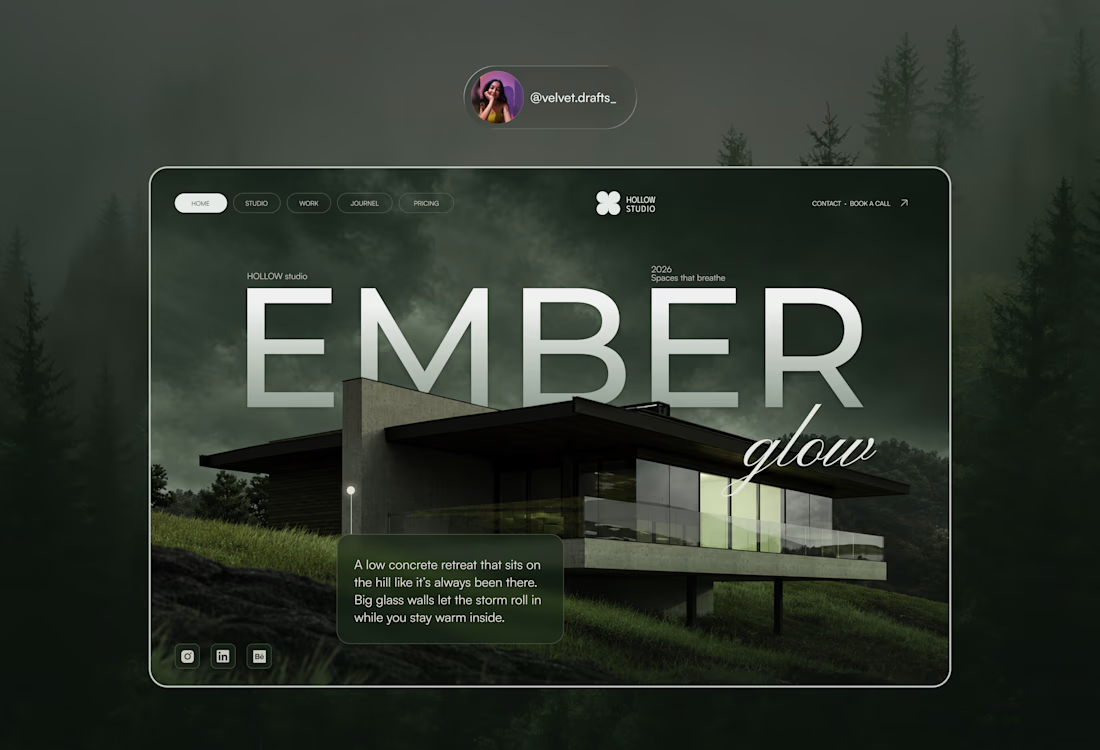
HOLLOW Studio: a moody hero section for an architecture studio. Big type, one cursive flex, a lot of fog. Open to feedback.



Looks great!👌

Congratulations @Dstudio Agency for this milestone.
But why I feel like Contra is not for accountants and bookkeepers? And it only support designers and creators?
Any suggestions for accounting people on contra? Or should we deactivate our accounts?😂


Hola Amigo 🫶

Huge congrats @Dstudio Agency on $25K! 🎉 So well deserved!
And I feel you on the accountant/bookkeeper part 😂 - Contra definitely feels more design/dev heavy. But I think finance folks can still kill it by packaging services like "Bookkeeping for Creators/Startups" or "Clean...

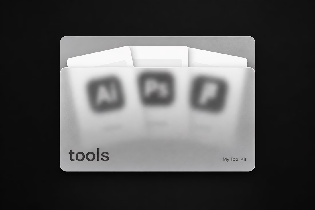
building a folder component for framer
hover → the cards inside slide out
frosted glass front so you get a peek before you open it
put your projects, tools, whatever in it. dropping this week 👀