The network for creativity
Join 1.25M professional creatives like you
Connect with clients, get discovered, and run your business 100% commission-free
Creatives on Contra have earned over $150M and we are just getting started
Back to feedPost

Good UI animation is not about making every element move.
It is about showing the viewer where to look first.
One clear action, one visual priority and enough time to understand what happened.
When everything moves at once, the interface becomes harder to follow.
The best motion usually feels almost invisible — it simply makes the product easier to understand.

Excellent !
Thanks!

Even the title card follows your rule: "Meet" stays grey and only "Aura" gets the warm colour. I see the same in presentations, one moving element per slide is about all a speaker can talk over.
Thanks!

Such a good point about motion.
Thanks!

Amazing work!
Thanks!

"Show the viewer where to look first" is the best definition of UI motion I've read. Saving this one.
Glad it resonated!

Excellent work
Thank you!

That single visual priority is the difference between helpful motion and a screen full of choreography.
Exactly!

Creative!
Thanks!

This matches what I see on small business websites too. One clear movement helps a visitor find the next step, and too much motion just hides it.
Exactly!

Enough time to understand what happened is such an underrated rule in motion design. How long do you usually pause on a screen so users can digest an action before the next transition triggers?
Usually 1–2 seconds.

The reduced-motion version is a useful test of this idea: if the state change becomes unclear without the animation, it may need a stronger label or visual cue too. Do you design that fallback alongside the motion, or after the main interaction is settled?
Alongside the motion.

lovely video
Thank you!

Couldn't agree more. Motion should guide attention, not compete for it.

Amazing!

This looks really cool, what software do you use?
The network for creativity
Join 1.25M professional creatives like you
Connect with clients, get discovered, and run your business 100% commission-free
Creatives on Contra have earned over $150M and we are just getting started



Related posts

AI Analytics Dashboard
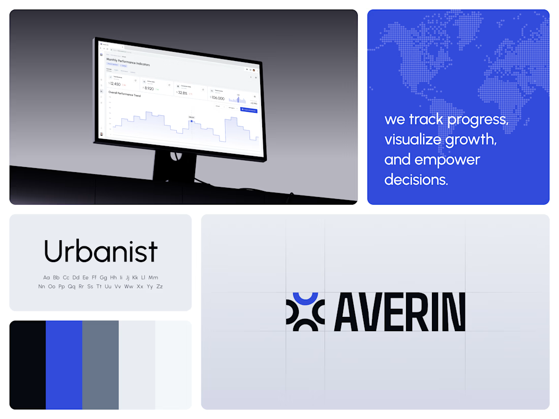
One blue runs from the logo to the chart line.
Revenue, active users, conversion rate and income sit in a row of cards above the trend chart. The cards answer where the numbers stand. The stepped line answers how they got there, holding each period's value until the next, with a tooltip on a dashed guide line for the exact figure.
The identity pairs a four-arc mark with a condensed wordmark, drawn to the same top and bottom lines on the construction grid. The top arc's blue comes back in the slogan tile, the chart line and the main button, so the brand and the product share one accent.
Designed by the Hue & Machine team.
#DashboardDesign #DataVisualization #SaaS #Analytics #AI #WebApp #BrandIdentity #UIDesign #ProductDesign #FigmaDesign




Really clean UI. That gradient card against the dark mockup scene looks sharp, makes a finance app feel a lot less boring.