The network for creativity
Join 1.25M professional creatives like you
Connect with clients, get discovered, and run your business 100% commission-free
Creatives on Contra have earned over $150M and we are just getting started
Back to feedPost

This motion design video presents a bold and modern brand identity showcase for Solflare, built around a strong yellow-and-black visual system. The animation highlights key brand assets including logo variations, iconography, typography, and product visuals in a clean, structured layout.
The use of high-contrast colors creates a powerful and energetic brand presence, while smooth transitions and refined motion effects bring the elements to life. The video demonstrates how the brand adapts across digital applications such as mobile interfaces, promotional graphics, and marketing materials.
With its minimal yet striking design approach, the presentation communicates innovation, reliability, and 24/7 accessibility. Overall, the motion piece effectively showcases a cohesive, contemporary brand system designed for impact and clarity.


Solid work, Kal!

Love it!

Super cool! Love the logo's type work

Wow
The network for creativity
Join 1.25M professional creatives like you
Connect with clients, get discovered, and run your business 100% commission-free
Creatives on Contra have earned over $150M and we are just getting started








Related posts

Exploring hero sections for Nation e-commerce
Loving the direction


Solid layout, Miguel! The contrast between the clean typography and those interactive bento-style cards is crisp. Building this layout with smooth CSS grid transitions or GSAP pin scrolling would make the UX feel incredibly interactive.

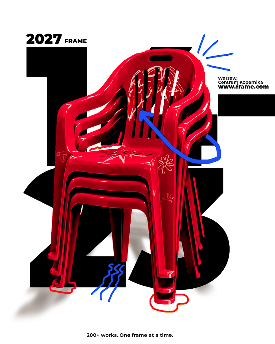
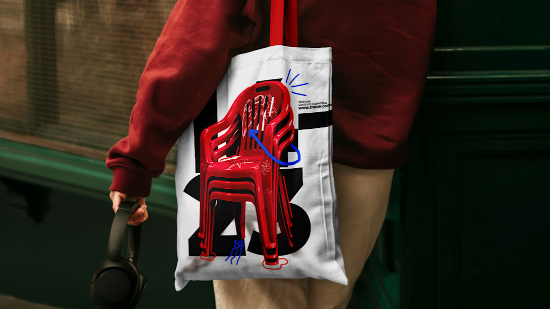
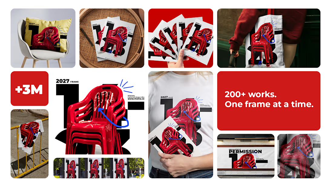
A frame is a decision about what matters 🖼️
Spent the past week designing FRAME, a brand identity and poster series for a design exhibition. Four posters, one system: a main exhibition visual, a talk, a workshop, and an open call for entries, each with its own composition and the same confident language underneath.
No sterile gallery minimalism, no chaos pretending to be creativity. Just type, color, and a lot of decisions about what goes inside the frame. 🖤
Sometimes the best proof a system works is that no two posters look the same.


I like the design and color palette🔥🔥

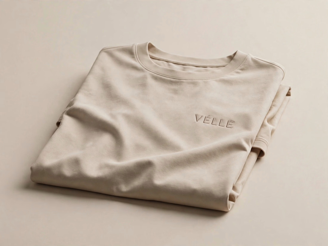
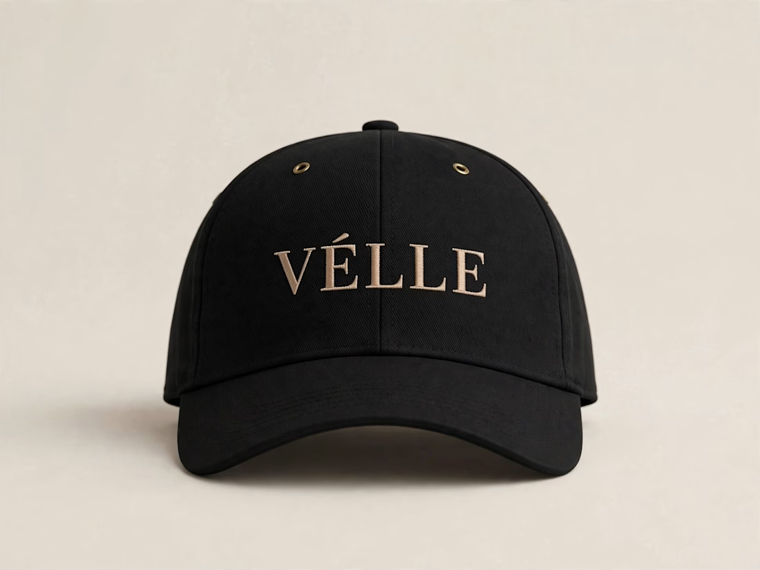
VÉLLE - Minimal Luxury Fashion Brand Identity
A conceptual fashion brand built on quiet luxury and timeless essentials.
What I did:
→ Logo Design (Primary + Secondary)
→ Brand Identity & Color System
→ Product Mockups (T-Shirt, Cap, Tote Bag)
Concept: Less is more. Clean serif typography with subtle accent for premium feel.
Palette: Beige #E8DDD0 / Black #0A0A0A
Full case study on Behance: behance.net/gallery/257321557
Open for freelance projects - DM for fashion branding.
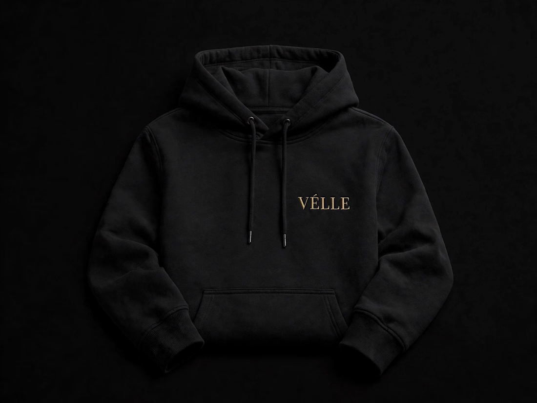
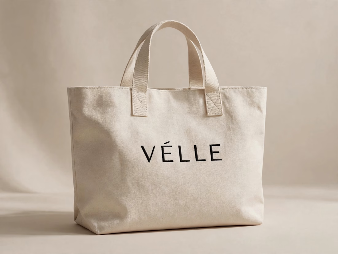

love the minimal direction on this. VÉLLE feels expensive but not loud, the tote and cap mockups are so good