The network for creativity
Join 1.25M professional creatives like you
Connect with clients, get discovered, and run your business 100% commission-free
Creatives on Contra have earned over $150M and we are just getting started
Back to feedPost


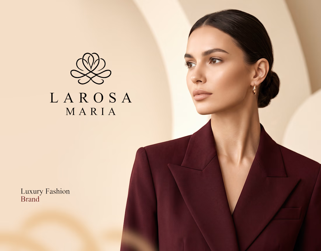
Luxury Fashion Brand Identity & Visual Design
Luxury is more than just a look — it's an experience, a statement, and an identity.
A strong luxury brand identity is built through timeless typography, sophisticated color palettes, elegant layouts, and carefully crafted visual elements. Every detail communicates exclusivity, elegance, and sophistication.
From minimalist logos to premium packaging and cohesive brand aesthetics, visual design transforms a fashion brand into an unforgettable experience.
Because true luxury isn't just seen — it's felt.
Designing elegance. Creating identity. Defining luxury.
#LuxuryBranding #FashionBrandIdentity #VisualIdentity #LuxuryFashion #BrandDesign #GraphicDesign #LuxuryAesthetic #CreativeDirection #BrandStrategy #MinimalistDesign #FashionBranding #VisualDesign
Check it out


The network for creativity
Join 1.25M professional creatives like you
Connect with clients, get discovered, and run your business 100% commission-free
Creatives on Contra have earned over $150M and we are just getting started





Related posts

What should a beekeeping website explain before asking someone to choose a hive?
For Bee Girl, I designed and built a complete Shopify website around a clear journey: meet the colony, understand what’s inside a nucleus hive, compare the options, and connect with the beekeeper.
Honey yellow, hive black, warm cream, and bold typography bring the same visual language across desktop and mobile layouts.
One design decision that ties it together: the page explains the colony and its five frames before introducing the hive-quantity choices. Education gives the product selection context.
I handled the complete website project for the client through Fiverr, using Shopify. This video walks through the homepage.
Which would you explore first—the hive options, field classes, or the beekeeper’s story?
Explore the full Bee Girl case study: https://contra.com/p/WqNFR67b-bee-girl-shopify-website-design-for-beekeeping
If you’re building a Shopify website for a specialist business, I’m available for website design and development projects.


I'd open the hive options first, but only because the colony section already told me what I'm buying. Explaining the five frames before the quantity choice is a smart order. Teaching before asking someone to choose is so underrated in Shopify stores.

For Ranch University, I designed and built a custom Kajabi website and course platform + community around ranch ownership and life on the land.
Earthy colors, ranch photography, and spacious layouts carry through the site, membership pages, and course presentation. I also handled the course structure and offer setup behind the scenes.


Velocert Brand Identity
Hey everyone! Just shared a new brand identity project and wanted to show the process here.
It started with a quick pen sketch. The V of Velocert was already a checkmark, and I circled “cert” like an approval seal. I kept that idea and turned it into one mark: speed lines, a checkmark and the ECE E-Mark ring. Speed and certification in a single symbol.
Velocert helps carmakers get their vehicles approved for the road, so the brand had to feel fast and trustworthy at the same time. I built the full system from that one sketch.
Check it out the full case study on my profile

Looks amazing

