The network for creativity
Join 1.25M professional creatives like you
Connect with clients, get discovered, and run your business 100% commission-free
Creatives on Contra have earned over $150M and we are just getting started
Back to feedPost

How do you design a contemporary logo for something so deeply connected to tradition?
That was the main question behind my logo design for Opern.news.
Opera comes with centuries of history, recognizable architecture, and a very strong cultural identity. But Opern.news is a digital platform, a place for current stories, information, and communication.
I wanted to find a simple visual idea that could connect those two worlds.
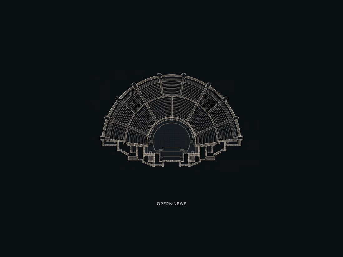
The answer came from looking down at the architecture of theaters and amphitheaters. The stage and surrounding rows of seats gradually became a minimal geometric symbol.
And then I noticed a second meaning in the same form: the lines also felt like broadcast waves, representing news, communication, and the flow of information. One symbol, two readings: opera + news.
Opera and communication. Tradition and the present.
The full logo design project is now on Behance.
#logodesign #logodesigner #opera #designprocess #visualIdentity #brandidentity


The network for creativity
Join 1.25M professional creatives like you
Connect with clients, get discovered, and run your business 100% commission-free
Creatives on Contra have earned over $150M and we are just getting started





Related posts

Cleann🔥

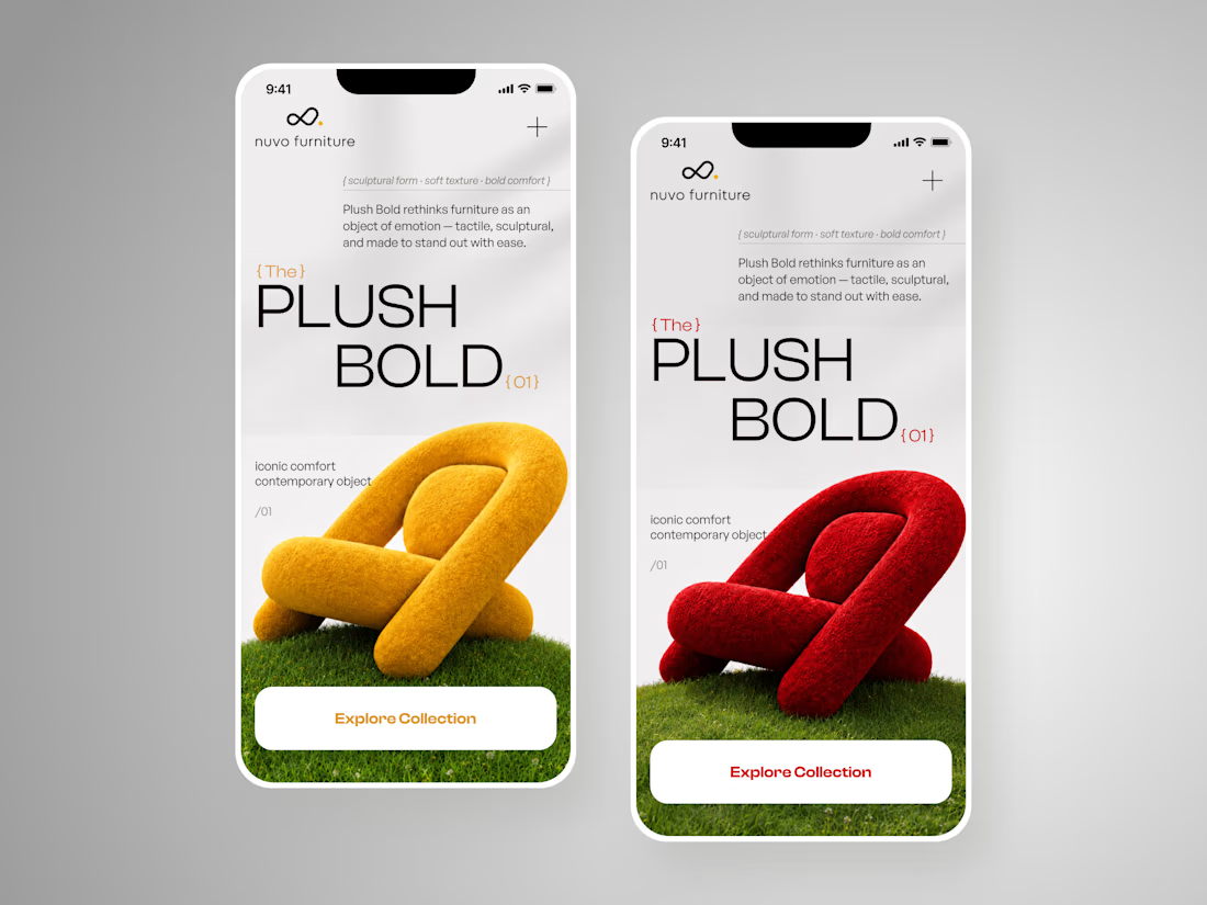
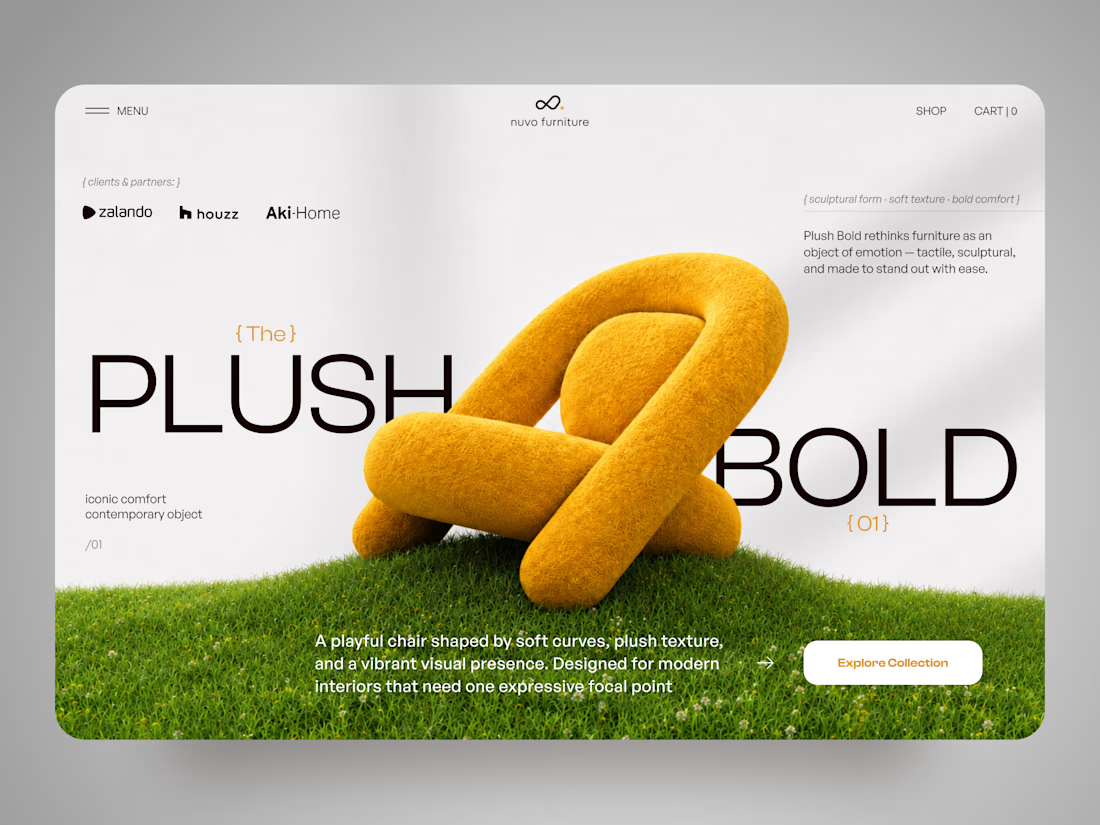
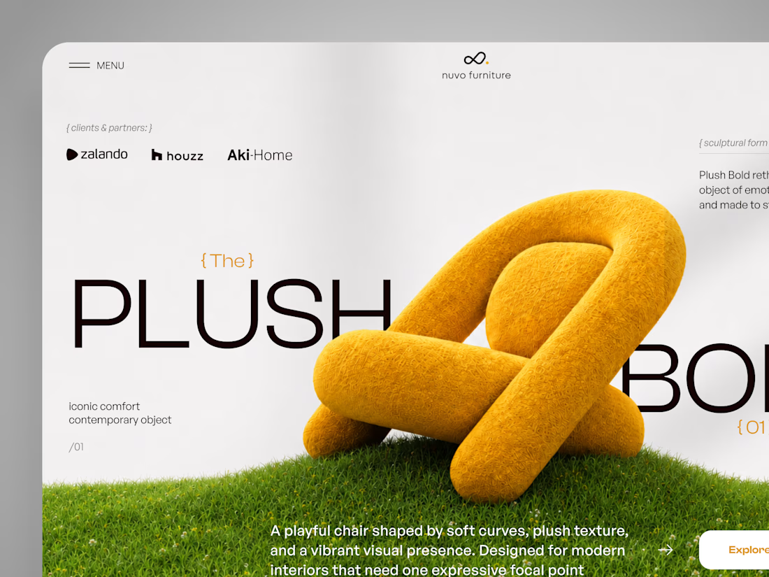
NUVO Furniture — Sculptural Furniture E-commerce Concept 🪑✨
NUVO is a contemporary furniture website concept built around one idea: let the product become the experience.
At the center of the concept is Plush Bold — an expressive statement chair designed to feel more like a...

A jewelry brand shouldn't feel special only when the box is opened. For Mivessa, the goal was to build that feeling from the very first touchpoint.
The M monogram became the visual signature of the brand simple enough to remember, distinctive enough to own. Then we carried that identity into the full experience:
→ Jewelry boxes
→ Velvet pouches
→ Ribbons
→ Wrapping materials
→ Gift cards
→ Brand stationery
Deep green creates a rich, premium foundation. Gold adds warmth and elegance. And the consistent use of the identity turns separate materials into one recognizable brand experience. Because premium branding isn't only about how the jewelry looks. It's also about how the brand feels before, during, and after the purchase.
🏀 Full Design Showcase – Better View on Dribbble.
Premium Jewelry Brand Identity, Packaging & Brand Materials


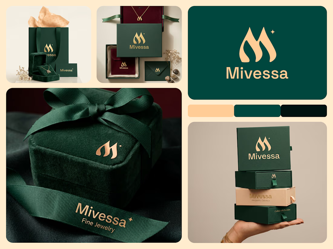

The monogram, packaging, and overall visual language feel premium.

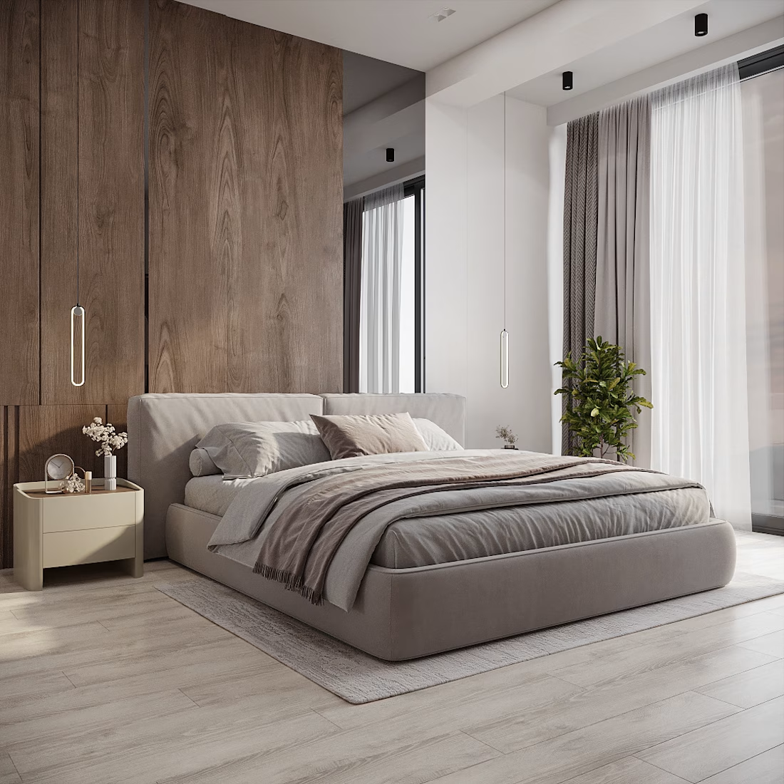
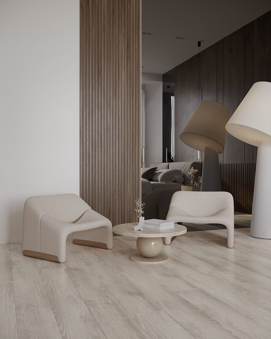
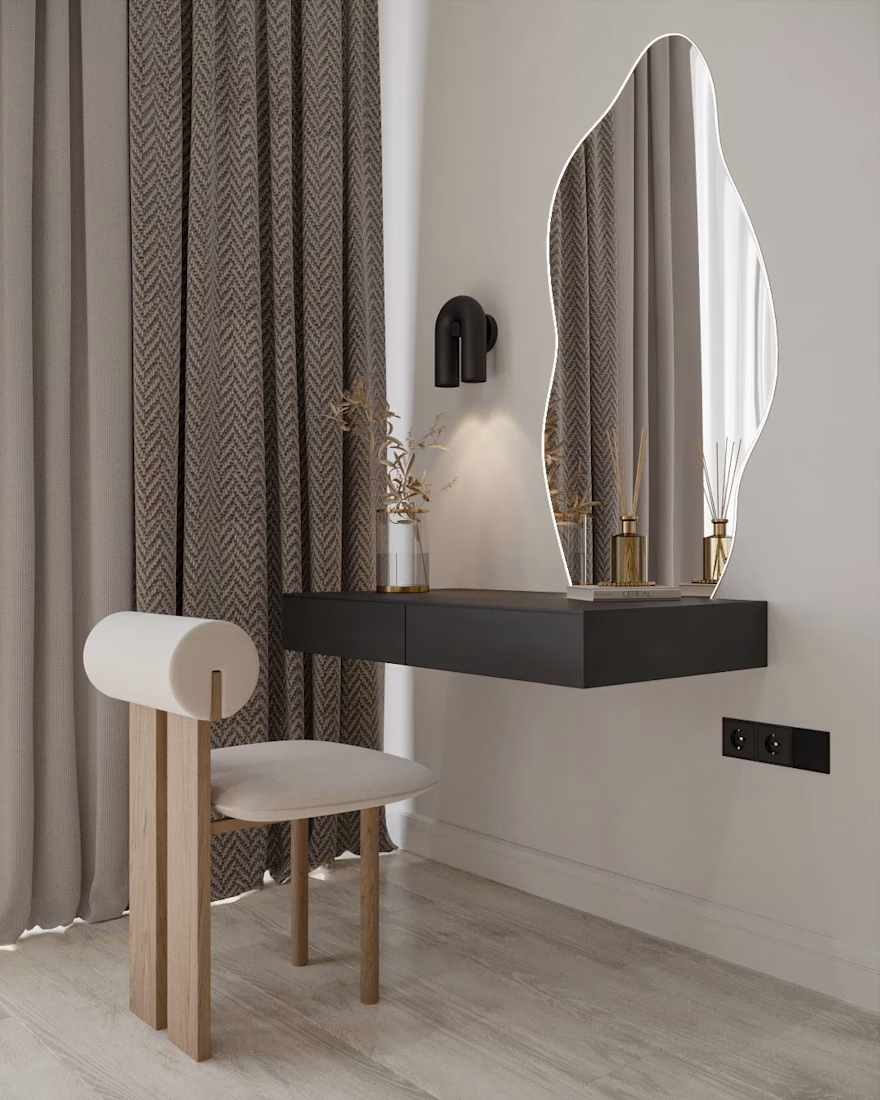
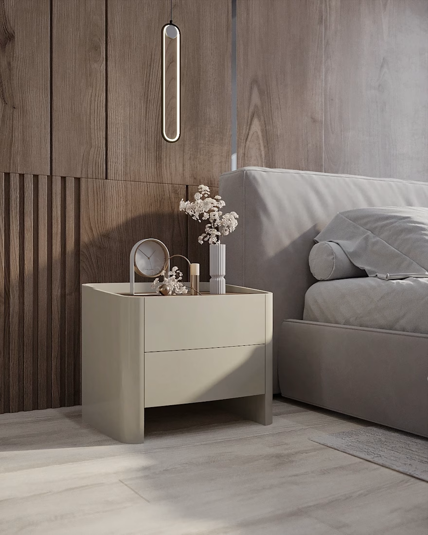
Sunny & Cozy Apartment
An apartment in Canada
Location: Toronto, Canada
Date: 2026
The main goal:
To create a minimalistic and comfortable home that feels warm, inviting, and cozy from the very first moment.
#InteriorDesign #LivingRoomDesign #ArchitecturalVisualization #3DRendering #ResidentialDesign
Adobe PhotoshopAutodesk 3ds MaxChaos Corona3D ModelingInterior Design Architecture & Interior Design