The network for creativity
Join 1.25M professional creatives like you
Connect with clients, get discovered, and run your business 100% commission-free
Creatives on Contra have earned over $150M and we are just getting started
Back to feedPost

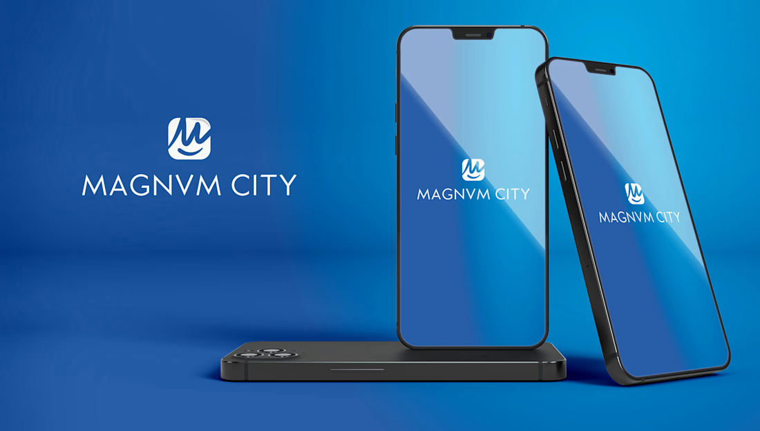
MAGNVM CITY — Tech & Mobile App Brand Identity System
MAGNVM CITY is a modern technology and mobile application initiative requiring a sharp, memorable visual identity. The project aimed to deliver a high-precision brand design capable of positioning the app as a sleek, top-tier digital ecosystem.
The Challenge
In the competitive app and tech market, a brand identity must instantly capture attention on small screens while maintaining authority and versatility across high-resolution displays, app stores, and marketing channels.
The Solution & Art Direction
As Senior Art Director, I crafted an emblem-driven visual system built for digital versatility:
Emblem Logotype & Iconography: Engineered a minimalist, high-precision emblem symbol that functions seamlessly as an app icon, favicon, and brand signature.
App & Tech Visual Hierarchy: Developed a clean typographic structure and high-contrast palette optimized for mobile UI interfaces and digital dark/light modes.
Scalable Brand System: Established clear art direction guidelines to ensure complete brand cohesion across software environments, marketing collateral, and digital touchpoints.


The network for creativity
Join 1.25M professional creatives like you
Connect with clients, get discovered, and run your business 100% commission-free
Creatives on Contra have earned over $150M and we are just getting started



Related posts

Brand work for HauntChain
I'm loving building this brand and the results so far
A deFi platform with some gamification


That's cute ❤️


Is text on album covers really tacky?
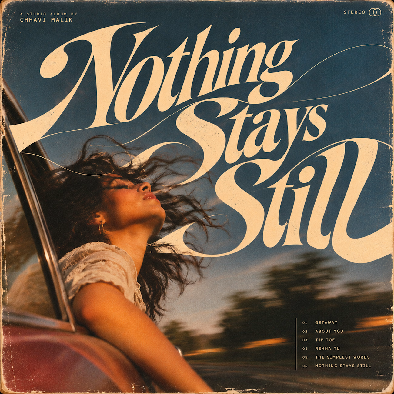
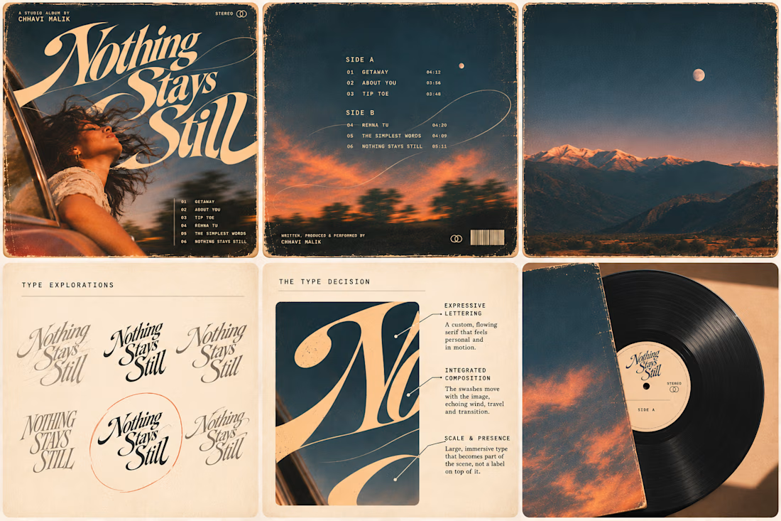
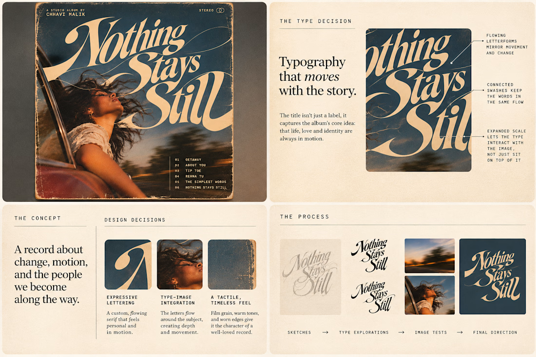
This question has been doing the rounds on X and I have to say, I'm firmly on the other side of that argument. I've always loved seeing typography become part of the artwork rather than just a title sitting on top of it.
So I wanted to put that idea to the test with an imagined album called Nothing Stays Still, inspired by change, fleeting moments and everything in between:)
I played around with the lettering until it felt expressive, a little restless, and inseparable from the photograph.
Because I think badly considered typography is tacky. Typography itself? Give it a chance :)
What's an album cover where the type really makes it for you?


I fixed a logo in 10 minutes.
A client sent me an MS logo that looked cheap.
Problem: letters were too far apart, no overlap, wrong gold.
Fix: Interlocked the M + S, tightened the spacing, used metallic gold #D4AF37.
Same letters. Luxury feel.
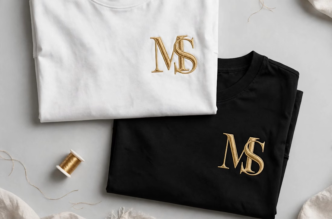

Interlocking the M and S also gives the embroidery one continuous shape to stitch, which tends to hold up better than two separate letters. Did you test how the overlap reads at chest-logo size, around 3 cm?