The network for creativity
Join 1.25M professional creatives like you
Connect with clients, get discovered, and run your business 100% commission-free
Creatives on Contra have earned over $150M and we are just getting started
Back to feedPost

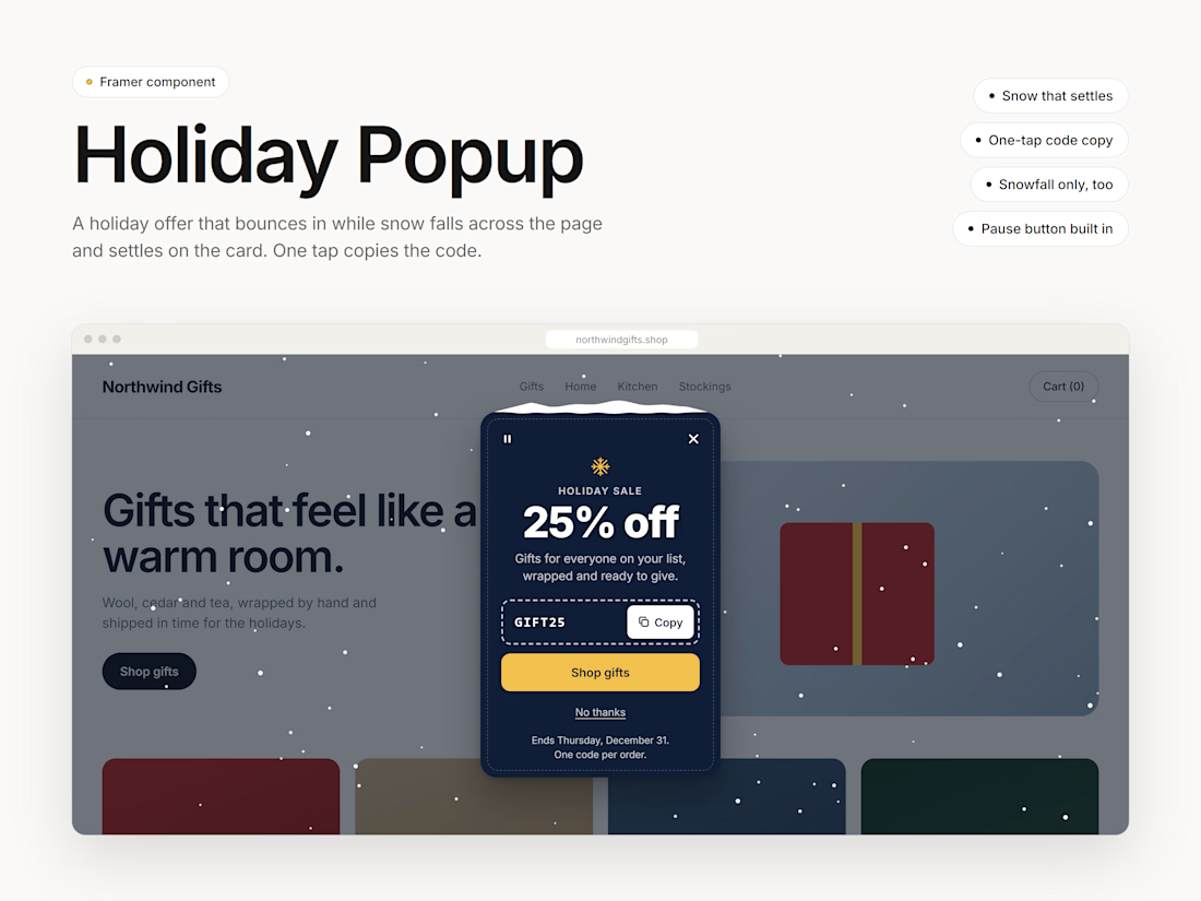
Your holiday offer on a card that bounces in while snow falls across the page and settles on top of it. Visitors copy the coupon code in one tap, and after they close it, a small gift button brings it back. Everything is a setting in the properties panel. No code needed. $10.


The network for creativity
Join 1.25M professional creatives like you
Connect with clients, get discovered, and run your business 100% commission-free
Creatives on Contra have earned over $150M and we are just getting started





Related posts

How do you make a construction brand feel consistent from a business card to a building site?
Brixon’s identity brings angular lettering, an assembled geometric symbol, and a lime, black, and white palette together.
I carried those elements into stationery, brand guidelines, team identification, social graphics, and site signage, then brought the system into motion with Adobe After Effects.
The connecting decision: keep the geometry and layout structure consistent while the logo details, messages, and application previews change within the animated panels.
My contribution covered brand design, graphic design, and motion design.
What draws your attention first: the wordmark, the lime palette, or the rotating symbol?
See the full Brixon case study. If you’re shaping a construction or development brand, I’m available for brand identity and motion projects.

Incomparable work!


Niceee

Landing page design for Matterlane, an AI tool for law firms.
Matterlane’s agents turn client files into a brief, draft using the firm’s precedents, and flag what needs a lawyer’s decision. The whole matter moves forward in one place.


Great work! I appreciate how clearly the design prioritizes usability without compromising its visual appeal.

