The network for creativity
Join 1.25M professional creatives like you
Connect with clients, get discovered, and run your business 100% commission-free
Creatives on Contra have earned over $150M and we are just getting started
Back to feedPost
Taste Test


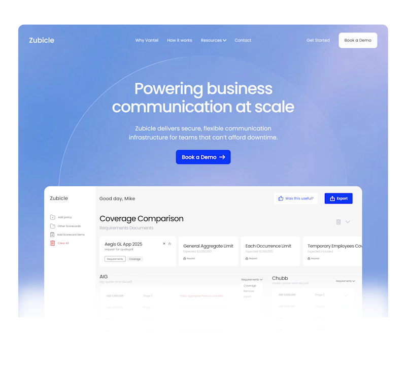
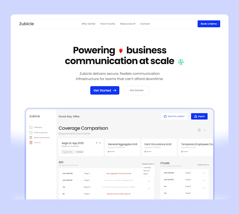

team A......

Thank youuu


This is A for me, idk what emotion it is but A makes me feel something vs B where my mind goes "oh ok another saas website"
Thank you for the feedback 🙏🏼


I feel more confortable using A
Thank you for the feedback

A definitely convert more
Thank you for the feedback

Love the A version
Thank you for the feedback

A for me

Team A ✔

option A, it looks too smooth

Hard to choose. Visually, I'd probably choose option A. However, it can be harder to read (color contrast between the white and light blue). So, from an accessibility perspective I'd go with B. But, as others said, A has a more wow effect.

the subtle round faded cicrlce and glow on A works for me better, more unique and refreshing
I love that you noticed that. Thank youu

Team A

I liked how UI is more prominent in the left one, both great though 👍

A for me


Team AAA

Both look great, but Team B feels a bit more polished and readable.


I think A gives a bit more of an organic feel to it. In this industry a lot of projects can get a cold robotic and corporate feel to them, which is fine in moderation, but sometimes a bit of personality within a concept can go a long way. Either way both look really good!
Thank youuuu

I’d go Team A. The gradient creates a clearer hierarchy and pulls focus to the headline first, then the product. Team B feels a bit more “dashboard heavy” for a hero
Thank you for the feedback 🙏🏼

right


Team A
Feels more welcoming

Love the A

Its the A for me

Team B: The first attention goes to the headline, followed by the button after the dashboard image. This feels like a better flow for highlighting the message we want users to notice.
Team A: Overall, the design and flow are good, but attention goes first to the button, followed...


Team A any day.
Very nice separation and contrast. Speaks more to businesses.
Option B is clean, yes.. but feels too clean.. as in it gives a vibe coded site feel. That's kind of websites that dont get much trust from investors or potential users. 🙌
Great exploration!

color really makes sense. I think white minimalist saas websites era is over

A For me..!!

Team B

Team A

'A' def makes me feel more emotionally invested.
I can't even explain what I feel, buh it definitely hooks me😂
The network for creativity
Join 1.25M professional creatives like you
Connect with clients, get discovered, and run your business 100% commission-free
Creatives on Contra have earned over $150M and we are just getting started





