pro
Asma Hashim Khan
Designing & Developing High-Converting Websites
Ready for work
Asma Hashim is ready for their next project!
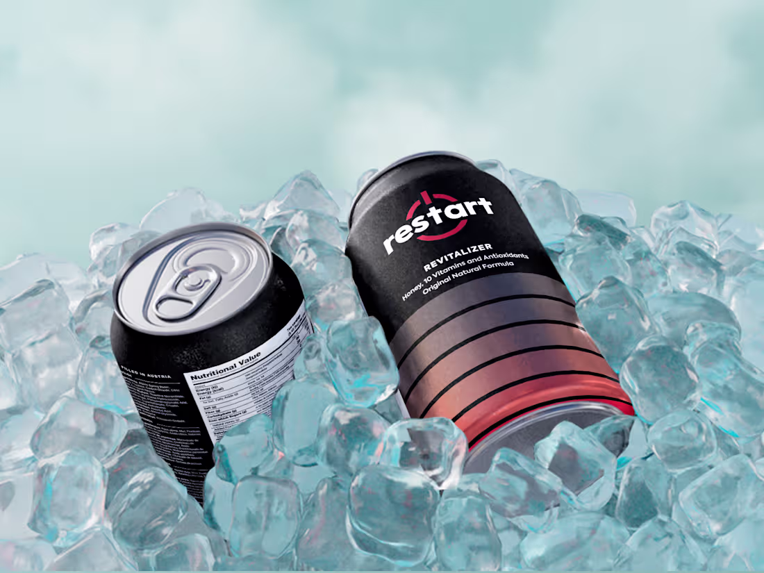
Created a high-impact 3D product render designed to highlight the product's premium feel and refreshing nature. The icy environment helps reinforce the cold, energizing experience while keeping the focus on the packaging design.
1
35
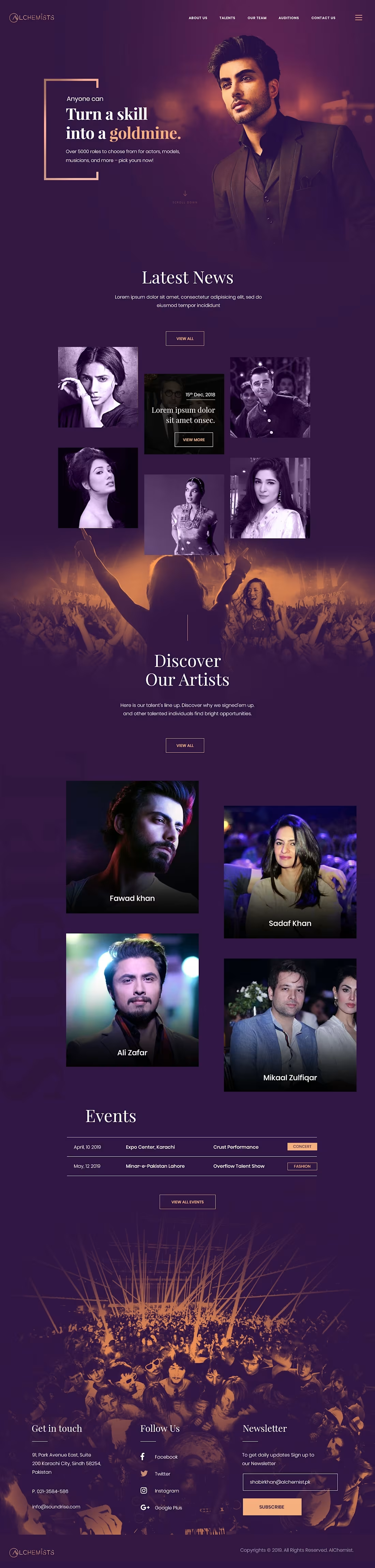
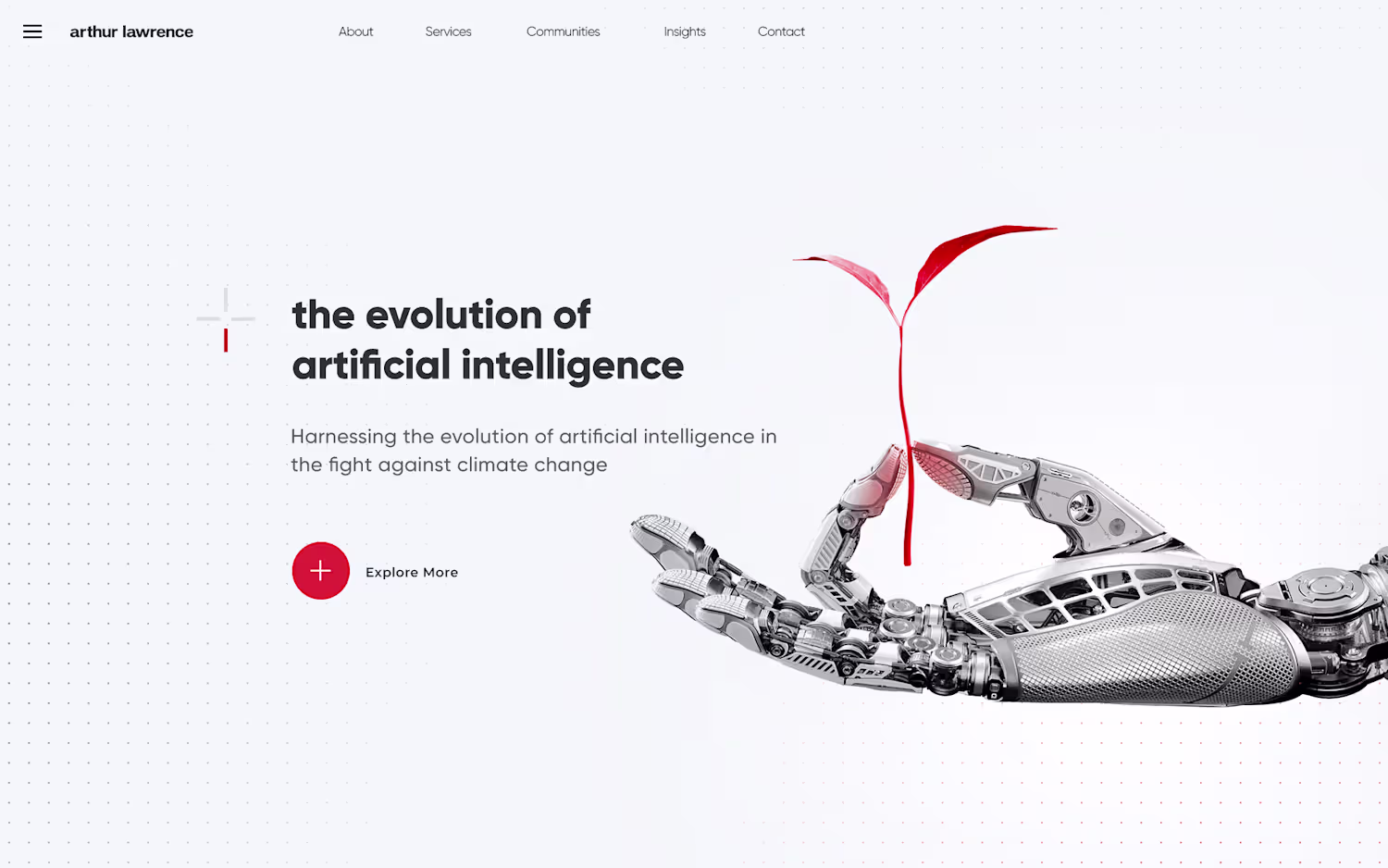
Turning talent into opportunity ✨
A bold, cinematic website concept for a modern talent agency, where every skill has the potential to become a goldmine.
Clean UI. Strong visuals. Luxury feel.
Would love your thoughts.
0
68
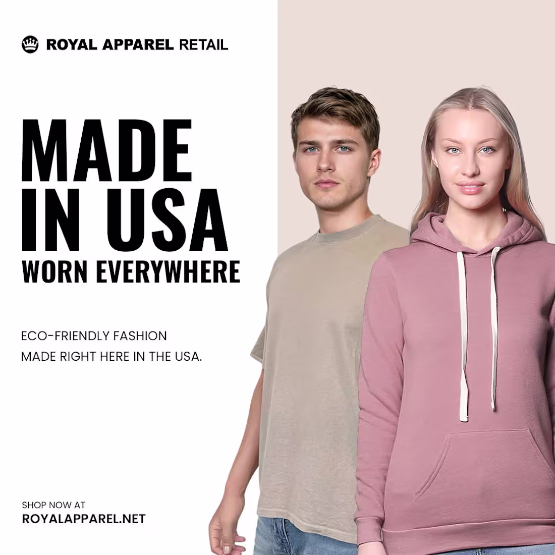
Crafted a modern fashion ad creative focused on minimal elegance and strong visual hierarchy.
Soft pastel tones paired with bold typography create a premium lifestyle feel while keeping the focus on the product.
Designed to work perfectly for social media ads, fashion campaigns, and brand promotions.
0
106
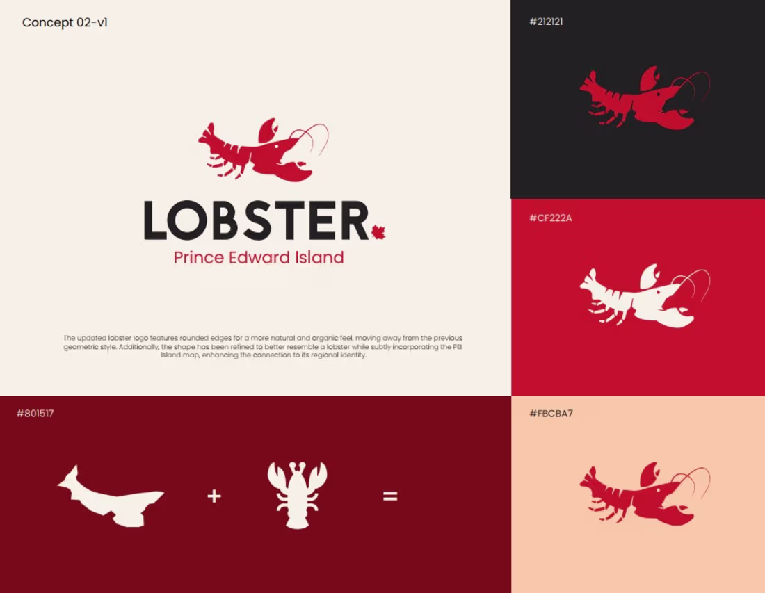
For this project, I explored two logo directions focused on identity and origin.
Concept 01 blends the lobster form with the Canadian maple leaf, highlighting national pride and premium quality.
Concept 02 integrates the shape of Prince Edward Island into the lobster, creating a strong connection between the product and its regional roots.
The color palette reflects freshness, heritage, and coastal warmth while keeping the brand modern and scalable across packaging and digital platforms.
A minimal logo with a meaningful story behind it.
2
177
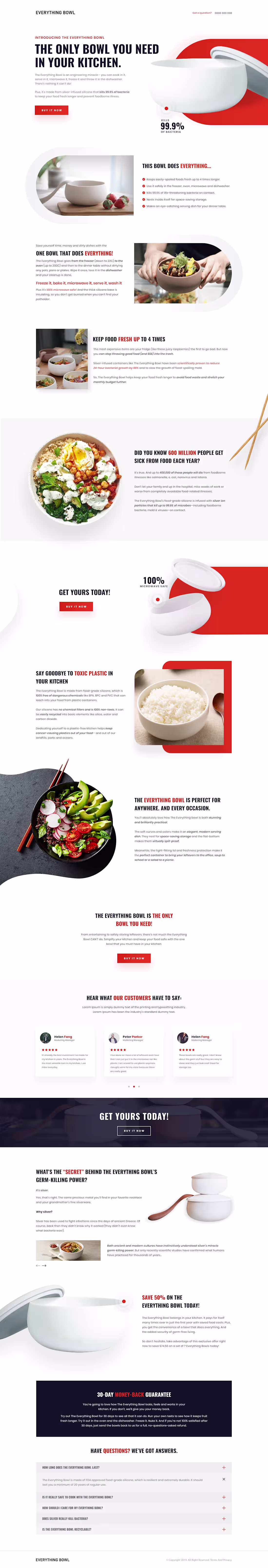
Some products don’t need noise, they need clarity.
This project explores how a simple kitchen object can feel intelligent, trustworthy and essential through design alone. The identity is built on clean geometry and confidence, while the website guides users through a calm, persuasive journey from curiosity to decision.
Every section answers a question:
What is it?
Why does it matter?
Can I trust it?
Should I get it now?
A minimal system. A focused message. A seamless user path.
0
154
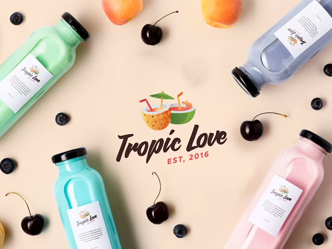
I designed the complete brand identity for Tropic Love, starting from the logo, moving into packaging design, and finally presenting it as a social media visual to show how the brand comes to life.
The idea was to create a fresh, vibrant feel that reflects a modern beverage brand. This project shows my end-to-end design process, from concept to a market ready brand presentation.
2
3
229
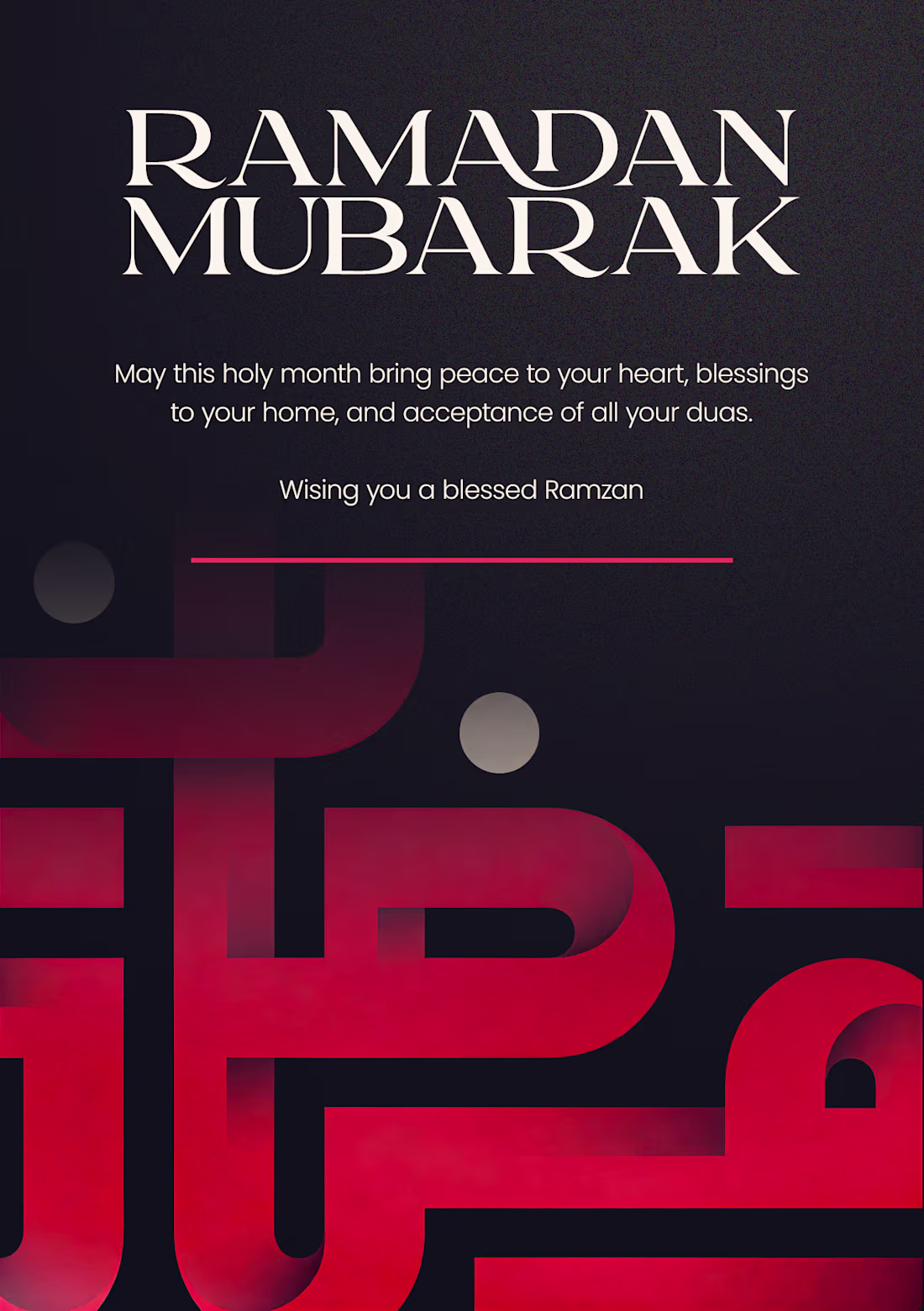
Wishing you a blessed Ramadan filled with peace, forgiveness, and joy.🌙
0
170
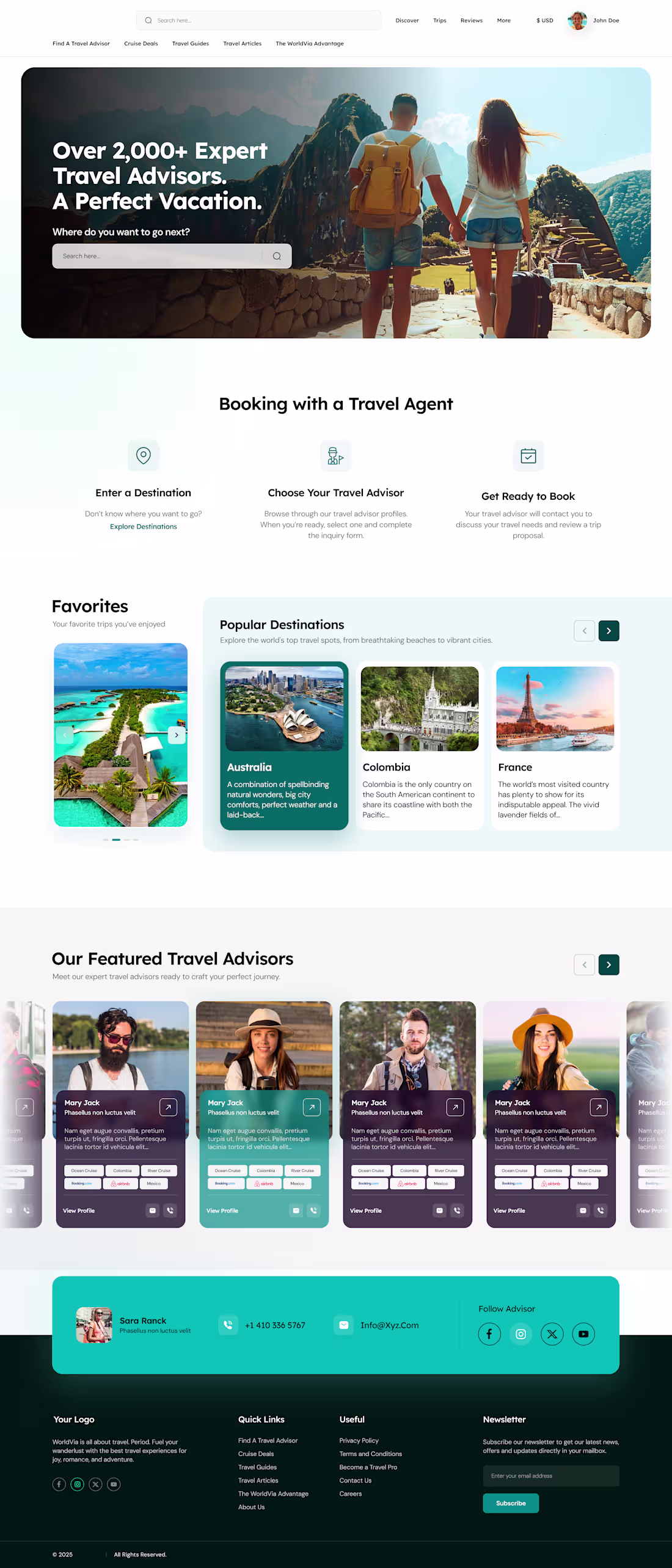
I designed this landing page for a client who needed a modern, engaging travel website to showcase destinations and connect users with expert travel advisors. The primary requirement was to create a high-impact first impression while keeping the user journey simple and conversion-focused.
The client wanted a design that feels inspiring, trustworthy, and easy to navigate, encouraging users to explore destinations and take the next step toward booking their trip.
1
194
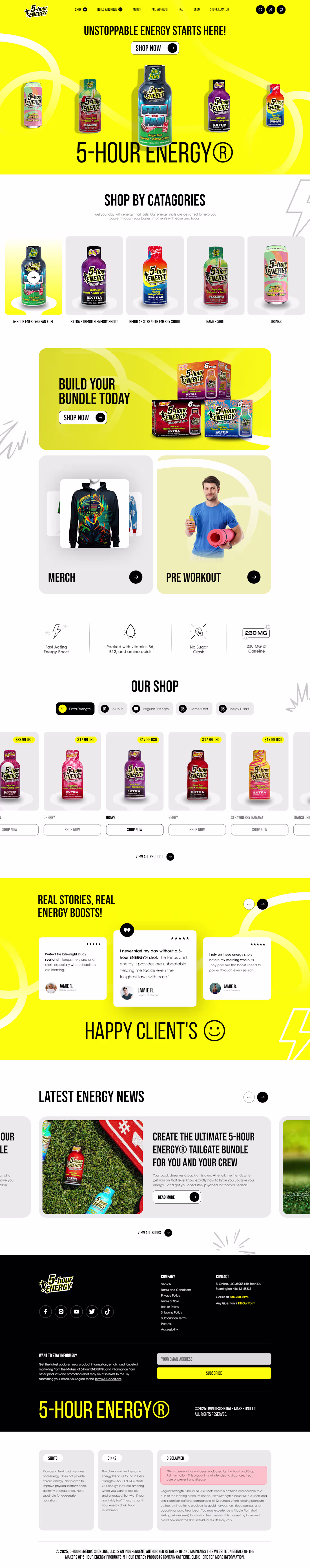
Excited to share that I’ve completed the website design I previously posted about .
This project was all about creating a bold, high energy, and conversion focused UI while keeping the user experience smooth and engaging.
Grateful for the trust of my client and proud of how this turned out.
Feedback is always welcome! 😊
1
184
Hi everyone ✨
Sharing one of my recent projects with one of my amazing female client . This is the logo we created for Bella Blue , a brand built around community and cause. I truly enjoyed translating her vision into something meaningful and timeless. Grateful for the trust and the opportunity to create together 🤍
0
168
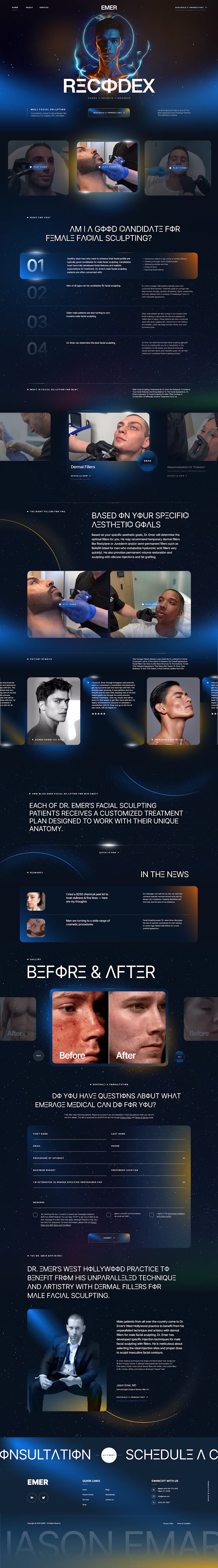
I designed this website concept for EMER, a brand focused on male facial sculpting and aesthetic treatments. The goal was to create something that feels modern, confident, and trustworthy while still looking premium. I used a dark color palette with subtle glow effects, strong visuals, and clean layouts to guide users through the treatments, process, and results. The overall design is meant to feel immersive and easy to navigate, helping visitors understand the service and build confidence in the brand.
1
183
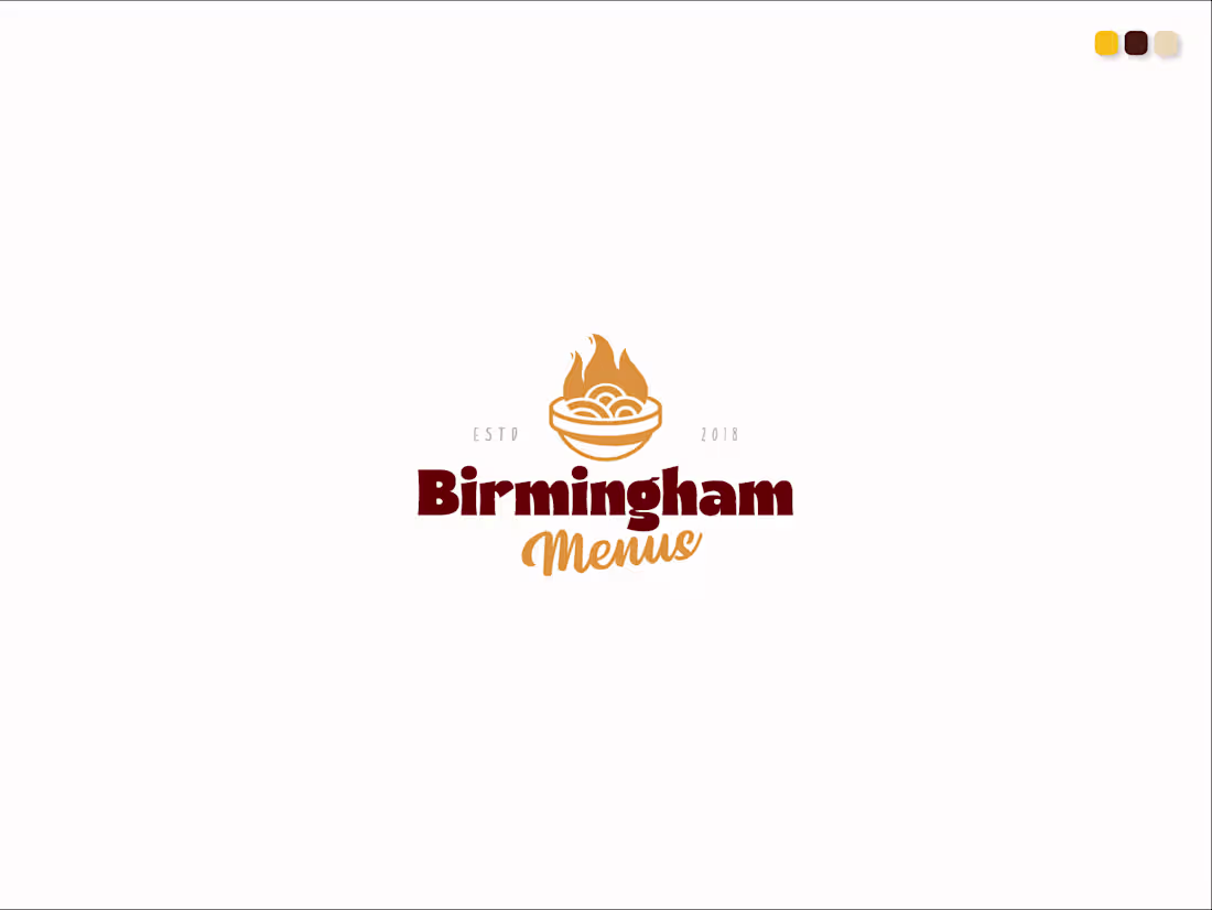
This logo was designed for a chef based client, Birmingham Menus. The bowl with rising flames represents freshly prepared, hot, and flavorful food, highlighting the chef’s passion for cooking. The warm orange and brown color palette reflects heat, taste, and comfort, key elements of great cuisine. The clean typography ensures the brand feels modern and trustworthy, while the “ESTD 2018” detail adds authenticity and establishes the brand’s experience in the food industry.
1
171
I’m currently working on my new website
So far, I’ve completed the banner section, and now I’m moving on to building the other sections. Step by step, everything is coming together, and I’m excited to shape this project into something meaningful. Stay tuned for more updates as the design and structure continue to evolve.
1
154
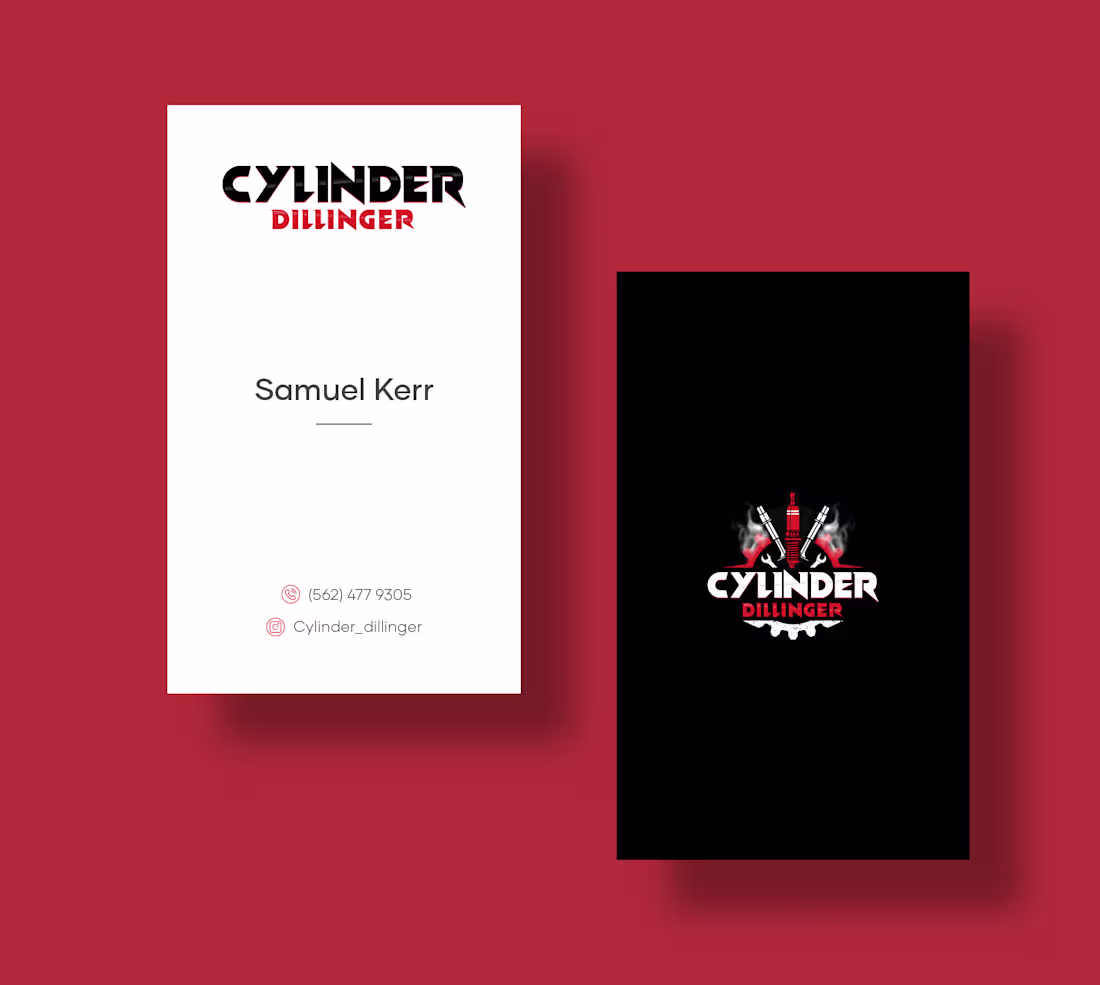
I designed this business card for Cylinder Dillinger to capture a tough, automotive vibe. I went with a high-contrast red, white, and black color scheme because it feels energetic and fits the industry perfectly.
I kept the front side clean and white so the contact info is super easy to read. For the back, I flipped the script with a solid black background, this makes the custom piston and wrench logo really pop. The goal was to create something that looks gritty and industrial, but still professional.
0
144