The network for creativity
Join 1.25M professional creatives like you
Connect with clients, get discovered, and run your business 100% commission-free
Creatives on Contra have earned over $150M and we are just getting started
Back to feedPost

Designing for Trust: A Minimal Mobile Wallet Concept Prototype 💸

The network for creativity
Join 1.25M professional creatives like you
Connect with clients, get discovered, and run your business 100% commission-free
Creatives on Contra have earned over $150M and we are just getting started





Related posts

Design Agency Website
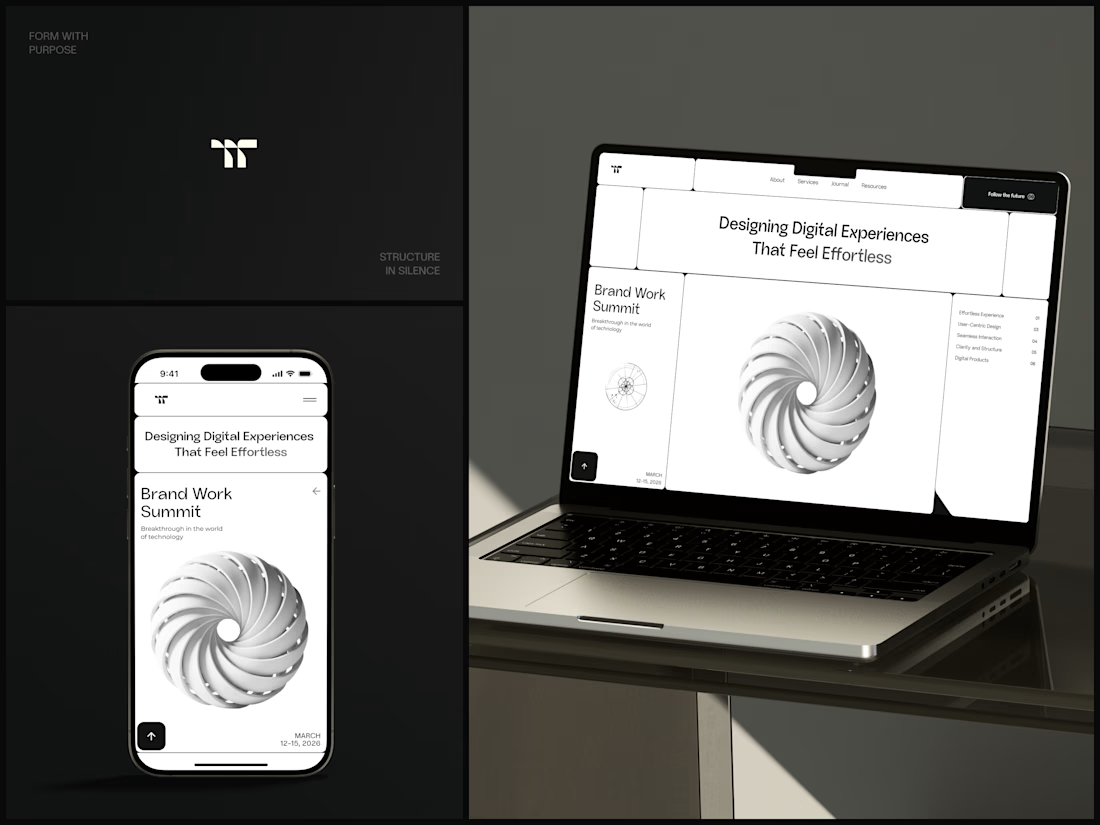
Only one cell on this homepage is black.
The rest of the page is a grid of rounded white cells: the headline, an event card, a white 3D spiral and a list of services. The black one, top right, holds the "Follow the future" button and stands out against all that white.
On the phone, the cells stack into a single column. The navigation folds into a menu icon, and the event card and spiral merge into one cell.
The headline reads "Designing Digital Experiences That Feel Effortless", so the grid has to look organized before anyone reads a word.
Designed by the Hue & Machine team.
#DesignAgency #WebDesign #AgencyWebsite #LandingPage #BentoGrid #MinimalDesign #UIDesign #ResponsiveDesign #MobileDesign #FigmaDesign



Looks cool

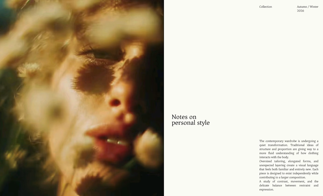
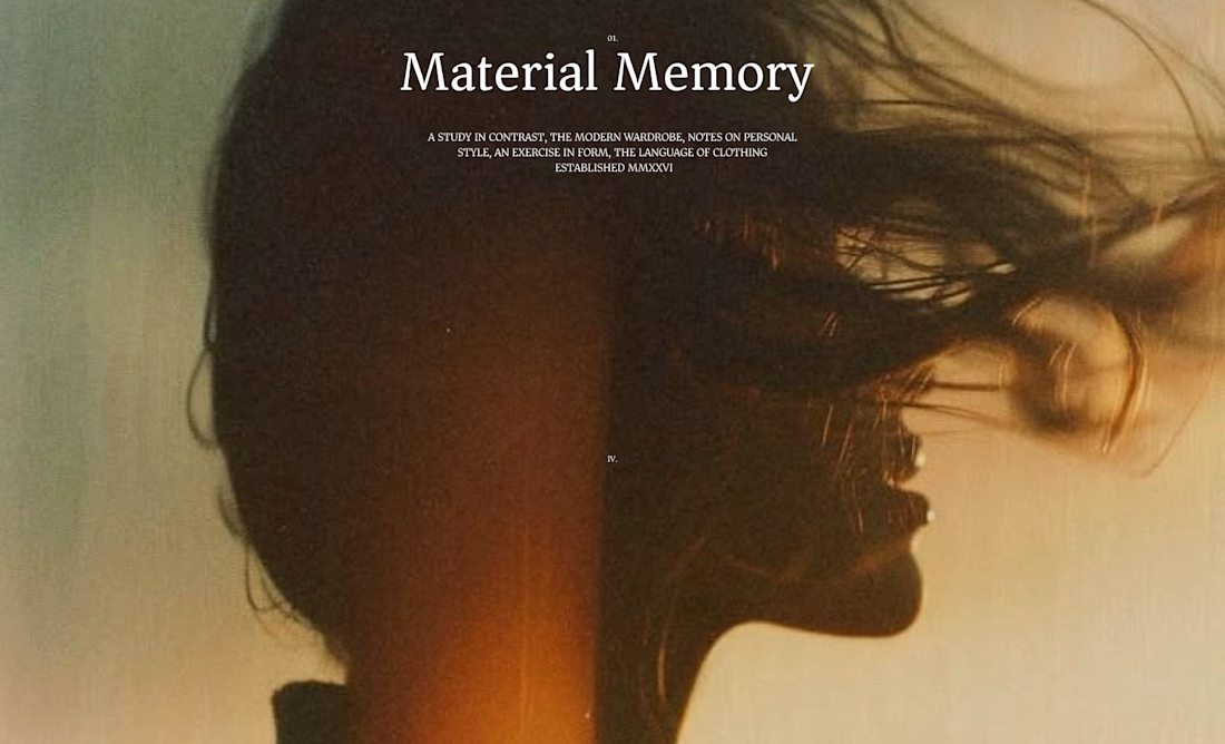
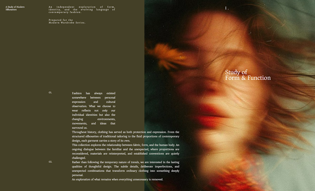
I designed these editorial-inspired layouts as part of an exploration for a fictional photography and fashion magazine
↳ Master typography & layout - The foundation of timeless web design. Join 350+ designers inside my 13-hour online course https://typomonday.com/course
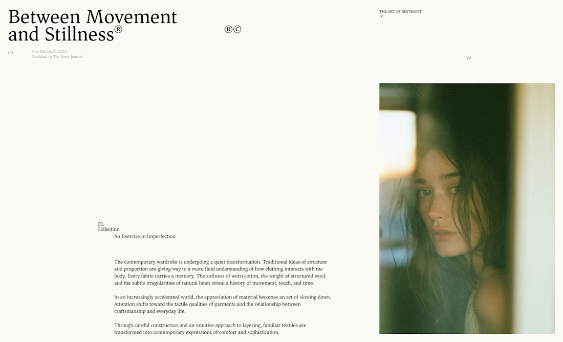

Really nice exploration 👍

New project! Me and @Mary Delaney helped out the folks at Balloon with a rebranding a redesign of their mascot! Check out the new appstore listing and stay tuned for much more!
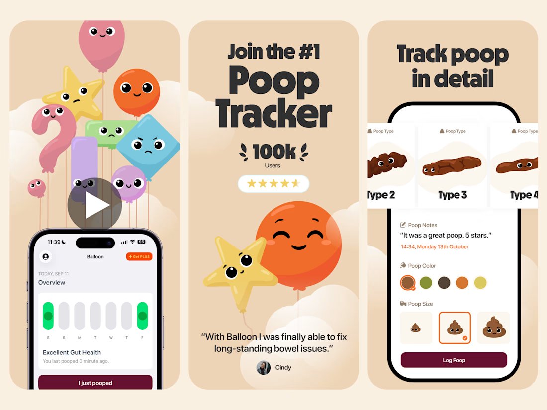

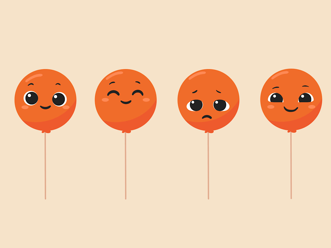

Everything has character! Good job. I like the little faces on the terds 🤣