The network for creativity
Join 1.25M professional creatives like you
Connect with clients, get discovered, and run your business 100% commission-free
Creatives on Contra have earned over $150M and we are just getting started
Back to feedPost


The network for creativity
Join 1.25M professional creatives like you
Connect with clients, get discovered, and run your business 100% commission-free
Creatives on Contra have earned over $150M and we are just getting started







Related posts


Design Sprint: ESCO Token
How do you build a brand for a business most people can't explain?
ESCO Token is built to become the standard behind Europe's Digital Product Passport: the system that will track what a product is made of, where it came from and where it goes next. Necessary, regulated, and completely abstract for most people.
One sprint. Zero to an identity that works:
- Micro-design style: restraint over noise, shaped by European design discipline.
- Wordmark and symbol built to hold up anywhere.
- Full brand identity.
- Landing page ready for the go-to-market.
When a business is hard to explain, the brand has to do the talking.
Teaser below.


Wonderful craftsmanship! 🎯


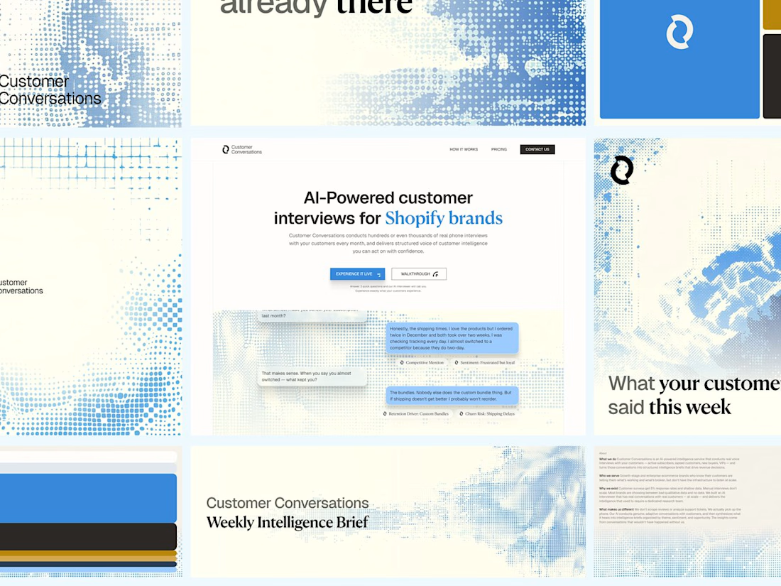
Customer Conversations is an AI that calls a store's customers and interviews them. Explaining that took half of every sales call.
Three weeks after Bryan Starck brought it to us, it had a brand and a homepage built to do the explaining. Answer three questions and the AI calls you for a real interview in 60 seconds.

Nice design

Rhyen Lab: Brand Identity & Packaging for a Skincare Brand
Rhyen Lab is a skincare brand built around science-backed formulas and a sensorial, human approach to beauty. The challenge was to create an identity that feels clinical enough to be trusted, yet warm and expressive enough to stand out in a crowded market.
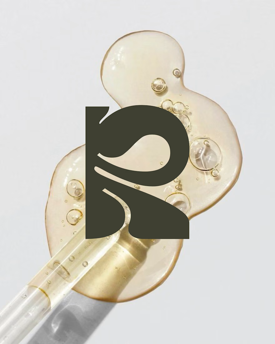
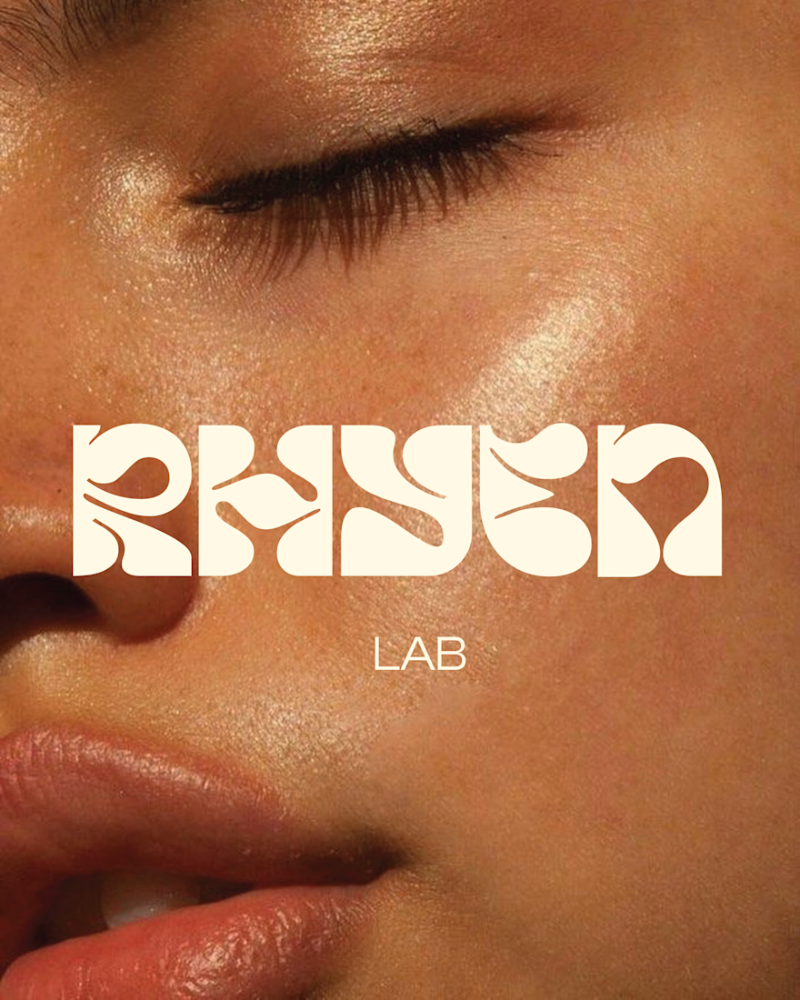
I designed a custom wordmark with fluid, organic letterforms that echo the texture of serums and oils, paired with a bold monogram “R” for compact applications. A palette of deep olive green and soft cream keeps the brand grounded, natural and premium, while macro photography of skin and product textures reinforces the sensorial tone.
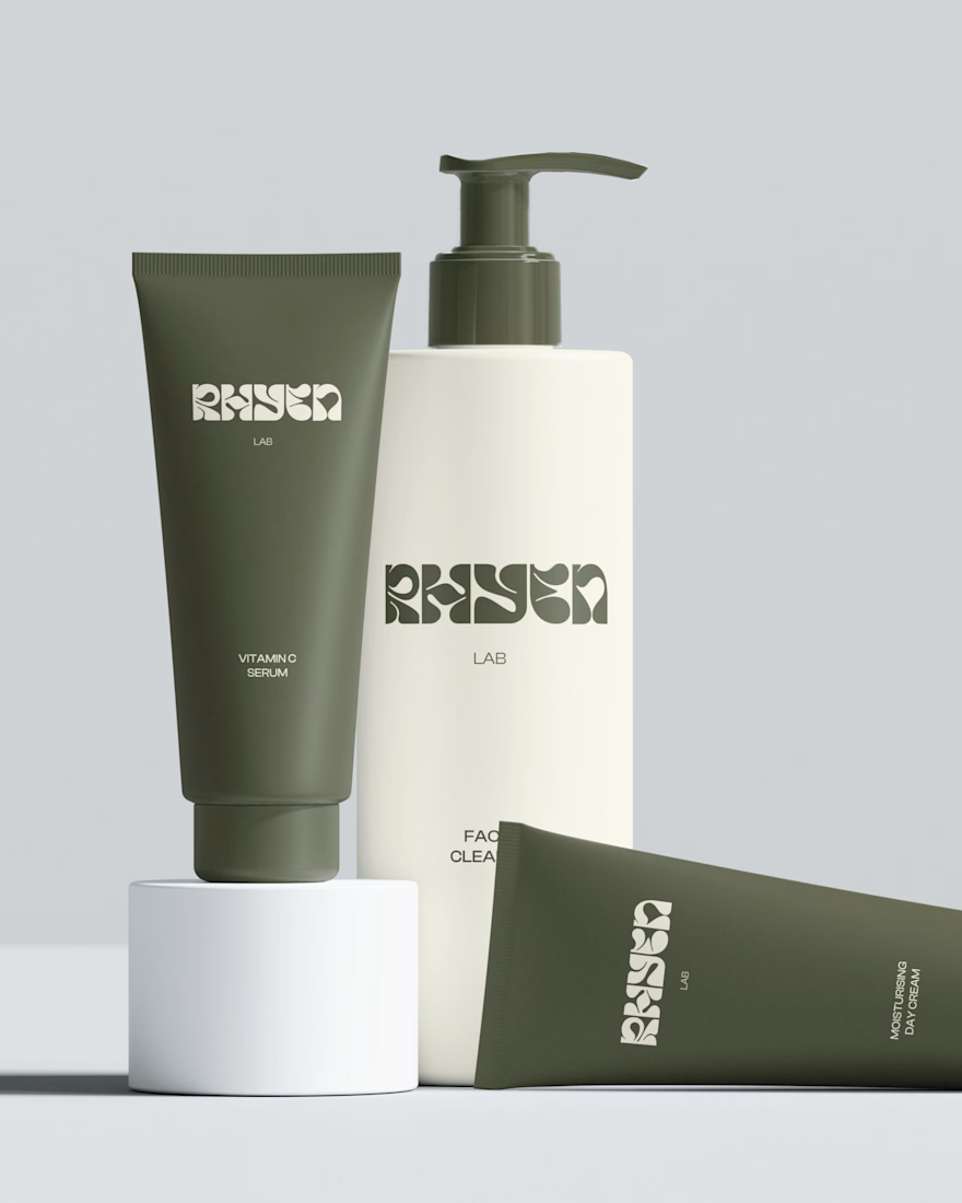
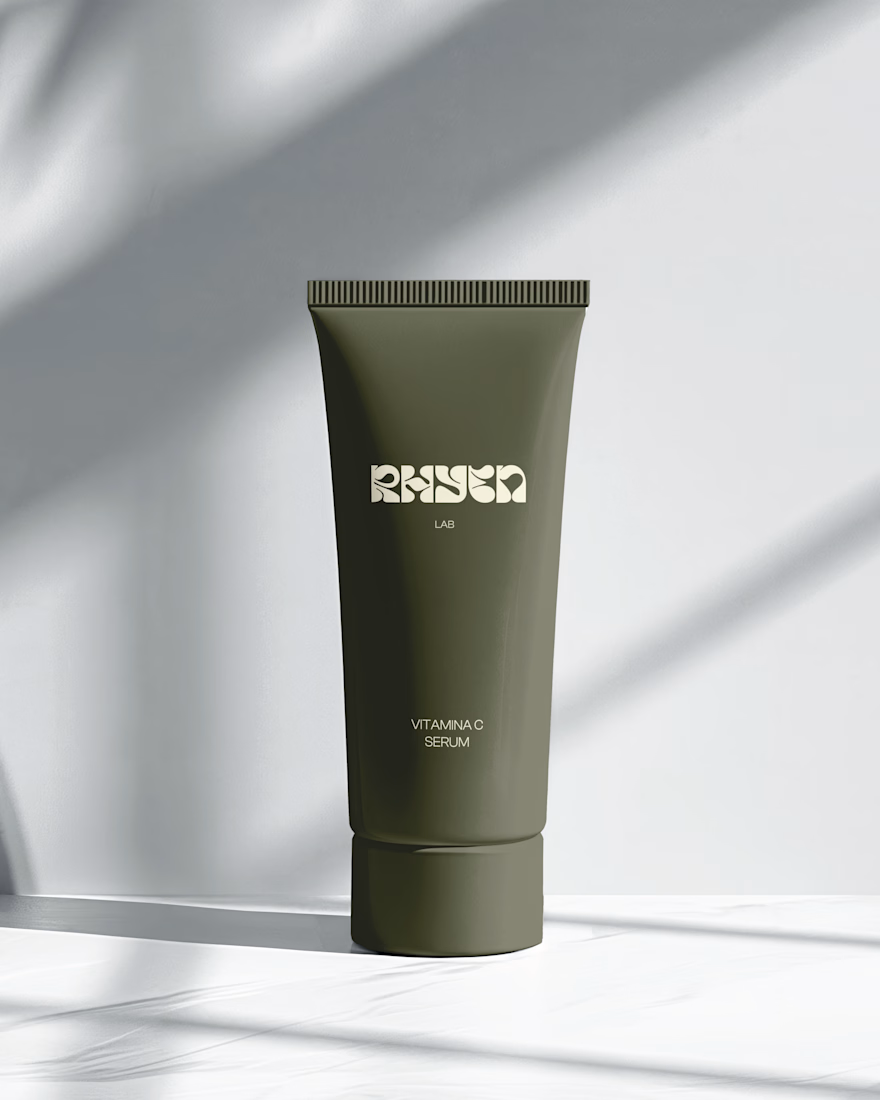
The system was applied across packaging for the Vitamin C Serum, Facial Cleanser and Moisturising Day Cream, ensuring consistency across tubes and bottles.
Deliverables: Logo & monogram · Visual identity · Color palette · Packaging design · Art direction