The network for creativity
Join 1.25M professional creatives like you
Connect with clients, get discovered, and run your business 100% commission-free
Creatives on Contra have earned over $150M and we are just getting started
Back to feedPost


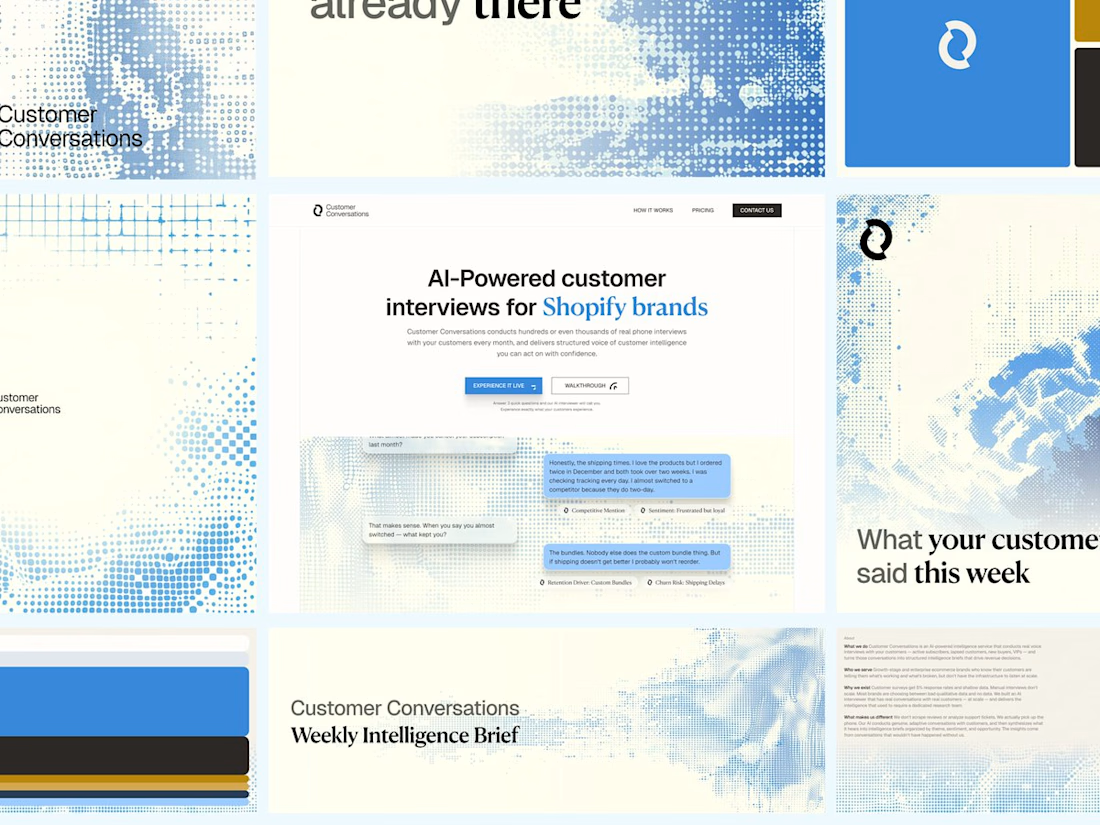
Customer Conversations is an AI that calls a store's customers and interviews them. Explaining that took half of every sales call.
Three weeks after Bryan Starck brought it to us, it had a brand and a homepage built to do the explaining. Answer three questions and the AI calls you for a real interview in 60 seconds.


Clean work on this, Daniel. Using the homepage to do the explaining is the right call when the product is a conversation - the three-question flow lets the brand earn the 60-second promise instead of overpromising in copy.


Clean layout pure focus

I love this 😀

Love how seamlessly the brand elements align with the core message. Highly professional and visually captivating work from start to finish!

this grid is fire. love how you didn't over-explain, the visuals do it. that weekly brief screen is a nice touch

Very clean brand work


Smart approach.

"Answer three questions and the AI calls you" is the best kind of homepage. The demo does the explaining that used to take half of every sales call.

Letting people try the actual AI call in 60 seconds is the best explainer you could ask for. Show, don't tell, and three weeks is a quick turnaround too

A live interview demo does a lot more than another 'AI-powered' headline 😅 How did you make requesting the call feel trustworthy enough for visitors to try it? That seems like the key moment in this flow.

loveeeeeeee ittt so muchhhh!!!


That blue halftone dither fading into the cream background is a great way to visualize voice without reaching for waveforms, and the serif on the weekly brief gives it a calm editorial feel.


Cooking as always, Daniel! Awesome stuff


Nice!!

The most interesting thing is that, how you pick one idea, and turn it into a totally creative direction, I'm saying about the pixel dotted patterns

Love how the homepage explains the product so effortlessly—clean, clear, and visually engaging. Great work! 🔥

Impressive

Nice one.

top notch
Answer three questions and get a call in 60 seconds is such a good way to explain the product. Letting people experience it beats any explainer copy.

Nice design


This is superb!

The halftone wave running through everything is a smart choice for a product that is basically signal pulled out of noise. And putting the interview bubbles on the homepage does the explaining the sales calls used to do. How did the three weeks split between brand and build?

"answer 3 questions and it calls you in 60 seconds" is such a smart move, the homepage literally demos the product. curious how many people actually take the call vs drop off at the questions?

Love how the branding and website tell the same story. Really nice execution!

Cool branding, how was the texture generated?

Looks Attractive
The network for creativity
Join 1.25M professional creatives like you
Connect with clients, get discovered, and run your business 100% commission-free
Creatives on Contra have earned over $150M and we are just getting started
Related posts


What happens when one website has to talk to two different people?
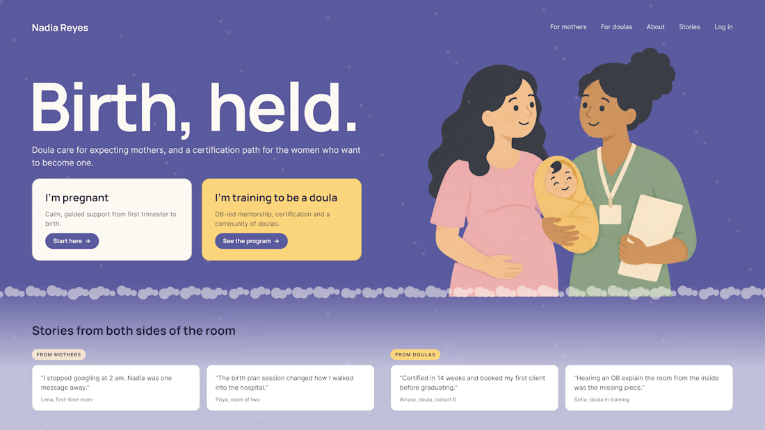
A client of ours teaches two audiences at once: expecting mothers who want a calm pregnancy, and women who want to become doulas. One brand, one site, two very different reasons to visit.
The usual fix is a hero that speaks to "everyone" and lands with no one. We designed it as a fork in the road instead:
1. Two doors in the hero. "I'm pregnant" and "I'm training to be a doula", side by side, equal weight. The visitor picks a path in one click, and the headline above them stays about the shared value.
2. One voice, two tones. The mothers' path is softer: fewer words, more room, gentle photos. The doula path is more structured: modules, certification, dates. Same fonts, same colors, different rhythm.
One proof section, split in two. Testimonials from mothers on the left, from doulas on the right. Each visitor sees people like them before the price.
Writing for everyone is writing for no one. Give each reader a door.
Have you ever designed a page for two audiences at once? How did you split it?


Love that purple hero with the two cards right up top.

AI Mental Wellness Platform UI/UX Design
Designed a modern and intuitive AI-powered mental wellness website focused on emotional well-being and personalized digital experiences.
The platform features an AI therapist, mood tracking, meditation, sleep improvement, wellness plans, and data-driven insights. A calming blue color palette, immersive visuals, clean layouts, and thoughtful UI elements create a seamless and engaging user experience.
mentalhealthwebsitedesignartificialintelligenceAI VIsual DesignerResponsive DesignWeb DesignClaudeFigma


love how calm the mood tracking and meditation screens feel in this wellness design


Really nice one, Max!


