The network for creativity
Join 1.25M professional creatives like you
Connect with clients, get discovered, and run your business 100% commission-free
Creatives on Contra have earned over $150M and we are just getting started
Back to feedPost
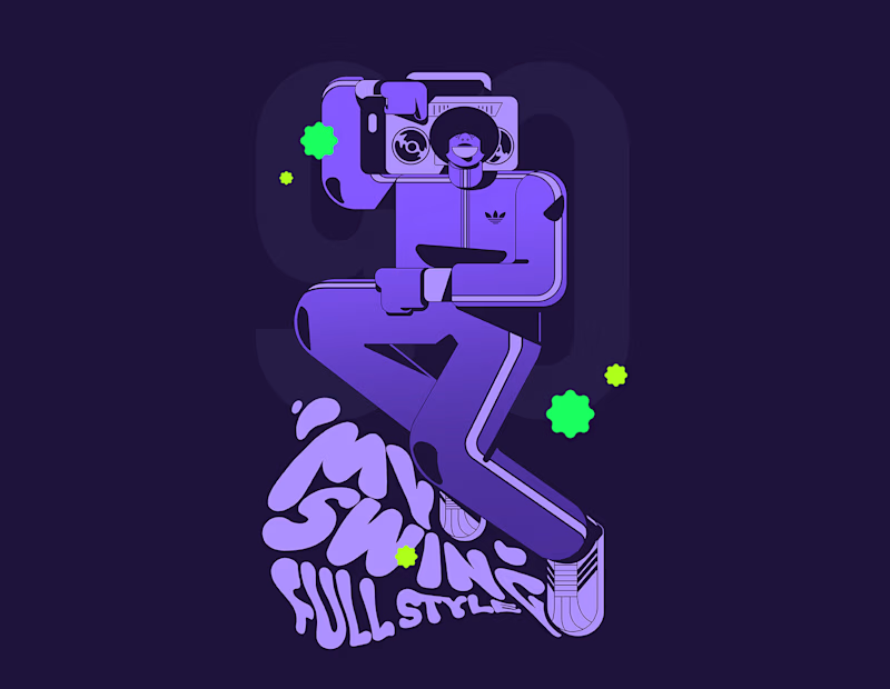
Taste Test
Two version, wich one to use?
I'm not sure, What would your choice be?
12 voted
86%
2 voted
14%

14 votes
Closed

Love the color choices of the first one! I also like the contrast with the dark blue tone of the shadows


Great! I appreciate the comment; maybe I'll decide on that one.

amazing art work

depends on how you plan to use it, the dark would be sick embroidered on something
The network for creativity
Join 1.25M professional creatives like you
Connect with clients, get discovered, and run your business 100% commission-free
Creatives on Contra have earned over $150M and we are just getting started





Related posts


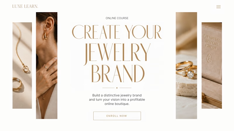
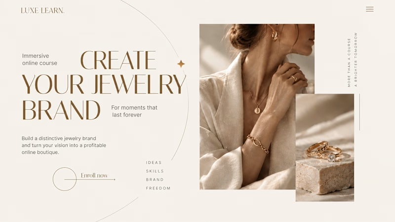
Same course. Same content. But two completely different feelings ✨
Which version would you choose?
27 voted
59%
19 voted
41%
46 votes
Closed

Option 2 is more practical ❤️❤️

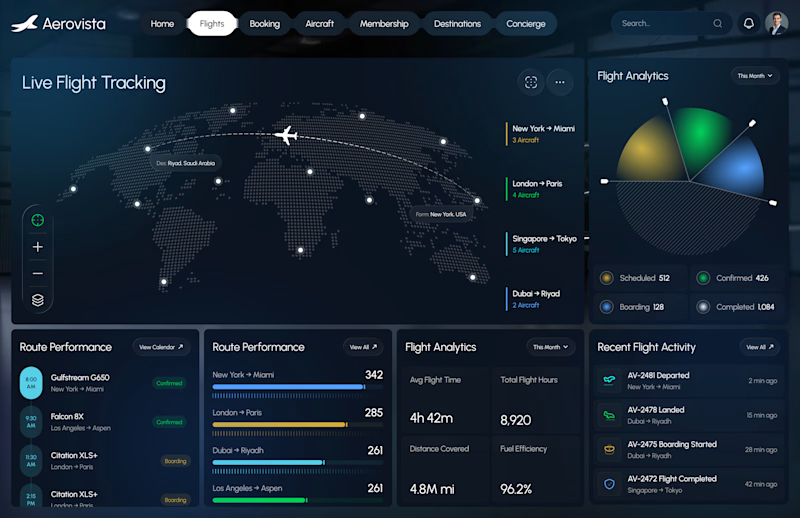
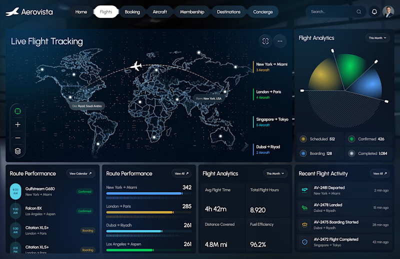
A beautiful dashboard isn’t always a better dashboard.
Which flight dashboard would you trust?
Same product. Same data.
Two completely different visual directions.
A or B
I’m curious which one you’d choose and why.


4 votes
Ends in 12h

A for me. The dotted globe keeps the map as quiet context, so the flight paths and the live numbers are what your eye lands on first. In B the detailed map competes with the data. For an ops screen people stare at all day, less noise usually means faster decisions. Having built...

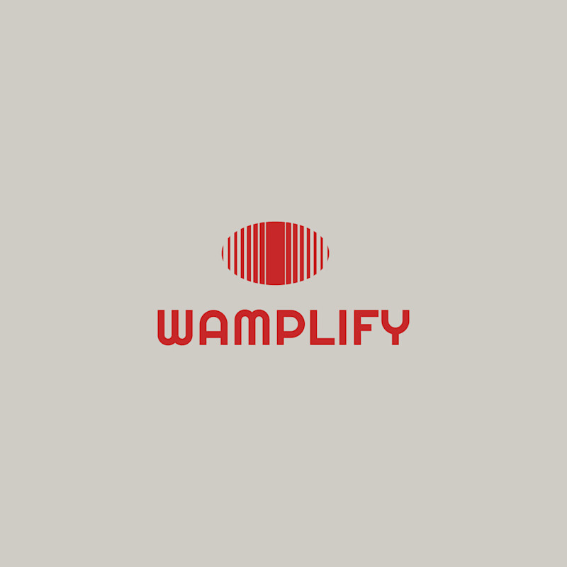
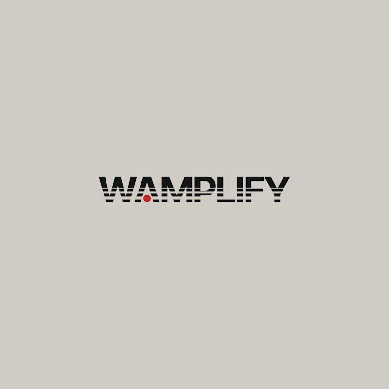
Please! Share your thoughts and take a guess which one of these 2 concepts were chosen for final production.
Here are 2 logo design concepts that I did for my client for 200$. I honestly love both of them really much.
Guess which concept was picked and vote your favorite one.
5 votes
Ends in 13h
