The network for creativity
Join 1.25M professional creatives like you
Connect with clients, get discovered, and run your business 100% commission-free
Creatives on Contra have earned over $150M and we are just getting started
Back to feedPost

The network for creativity
Join 1.25M professional creatives like you
Connect with clients, get discovered, and run your business 100% commission-free
Creatives on Contra have earned over $150M and we are just getting started
Related posts

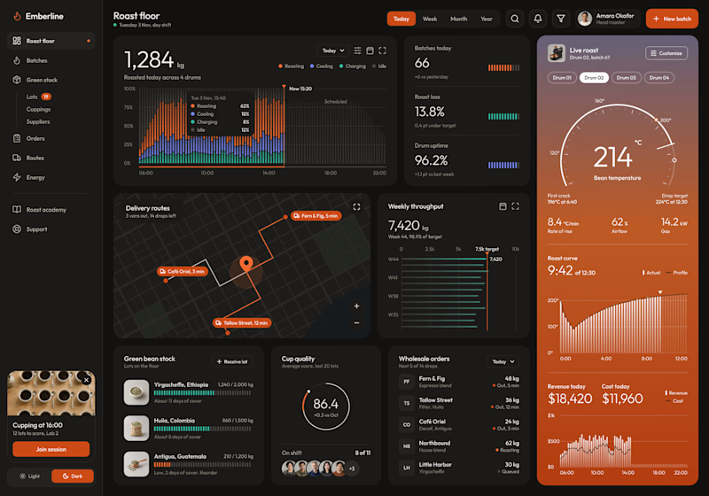
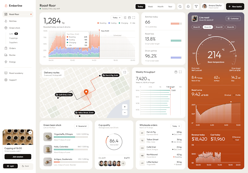
Dark or Light? Which dashboard design do you prefer?
I designed a production dashboard for a coffee roasting business in two themes, and I'd love your opinion! 🖤🤍
It brings everything into one view: live roast tracking, batch stats, delivery routes, weekly throughput, green bean stock, cup quality scores, wholesale orders, and daily revenue.
Both versions share the same layout and warm orange accents, but each creates a very different feel:
Option 1: Dark mode – Bold, focused, and easy on the eyes during long shifts.
Option 2: Light mode – Clean, bright, and airy with a modern minimal look.
Which one would you choose for your daily workflow? Vote and share why in the comments!

6 votes
Ends in 8h

I just published a free Framer template, Darkroom Photo, a portfolio for night and film photographers! 📷 I wanted it to feel like peering through a camera in the dead of night.
The home page is a black wall of frames split into 9 series. Click a series and that group steps forward, while the rest of the wall goes dark.
There's a viewfinder overlay with timecode, exposure scale and focus readout to frame every page. An about page, a contact page with booking form, and it works on desktop, tablet and phone. The images are all in the CMS. 🎞️
Live demo: passionate-saturn-708047.framer.app


Most ai saas sites go dark mode with purple glow. this one stays light and lets the line art do the talking 😏


Turning a data-heavy AI product into a light, friendly experience, brought to life with motion. We’d love to hear your thoughts!


