The network for creativity
Join 1.25M professional creatives like you
Connect with clients, get discovered, and run your business 100% commission-free
Creatives on Contra have earned over $150M and we are just getting started
Back to feedPost
Taste Test





In-line form

I choose the pop up form

Nice 👏


The first one gives less cognitive overload 🔥

Pop-up

though i love the animation, i think the inline version has a more refined, professional feel to it.

Pop-up form


I choose on inline form

Pop up form

Went with inline, less friction and the form doesn't feel like it's interrupting the flow. Though I'd guess the pop up version could filter out low intent clicks. Did you get to test conversion on both?


Pop-up form

I would go with the first one!

Pop up form
The network for creativity
Join 1.25M professional creatives like you
Connect with clients, get discovered, and run your business 100% commission-free
Creatives on Contra have earned over $150M and we are just getting started
Related posts

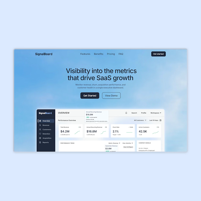
Minimal or with floating metrics. Which hero works better?
A SaaS executive dashboard landing page. Designed and built entirely in Framer.
14 voted
52%
13 voted
48%

27 votes
Closed

i would go for minimal one


its really tough to choose one ..I go with web , u did a great job must say


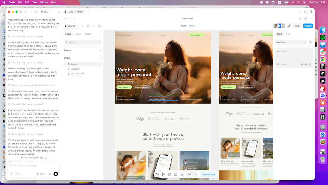

clean and thoughtful work








Trending

Claude
Claude has entered the design space. How are you using Claude Design?

Contra University
Learn from expert creatives how to earn more using next-gen AI tools.
fifaworldcup2026
The World Cup is here and the whole world's watching. How are you designing for the world stage?
creativeaiflow
Creative AI workflows are evolving. What tools do you use, and what are their strengths and weaknesses?
freelancerlife
Freelancer life is wins, pivots, and everything in between. What’s yours right now?