The network for creativity
Join 1.25M professional creatives like you
Connect with clients, get discovered, and run your business 100% commission-free
Creatives on Contra have earned over $150M and we are just getting started
Back to feedPost
Taste Test


I choose the pop up form

In-line form


The first one gives less cognitive overload 🔥

Pop-up

though i love the animation, i think the inline version has a more refined, professional feel to it.

Pop up form

Went with inline, less friction and the form doesn't feel like it's interrupting the flow. Though I'd guess the pop up version could filter out low intent clicks. Did you get to test conversion on both?


Pop-up form

I would go with the first one!

Pop up form


The Pop added beauty and interaction to it.
The network for creativity
Join 1.25M professional creatives like you
Connect with clients, get discovered, and run your business 100% commission-free
Creatives on Contra have earned over $150M and we are just getting started
Trending
retrofuturism
Share your favorite designs from the past exploring the distant future. Or your own take on the aesthetic 🚀
halftone
Dots. Texture. Grain. Let's see your designs using the halftone technique.

Midjourney
Creatives are showing off what they're making with Midjourney.
colorgrade
Video editors sound off: How do you enhance the mood of your video in color grading?


Related posts


we are working on two framer templates in parallel
hero interaction magic ✨

Great work on animations


UI Dashboard screen explorations with a different type of dither for expressing scale



amazing work Praveen

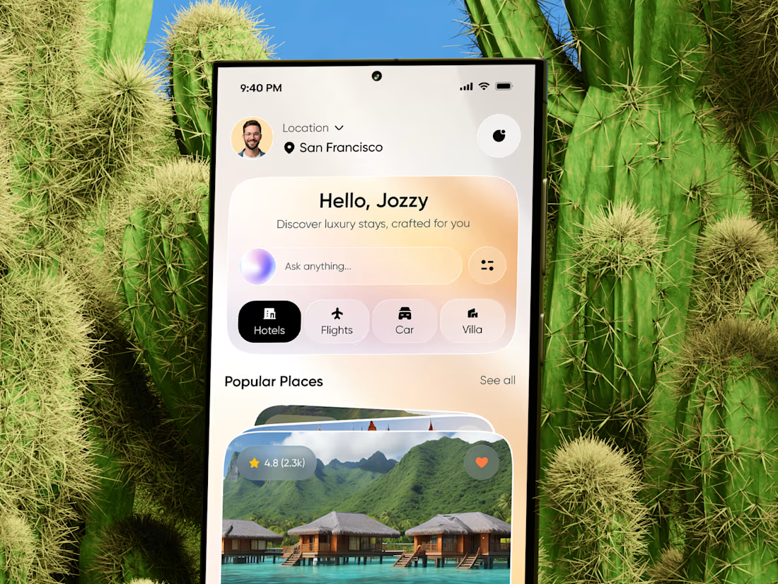
AI Travel Planner & Luxury Resort Booking Mobile App UI Design
The luxury travel industry is evolving beyond standard filter menus. High-net-worth travelers and modern vacationers want hyper-personalized itineraries, smart recommendations, and instant multi-modal booking through a single intuitive interface.
We designed this elegant AI Travel Planner & Luxury Resort Booking Mobile App UI to bridge conversational artificial intelligence with high-end hospitality design. Built for TravelTech startups, luxury resort platforms, boutique travel agencies, and AI concierge platforms, this app concept replaces complex search forms with a conversational travel planner.
The Problem We Solved
Most booking engines force users through rigid drop-down menus, overwhelming filters, and clinical listing grids. This fragmented experience friction reduces booking conversion rates, especially for luxury travelers seeking tailored packages.
This design solves the friction by putting a smart conversational AI search engine at the center of discovery. Prompts like "Ask anything..." allow travelers to type or speak natural queries (e.g., "Find me an overwater villa in Bora Bora with private dining"), while quick navigation tabs for Hotels, Flights, Cars, and Villas keep essential booking categories just one tap away.
Key Features & UX Highlights
Conversational AI Search Dock: Natural language search bar allowing travelers to plan multi-city trips and discover luxury stays using conversational AI.
Location-Based Personalization: Smart dynamic header that adapts featured luxury stays based on user telemetry and geographic location (San Francisco).
Multi-Category Booking Navigation: Instant switching between essential travel services—Hotels, Flights, Rental Cars, and Luxury Villas.
Immersive Visual Discovery Cards: High-contrast resort cards featuring high-resolution imagery, direct review ratings ($4.8\text{ stars}$), and quick-save bookmarking.
Building an AI Travel App, Hospitality Platform, or Booking SaaS?
Whether you're an ambitious founder launching an AI-powered travel concierge, modernizing an online travel agency (OTA), or scaling an enterprise hospitality app, we design ultra-clean, high-converting mobile UI/UX that transforms window shoppers into paying guests.
#AITravelApp #LuxuryHotelApp #TravelPlannerUI #TravelTechDesign #HotelBookingUI #ResortAppDesign #AITravelConcierge #VacationBookingApp #IOSTravelApp #TravelSaaSDesign