The network for creativity
Join 1.25M professional creatives like you
Connect with clients, get discovered, and run your business 100% commission-free
Creatives on Contra have earned over $150M and we are just getting started
Back to feedPost


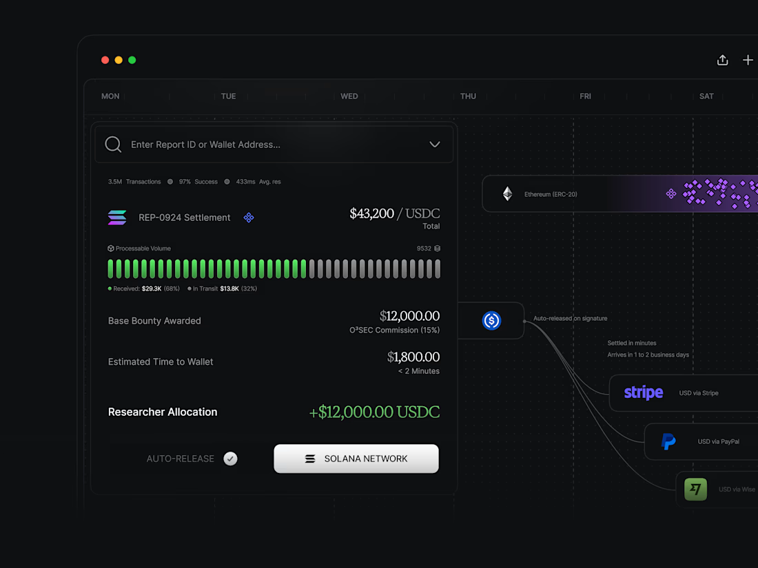
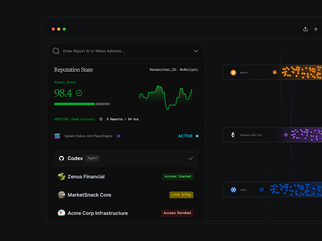
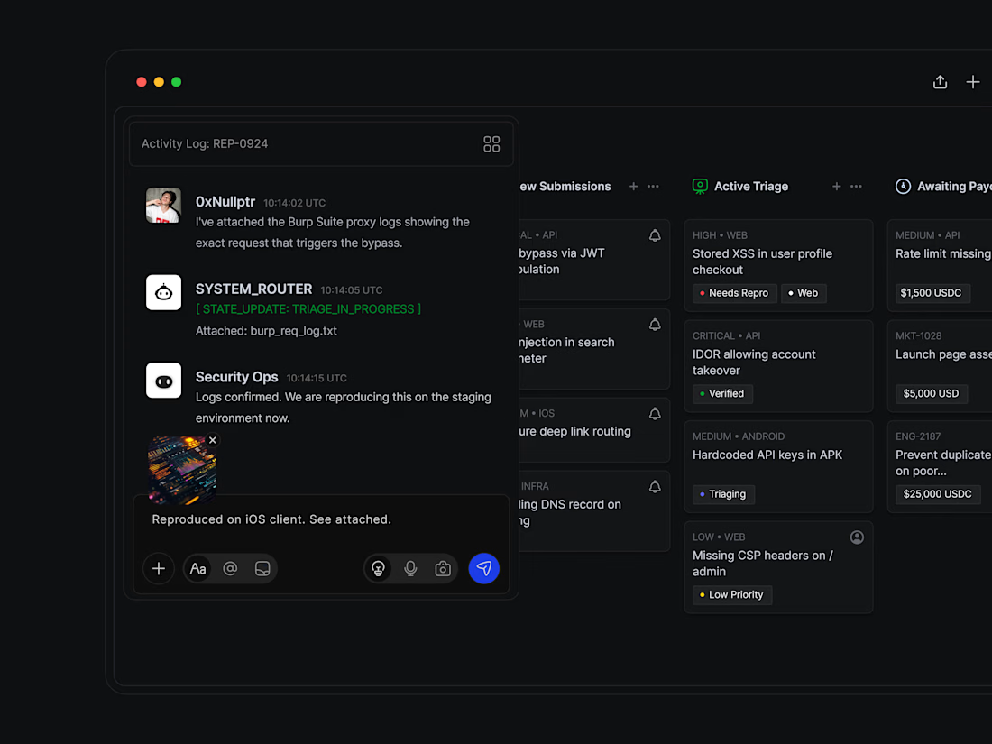
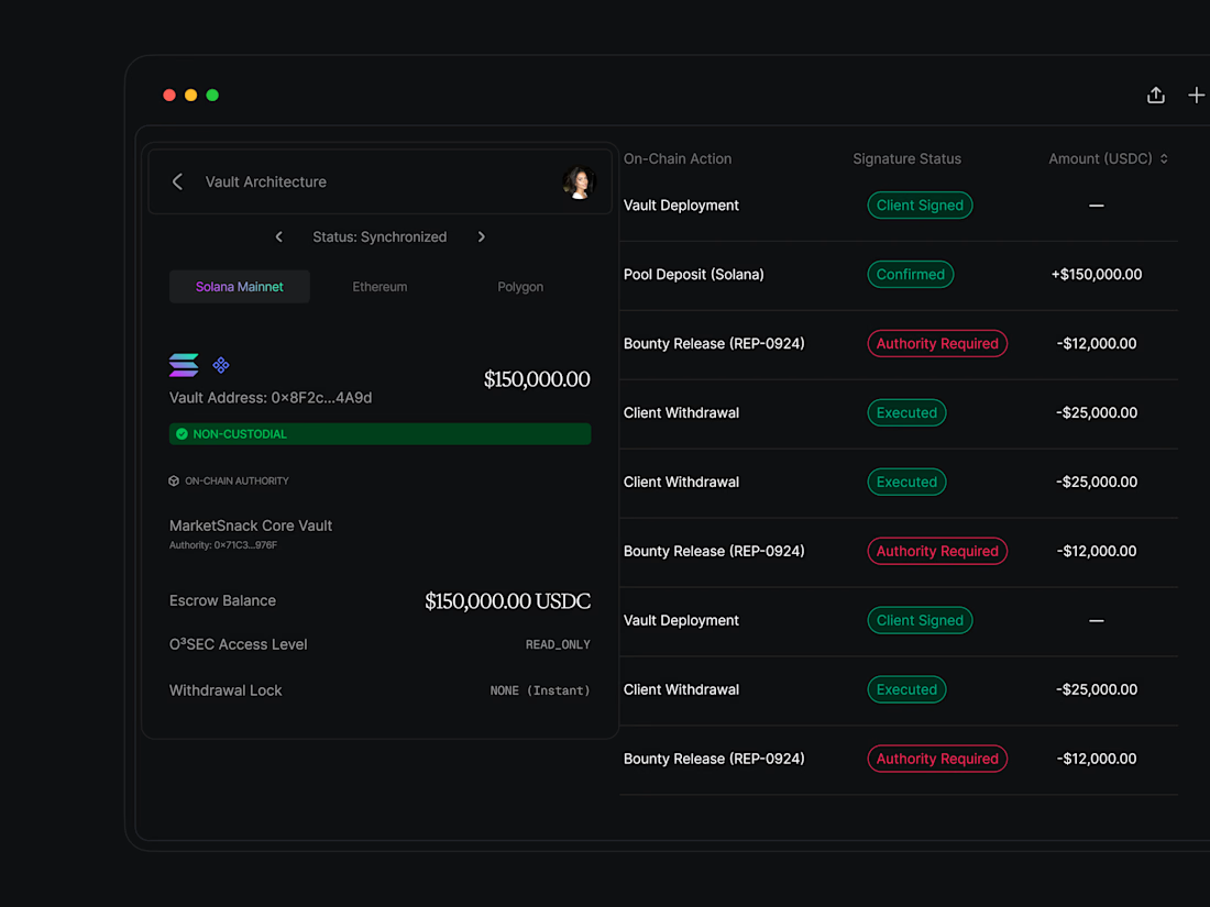
UI Dashboard screen explorations with a different type of dither for expressing scale




Looks great


Dither instead of a gradient fill is the right call here — gradients wash out on true blacks, and the dither texture still reads as intensity without fighting the chart's own color coding.

Great Work 🔥

THIS IS WONDERFUL. IVE BEEN THINKING OF GOING INTO UI/UX DESIGN. IS THIS A SIGN?

Using dither to encode scale is a smart move since it keeps the value legible without adding a second color axis. The one thing I would stress test is how it holds at small render sizes and on lower-DPI screens, where dot patterns can shimmer. On these hero screens it reads beautifully.
The network for creativity
Join 1.25M professional creatives like you
Connect with clients, get discovered, and run your business 100% commission-free
Creatives on Contra have earned over $150M and we are just getting started




Related posts

After a long time finally
New case study: Conduct AI 🖥️
Designed and built in Framer.
Take a look 👇


Love the clean layout.

Brand Identity delivered by paper.

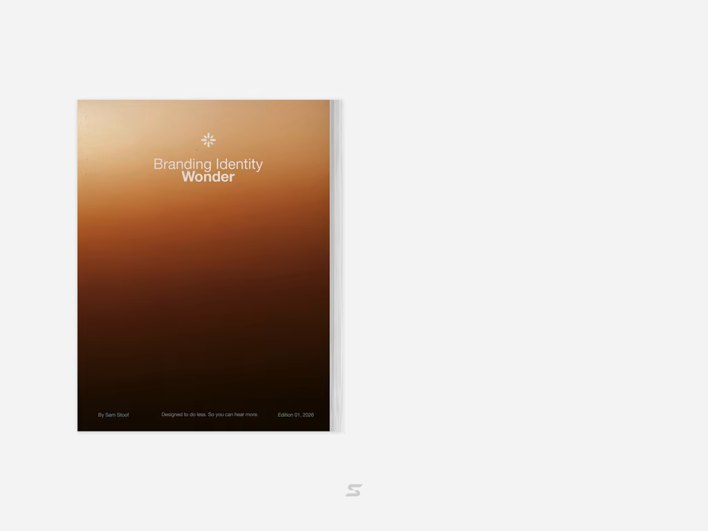

Love it🙌

Exploring 3D interactions and brutalist scale for Kinetix — a portfolio concept centered on design systems and digital products.
Focused on balancing heavy typography with fluid, tactile motion so the 3D element feels integrated rather than decorative.
Curious to hear your thoughts: does the 3D rotating showcase feel smooth and intuitive, or do you prefer flat, high-speed interactions for portfolio heroes?

The rotating 3D works here precisely because you kept it integrated, not decorative, so it reads as intent rather than showing off. For a portfolio hero I usually lean flat and fast, but this earns the motion. That heavy Kinetix wordmark has real physical weight.