The network for creativity
Join 1.25M professional creatives like you
Connect with clients, get discovered, and run your business 100% commission-free
Creatives on Contra have earned over $150M and we are just getting started
Back to feedPost
🛠️ 𝐂𝐮𝐫𝐫𝐞𝐧𝐭𝐥𝐲 𝐰𝐨𝐫𝐤𝐢𝐧𝐠 𝐨𝐧 𝐭𝐡𝐢𝐬 𝐨𝐧𝐞
Started with the visual direction for this work management experience, then took the design straight into Webflow to see how it actually behaves outside Figma.
The interesting part is making the pieces work together, the landing page, product sections, dashboard visuals, responsive layouts, and mobile views, while keeping the same visual language throughout.
Right now I’m refining the details that you don't really notice until they're wrong:
✨ spacing & typography
🖥️ responsive behavior
⚡ interactions & transitions
📱 mobile layouts
🧩 reusable Webflow components
Still building, still refining. 👨💻🎨
UI/UX • Web Design • Webflow • Product Design


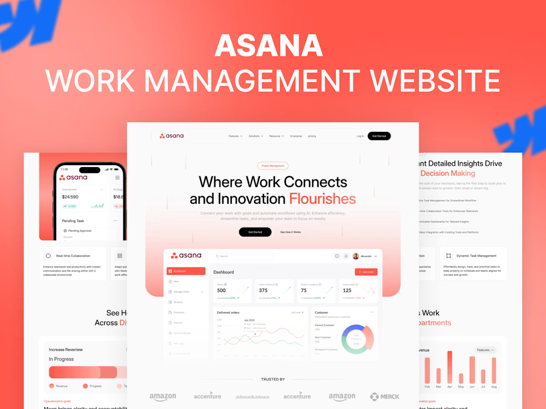
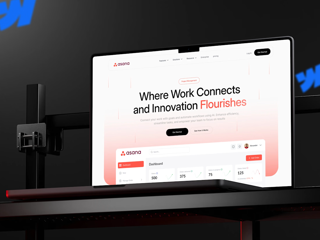
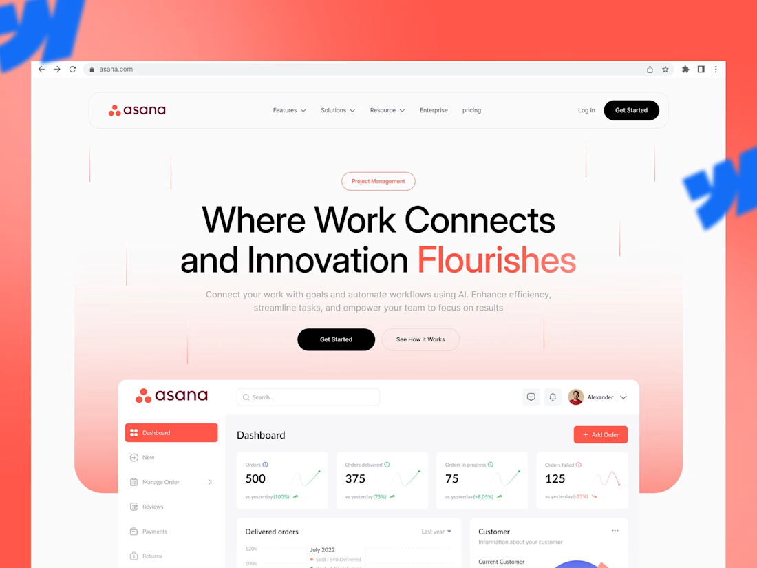

The refinement list you shared is basically the whole job, most people think the design is done when the big layout looks right and skip exactly those five things. How's the Webflow build handling the dashboard interactions so far?

Yeah, it’s going good so far. Just tightening up the interactions now and making sure everything works clean.
The network for creativity
Join 1.25M professional creatives like you
Connect with clients, get discovered, and run your business 100% commission-free
Creatives on Contra have earned over $150M and we are just getting started





Related posts

Built the site for Linea — a boutique rail brand where the whole UI is made of the same rule as the print system.
Every route card's red line isn't decoration, it's that route's actual elevation profile. Fare tiers aren't styled, they're the same data at different density.
The logo's sparkle mark even resolves from the exact same contour-drawing logic, live on the page.
One idea, all the way down → Here


Give me a good design and room to play with motion.
Here’s what that looks like in Webflow.
Turned the screen recording on for this one.


Great work, Milan

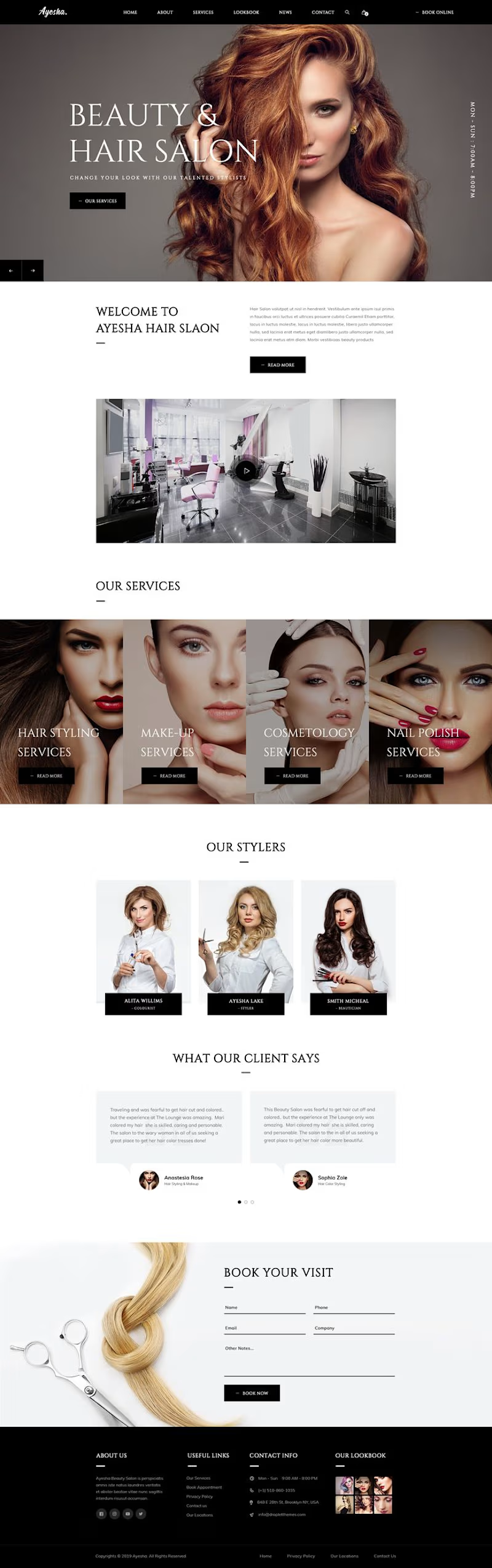
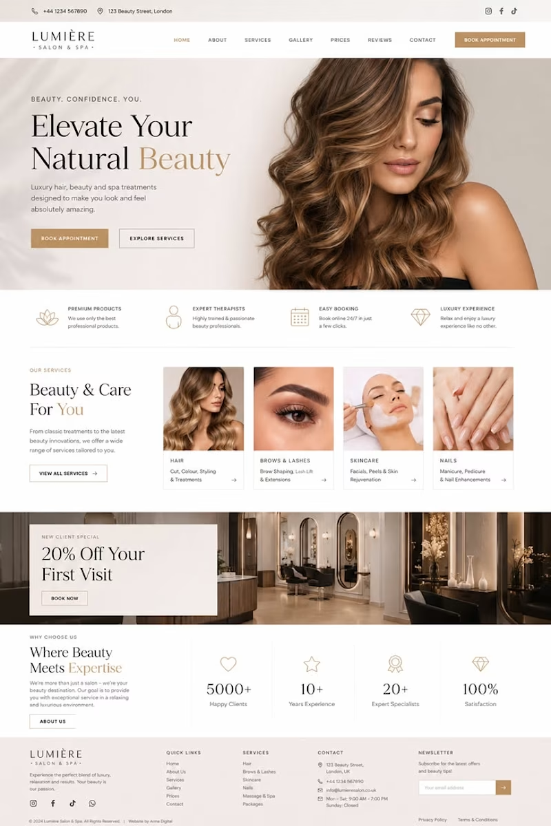
Your salon deserves a website as beautiful as your business.
we create sleek, modern and premium websites designed to turn visitors into bookings.17
Salon & beauty websites
Mobile-friendly design
Online booking integration
Premium, professional look
Built to help your business grow
Ready to give your salon the online presence it deserves?
2 voted
67%
1 voted
33%
3 votes
Closed

Option 1 is most appropriate