The network for creativity
Join 1.25M professional creatives like you
Connect with clients, get discovered, and run your business 100% commission-free
Creatives on Contra have earned over $150M and we are just getting started
Back to feedPost
Taste Test
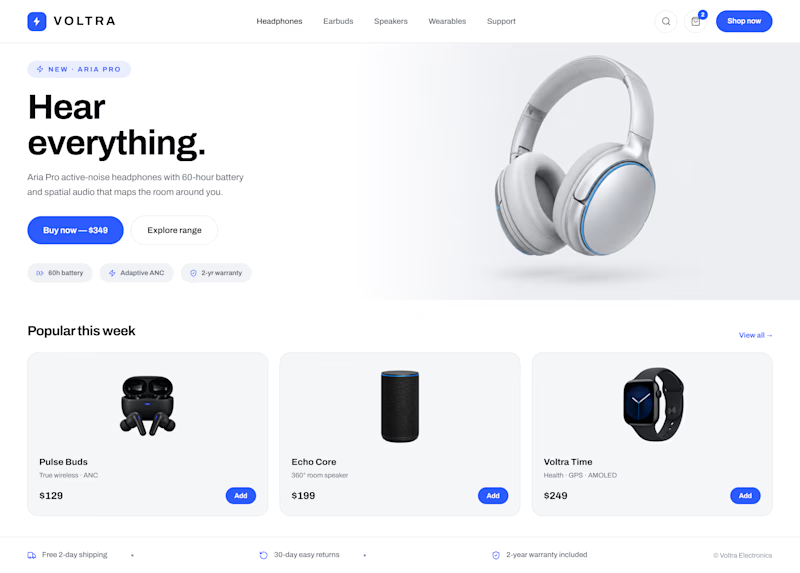
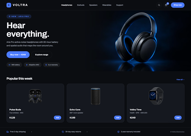
Working through the visual direction for Voltra.
The debate: does premium tech sell better in the shadows (Image 2) or in daylight (Image 1)?
Drop your pick below 👇

6 voted
43%
8 voted
57%
14 votes
Closed

I choose dark because I like dark mode but both of them are nice choice ❤️❤️

Dark mode always wins 😂 Appreciate it! ❤️

Dark for premium tech, Image 2. Shadows make the product the hero and read as high-end, which is why most flagship audio and phones launch on black. Daylight feels friendlier but more mass-market. For Voltra, the shadows sell the price tag.
Totally agree. The shadows really make the product feel more premium. Appreciate the take! 🙌

I would like it it have some sounds wave illustrations also with headphones
Yeah, that could add a nice visual touch, especially with the headphones. Love that direction! 🎧

I loved the option 1.
Same here! Option 1 has a really nice feel to it 🙌
The network for creativity
Join 1.25M professional creatives like you
Connect with clients, get discovered, and run your business 100% commission-free
Creatives on Contra have earned over $150M and we are just getting started











Related posts


🌲 Nordhaus | Prefab Timber Homes Website (Framer)
Homes that grow quietly with the forest, now on the web. 🏡
Nordhaus is a website for a Latvian builder of prefabricated timber homes, created in Figma and built in Framer as a responsive site for desktop, tablet and mobile. It brings the brand's calm Nordic character through full-screen photography, a scroll-driven process story, a horizontal model gallery and interactive testimonials.
✨ Template coming soon to Framer.


Wonderful design man

I designed and built Encore, a scheduling app for a three-office orthodontic practice, then made its launch film the same way I made the app: from the real thing.
Every screen in the film is the live app, recorded on an iPhone 17 Pro simulator. I built the phones as 3D models in Rive, mapped the recordings onto their displays, and choreographed the camera, a three-phone orbit, and a closing wall of twenty screens on a single Rive timeline. No mockups, no After Effects. Swap a screen or retime a move and the film re-renders.


Nice work!!

A few years ago I had the chance to take a course where one of the modules was taught by a designer I really admire, Joseph Berry.
The goal was to create a website for a product, in this case, a speaker. We went through the entire process, from receiving the brief to the very last detail, even modeling the product ourselves in 3D using Spline.
I learned so much, and also got to meet great designers. It’s amazing to see how each one has a different process, and having the chance to observe that and take a bit from each way of doing things to make it your own and develop a unique result really helps you grow a lot as a professional.
I’m sharing some frames from the project, hope you like them!

Great website design visuals I like the color palette ❤️❤️
Great job Ivan🎉🎉