The network for creativity
Join 1.25M professional creatives like you
Connect with clients, get discovered, and run your business 100% commission-free
Creatives on Contra have earned over $150M and we are just getting started
Back to feedPost

NAIL IN Cuticle Revitalizing Oil — Packaging Design
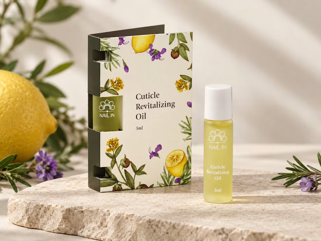
Natural & Botanical Inspired by the product’s nourishing formula, botanical illustrations and citrus elements create a fresh, natural, and approachable visual identity.
Soft & Minimal Aesthetic A warm ivory base is paired with muted green, yellow, and purple tones, balancing the richness of the botanical artwork with a clean and refined overall look.
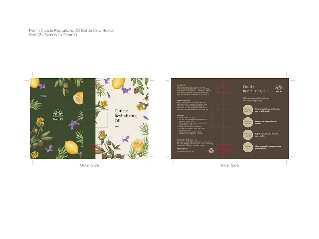
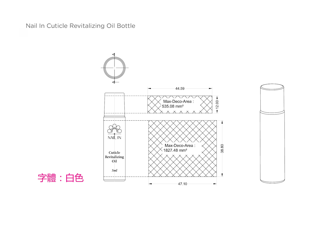
Clear Visual Hierarchy A simple typography layout keeps the product name and essential information easy to read, while allowing the illustrations to remain the key visual element.
Packaging Structure The window-cut packaging partially reveals the product inside, creating a stronger connection between the outer packaging and the actual product while adding visual interest to the structure.
Overall Concept A fresh, botanical-inspired packaging design that combines nature, simplicity, and functionality, giving the cuticle oil a gentle yet distinctive shelf presence.
Credit: HWG


The network for creativity
Join 1.25M professional creatives like you
Connect with clients, get discovered, and run your business 100% commission-free
Creatives on Contra have earned over $150M and we are just getting started
Trending
retrofuturism
Share your favorite designs from the past exploring the distant future. Or your own take on the aesthetic 🚀
halftone
Dots. Texture. Grain. Let's see your designs using the halftone technique.

Midjourney
Creatives are showing off what they're making with Midjourney.
colorgrade
Video editors sound off: How do you enhance the mood of your video in color grading?
Related posts

MATIZ pt. 2
Matiz is a handmade ceramics brand built around raw texture, natural pigment, and the small imperfections that make something feel truly made by hand.
Matiz creates mugs and bowls designed for slow mornings, and decor for quiet, tactile homes.
View the full project here
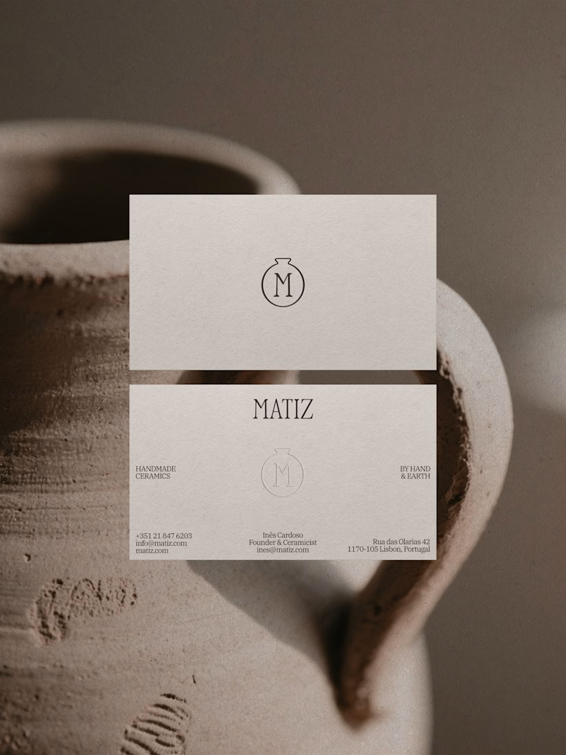
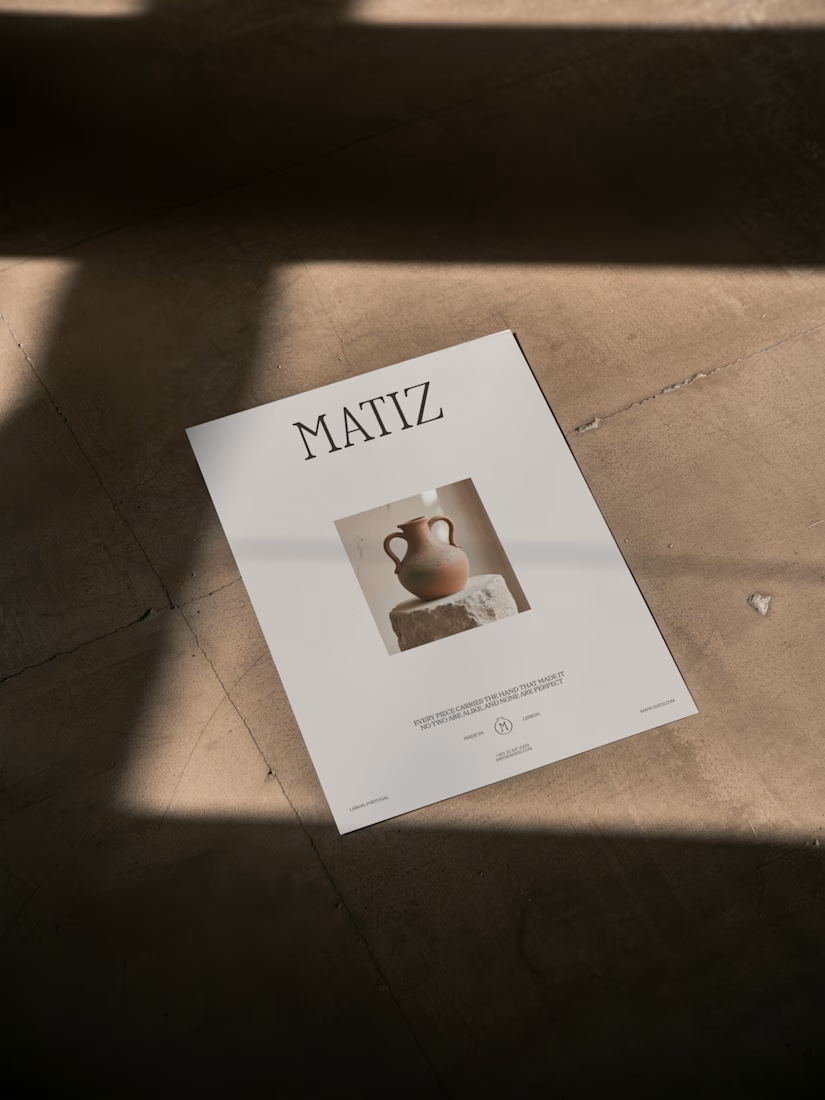
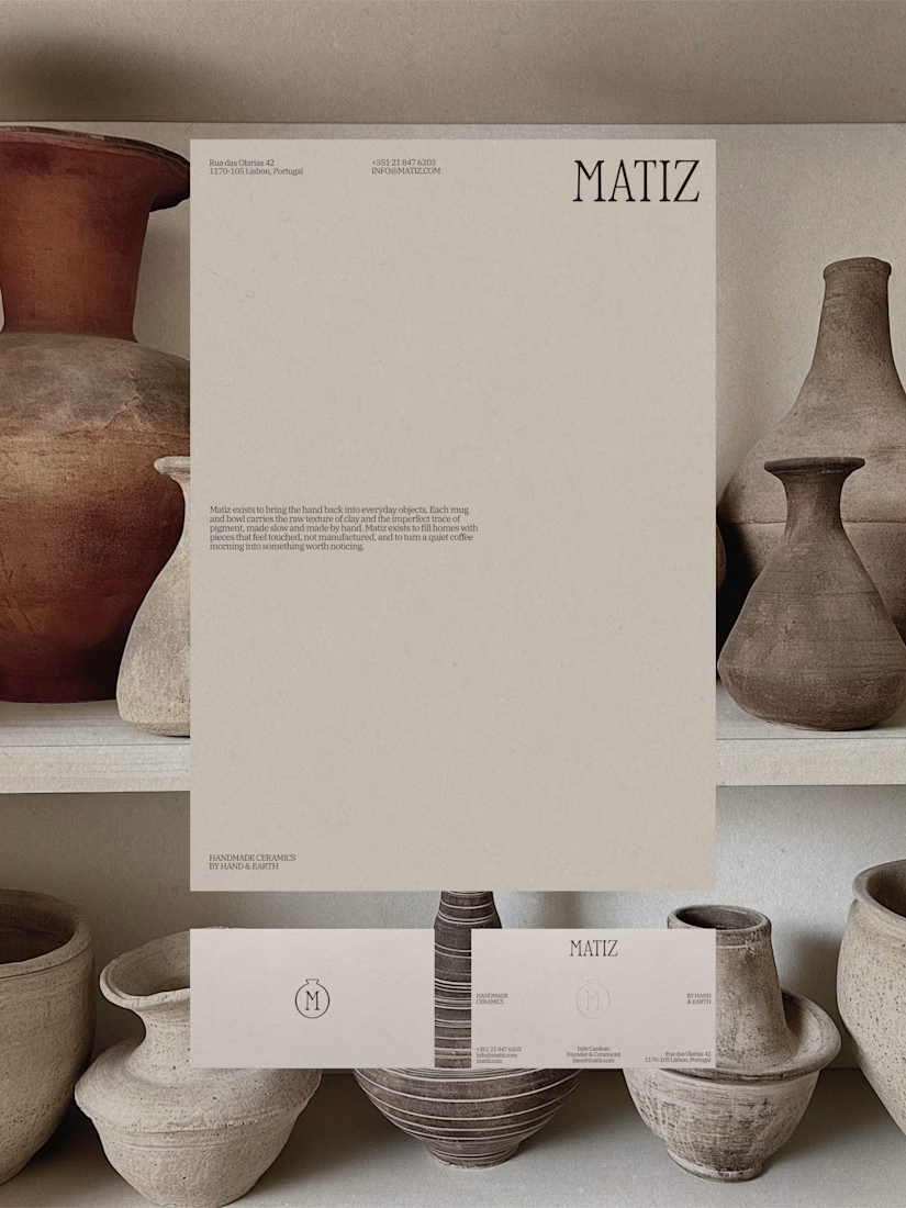
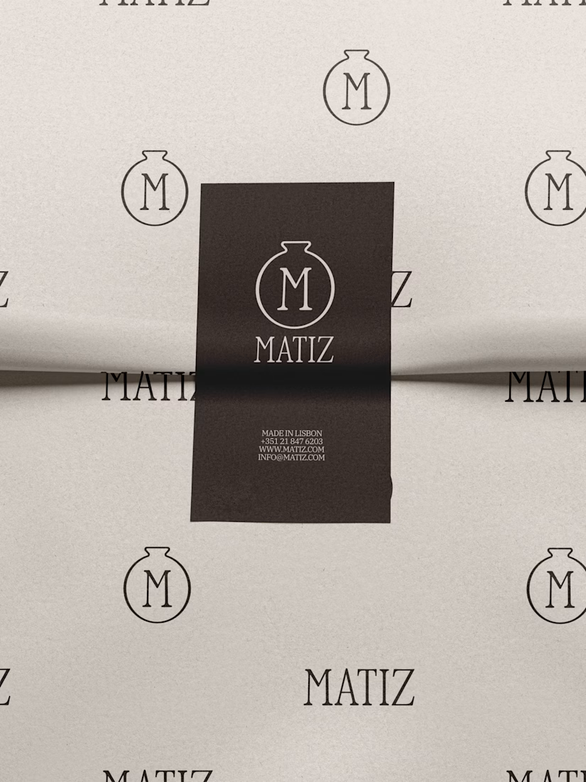

The neutral palette and clean layout let the ceramics speak for themselves. Solid work on capturing that tactile vibe.

What if the whisky-making process became the artwork?
Full Barile identity, campaign and film:
https://contra.com/p/bMNAvgWk-barile-brand-identity-and-launch-campaign
Barrel staves become monumental sculptures. Their curves carry through the collector’s packaging and a 15-second film. Explore four moments from the project here, then discover the complete visual identity and campaign in the case study.
Self-initiated concept for a fictional Brazilian single malt. Creative direction, brand identity and AI-assisted visual development by Mauricio Pontual.
#BrandIdentity #ArtDirection #PackagingDesign #BrandCampaign #AIVideo


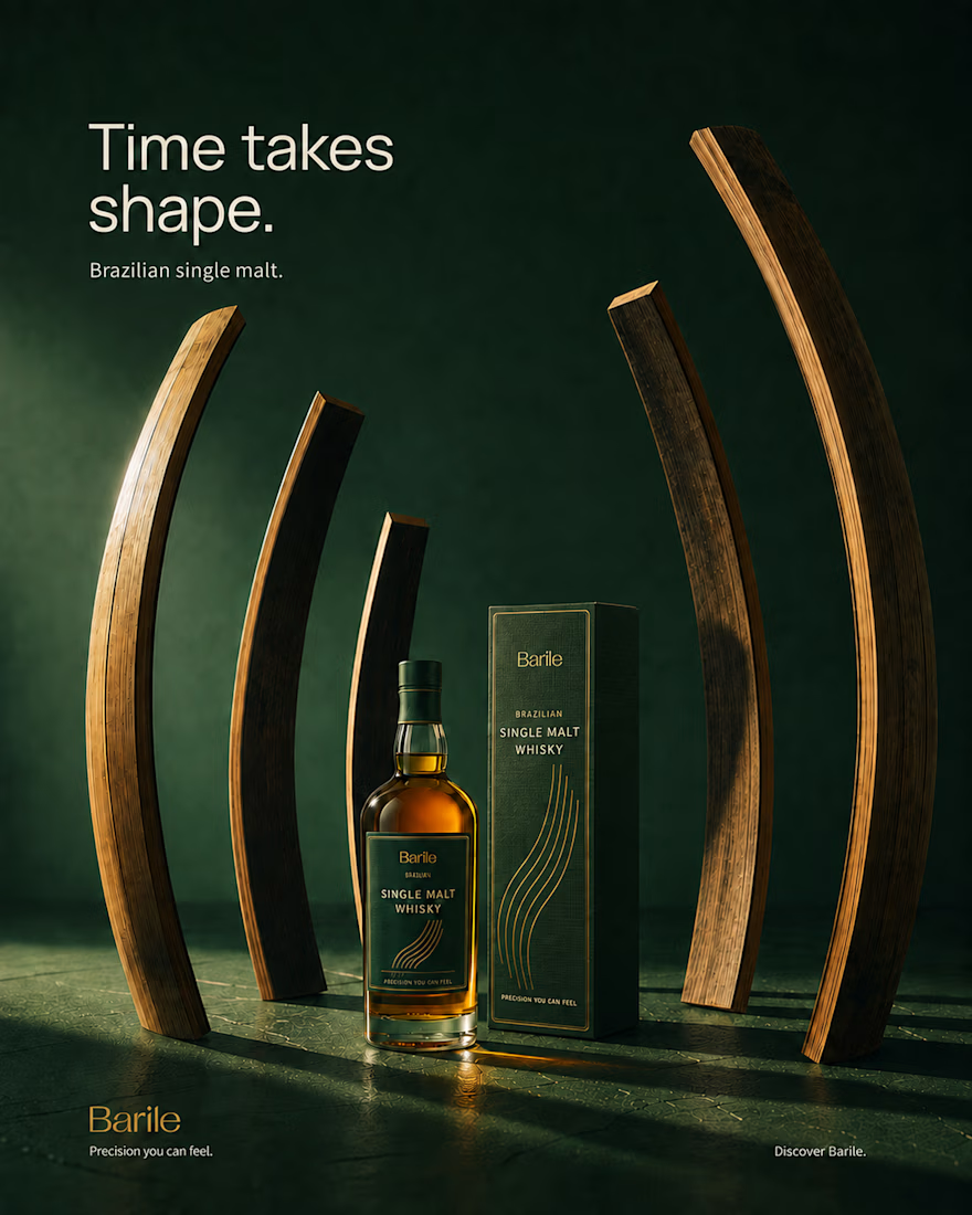
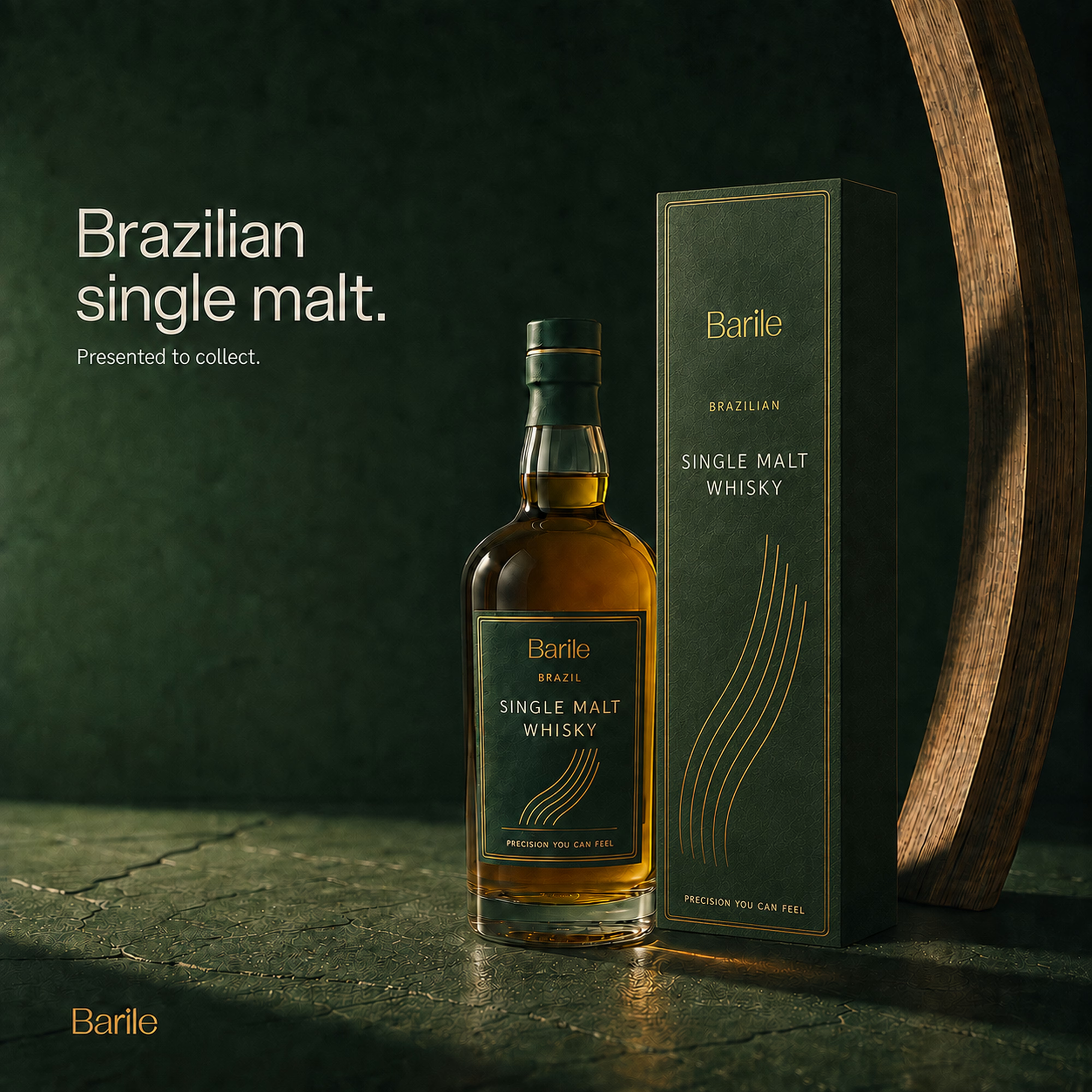
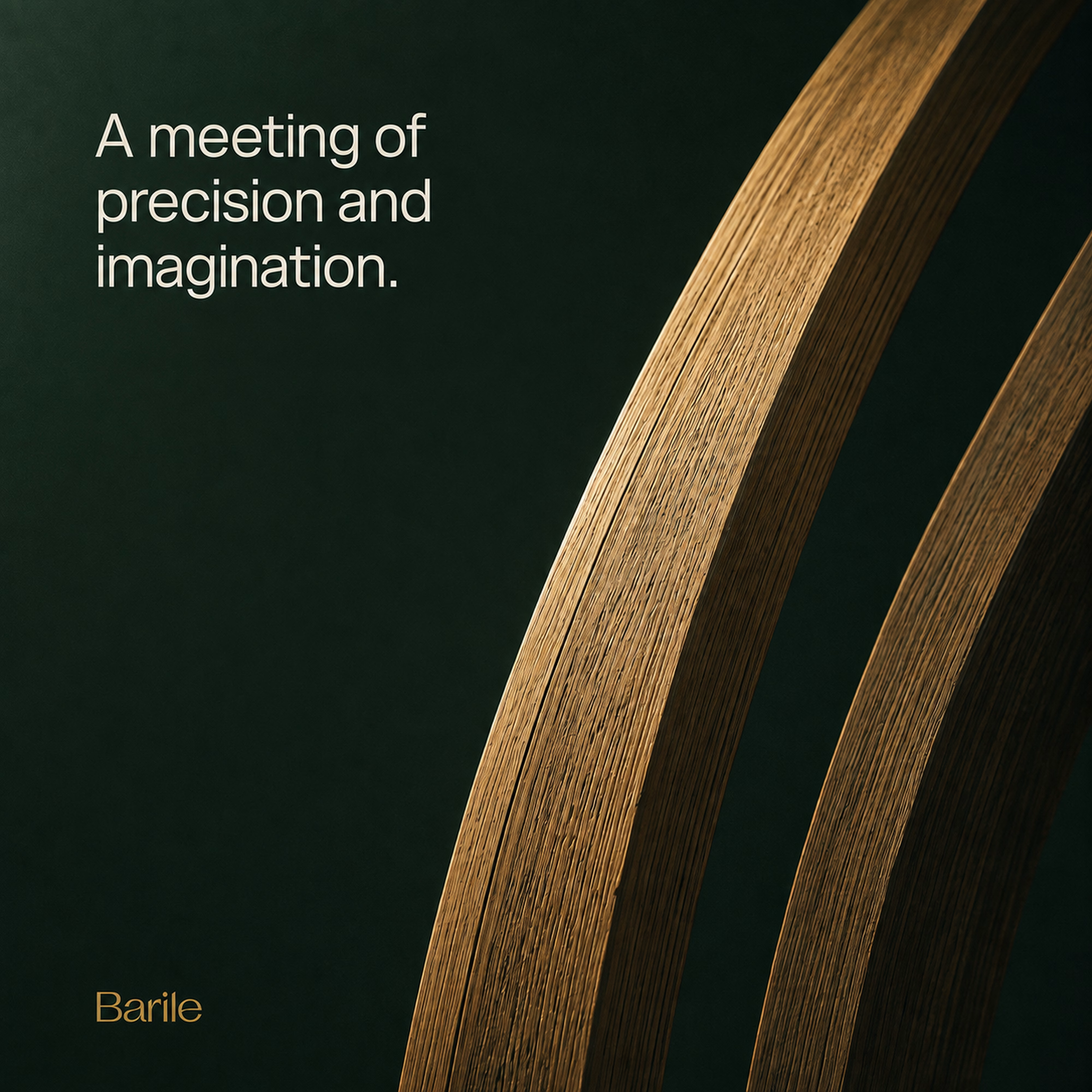

The way the barrel curves carry all the way through to the packaging is such a tight through line. Since this was self-initiated, did the sculptural direction come first and the 15 second film get built around it, or were they developed side by side?

Logofolio for agency, startup, and companies by Me.

Sick 🔥