The network for creativity
Join 1.25M professional creatives like you
Connect with clients, get discovered, and run your business 100% commission-free
Creatives on Contra have earned over $150M and we are just getting started
Back to feedPost
MATIZ pt. 2
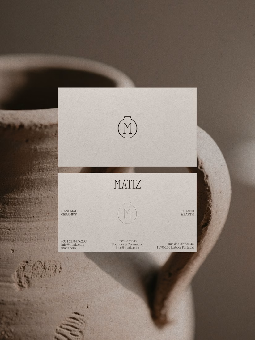
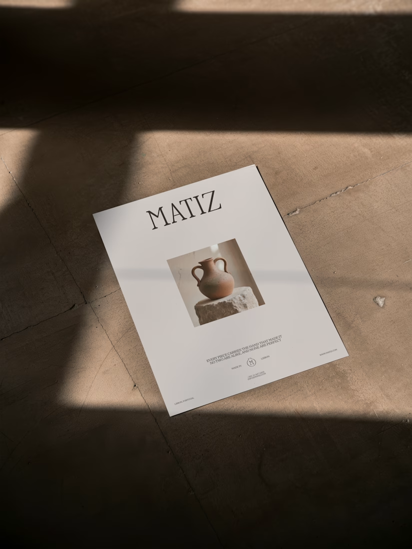
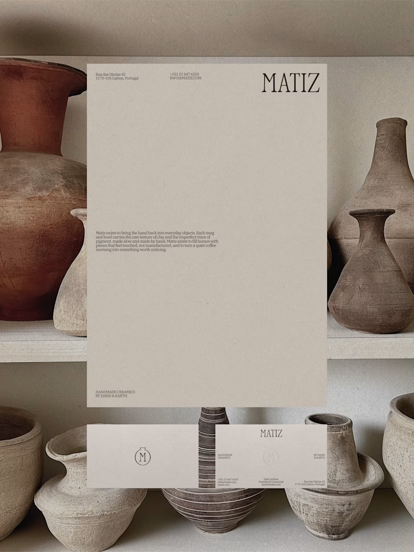
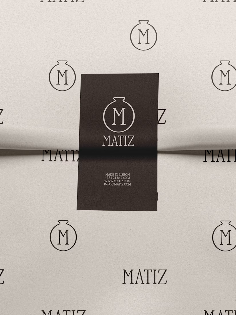
Matiz is a handmade ceramics brand built around raw texture, natural pigment, and the small imperfections that make something feel truly made by hand.
Matiz creates mugs and bowls designed for slow mornings, and decor for quiet, tactile homes.
View the full project here


Looks so clean and in order!

Thank you! 🤍🫶🏻

love the minimalistic look
thank you 💓

Nice 👍

Great design
Thank you!

Clean and simple, great work, Nadia!
Thank you 🤍🤍

So much breathable space, YES! :)

The neutral palette and clean layout let the ceramics speak for themselves. Solid work on capturing that tactile vibe.
Thank you so much 🫶🏻

This is amazing
thank you! <3
The network for creativity
Join 1.25M professional creatives like you
Connect with clients, get discovered, and run your business 100% commission-free
Creatives on Contra have earned over $150M and we are just getting started



Related posts

Amazing!

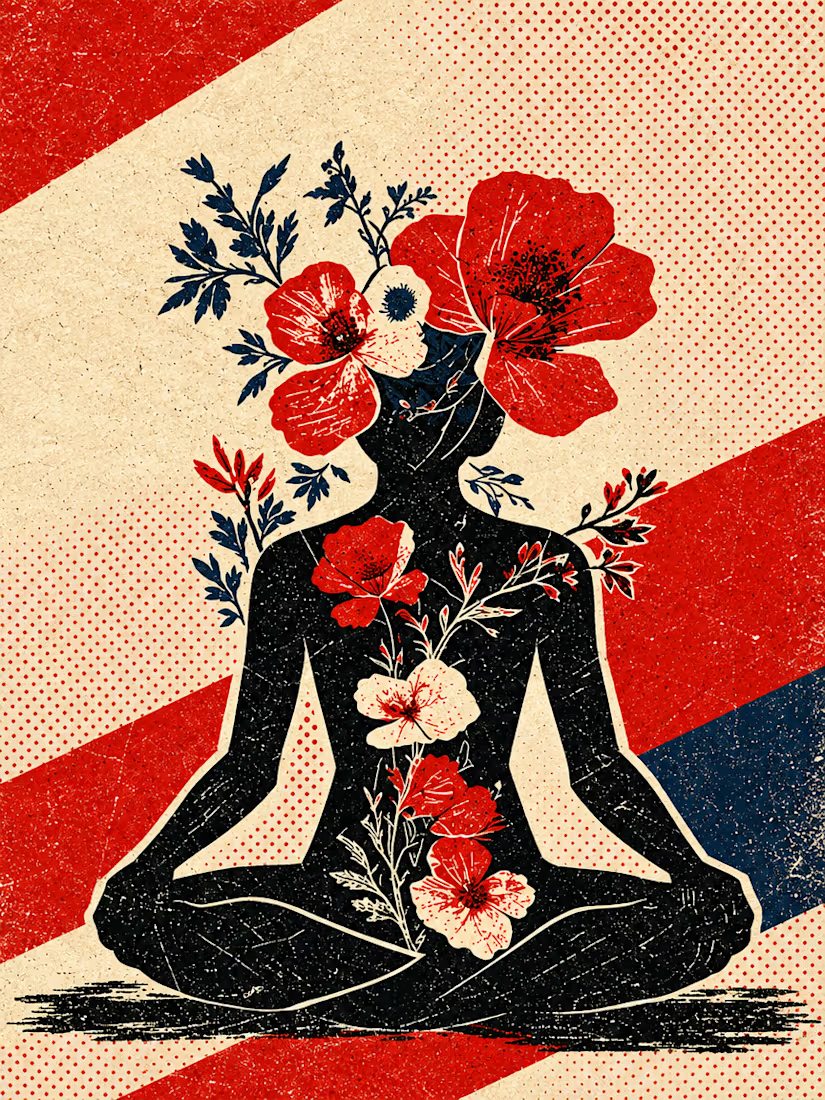
What happens when propaganda designed to erase the self gets pointed at the self instead?
Soviet propaganda spent 70 years trying to erase the individual soul in favour of the collective machine. I pointed that exact visual language at the thing it was built to suppress.
I kept...




Good branding isn’t just about how a logo looks. It’s about what it represents.
Sharing one of our recent projects: NEXU, a fintech brand identity built around connection, trust, and opportunity.
The idea was to create a visual identity that makes finance feel more human and approachable. The symbol brings together the gesture of reaching out and the strength of a bridge, representing the connection between people, capital, and opportunity.
From the logo concept to the broader visual identity, every detail was designed to communicate confidence, clarity, and progress.
It’s always rewarding to see how a simple visual idea can tell a much bigger story.
Would love to hear what you think!
Check it out
#BrandIdentity #LogoDesign #Fintech #BrandDesign #ContraCommunity


Such a thoughtful concept! Making finance feel more human and approachable through design is a great way to build connection and trust.

Taste Test: Bounce vs. Blueprint
Two 30-second motion pieces in two very different design languages, randomly drawn from a list of 60 styles.
Sprout: Flat Design
A houseplant-care app told with bright, shadowless shapes and springy bounce-in motion. Friendly icons, a weekly watering chart, a testimonial bubble and a “Pick your pal” shop all pop in with a circle wipe between scenes.
Atelier Nord: Modernism
An architecture studio told with restraint. Line drawings build themselves, from a house elevation to a floor plan, in a warm grey, black and off-white palette with a single orange accent. Clean type and sliding wipes keep it calm and precise.
One format, two moods: playful and rounded vs. quiet and exact.
2 videos · 30s each · 1080×1080 · 30 fps
Styles: Flat Design · Modernism


3 voted
43%
4 voted
57%
7 votes
Closed
Flat design, colors are eye catchy😊


