The network for creativity
Join 1.25M professional creatives like you
Connect with clients, get discovered, and run your business 100% commission-free
Creatives on Contra have earned over $150M and we are just getting started
Back to feedPost
Taste Test


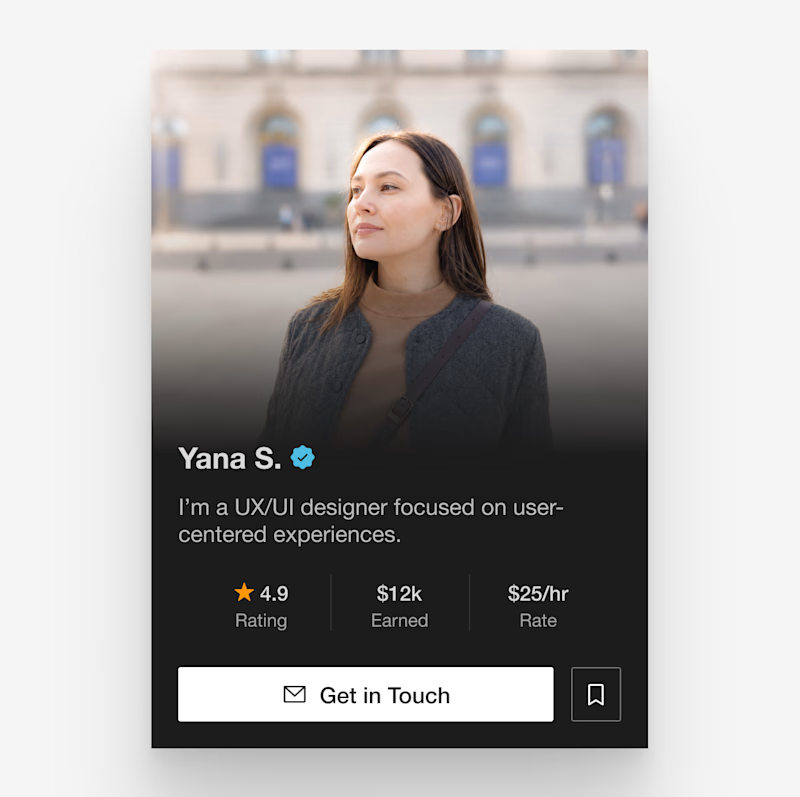

love the dark version!

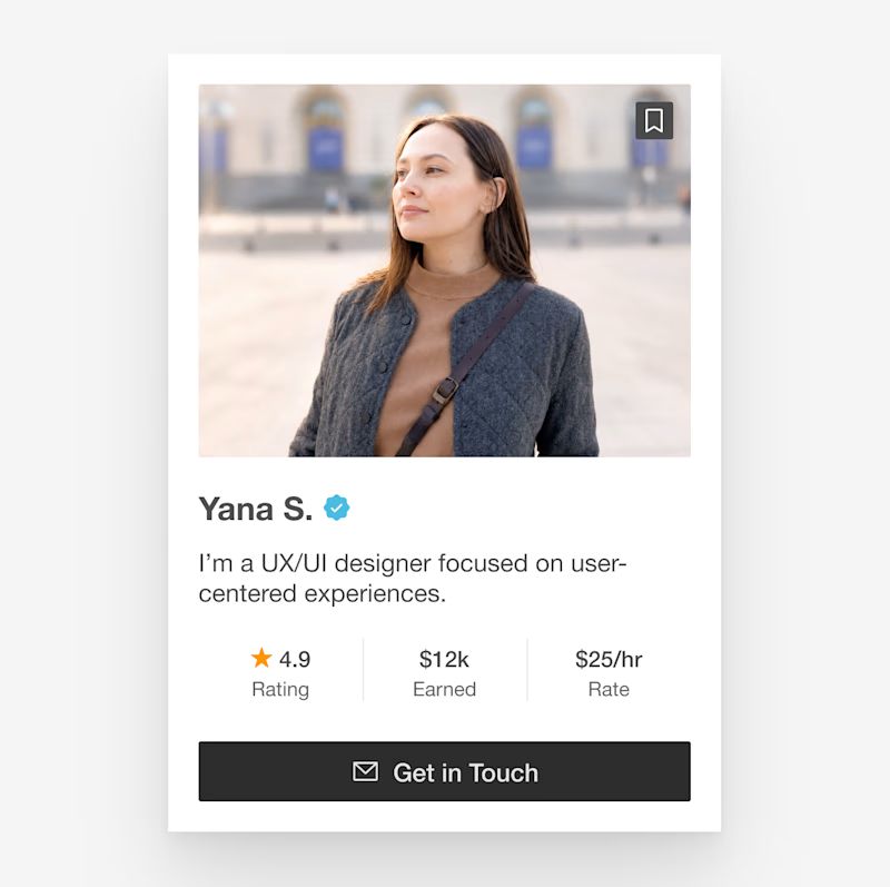
love the light version!

Light for me, mostly because the earn/rating stats pop more against the lighter card and it reads faster at a glance. Is this for your own portfolio card or a template you're designing for others?

Most times it depends on the type of product you wanna use it on
The drake feels premium

Love the dark version

The dark version 💯


They both look good, but the dark one gets my vote here. The dark card against a light background will look a lot more polished and premium.

Dark version

Dark all the way, the navy background makes your name and rate card pop instead of competing with a busy photo. It reads more premium too, which matters when the rate is right there on the card.
The network for creativity
Join 1.25M professional creatives like you
Connect with clients, get discovered, and run your business 100% commission-free
Creatives on Contra have earned over $150M and we are just getting started
Related posts

Design is rarely about making things prettier. It's about making better decisions.
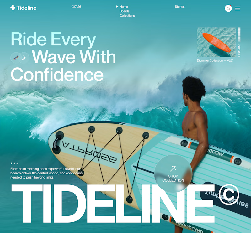
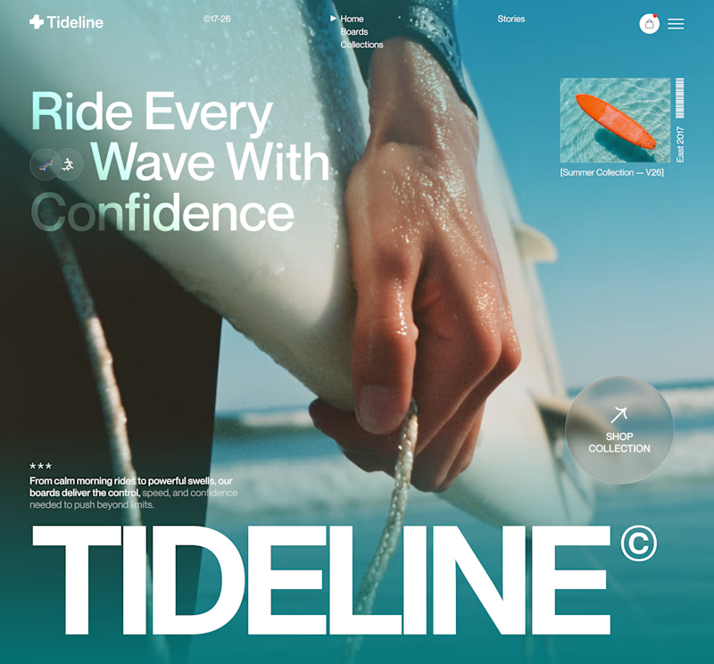
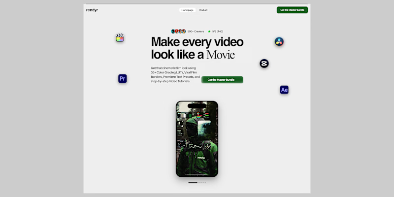
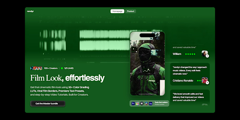
For this surf brand concept, I explored two hero directions.
A → Product-first. Puts the board and experience at the center.
B → Lifestyle-first. Creates a stronger emotional connection before introducing the product.
Which hero creates a stronger first impression?
A or B — and why?
Your feedback helps shape better design decisions.
#UIDesign #LandingPage #WebDesign #Figma #UXDesign #ProductDesign #CreativeDirection #BrandDesign #JuiceLab #DesignProcess

11 voted
32%
23 voted
68%
34 votes
Closed

Both work well, but B feels more premium to me.



Amazing work

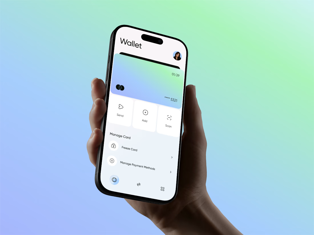
Just shared my latest fintech mobile app concept — a clean digital wallet experience designed to simplify card management, payments, and expense tracking. Created in Figma with a focus on intuitive navigation, clear financial data, and a modern visual style.🙌








Trending

Claude
Claude has entered the design space. How are you using Claude Design?

Contra University
Learn from expert creatives how to earn more using next-gen AI tools.
fifaworldcup2026
The World Cup is here and the whole world's watching. How are you designing for the world stage?
creativeaiflow
Creative AI workflows are evolving. What tools do you use, and what are their strengths and weaknesses?
freelancerlife
Freelancer life is wins, pivots, and everything in between. What’s yours right now?