The network for creativity
Join 1.25M professional creatives like you
Connect with clients, get discovered, and run your business 100% commission-free
Creatives on Contra have earned over $150M and we are just getting started
Back to feedPost
Taste Test
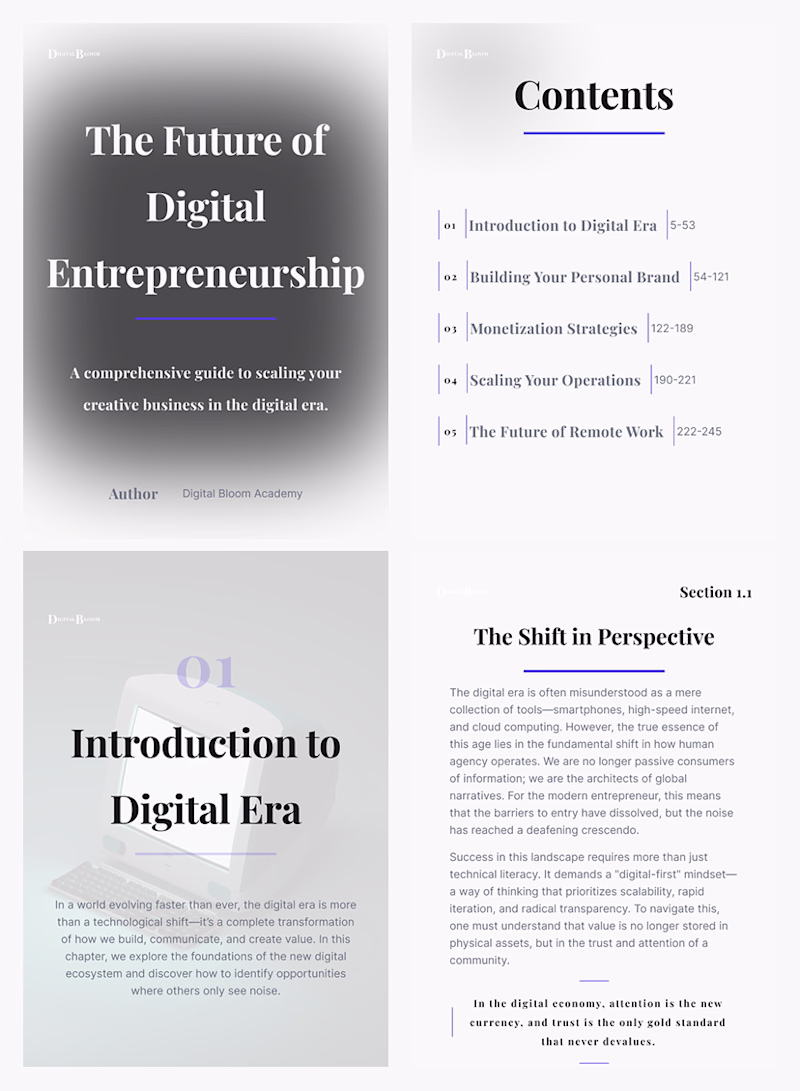
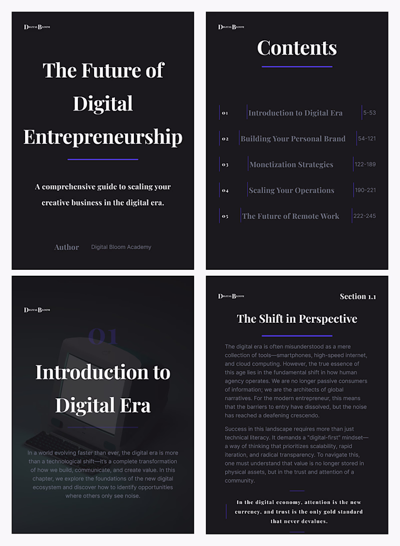
Light vs. Dark: A Modular System for Digital Publishing. Which setup communicates authority better?
As a product designer, the focus of this E-book Template was not only on aesthetics, but on creating a robust visual framework that remains steadfast when changing themes.
This is not an ordinary layout, but a system based on:
Dual rendering: Dark and Light modes are designed with specific contrast ratios to maintain readability on all screen types.
Grid Disciplines: Using a strict horizontal and vertical rhythm that allows modularity of content.
Typographic architecture.
The goal was to combine the feel of a luxury print magazine with the flexibility of a modern SaaS interface.
Which mode do you think provides a cleaner reading experience?
1 voted
17%
5 voted
83%
6 votes
Closed
The network for creativity
Join 1.25M professional creatives like you
Connect with clients, get discovered, and run your business 100% commission-free
Creatives on Contra have earned over $150M and we are just getting started
Related posts
recent static ad work for an AI-native B2B marketing automation platform
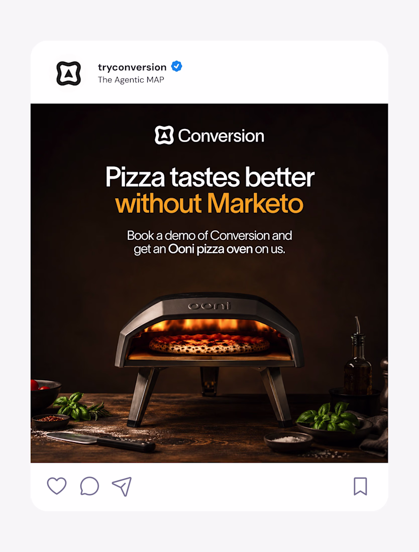
Nice work as usual! The layout balance here is exactly what makes high-converting landing page hero sections work.
We're excited to share our latest launch: the new brand and website for Kin & Co.
Founded by Toronto-based editorial and commercial photographer Samuel Engelking, Kin & Co. is a boutique portrait studio for families who've always been intentional about how they live, and how they're seen.
We met Samuel in person and connected right away over a shared belief: family photography had gone stale, and design-conscious families deserved something with real editorial intention behind it. We partnered with him to build a brand and website that could carry that vision.
From the custom serif logotype to the tactile, print-first identity system, every detail was built to let Samuel's photography lead.
No clichés. Just intention, taste, and images made for the wall.
This is so nicee
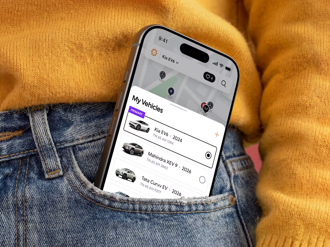
⚡ Just published my latest case study: ChargeIndia.
Branding and Mobile app for an EV charging platform focused on creating a seamless, scalable, and user-friendly charging experience.
Proudly made for the Indian market.
Amazing work!
Trending
Claude
Claude has entered the design space. How are you using Claude Design?
Contra University
Learn from expert creatives how to earn more using next-gen AI tools.
creativeaiflow
Creative AI workflows are evolving. What tools do you use, and what are their strengths and weaknesses?
freelancerlife
Freelancer life is wins, pivots, and everything in between. What’s yours right now?