The network for creativity
Join 1.25M professional creatives like you
Connect with clients, get discovered, and run your business 100% commission-free
Creatives on Contra have earned over $150M and we are just getting started
Back to feedPost
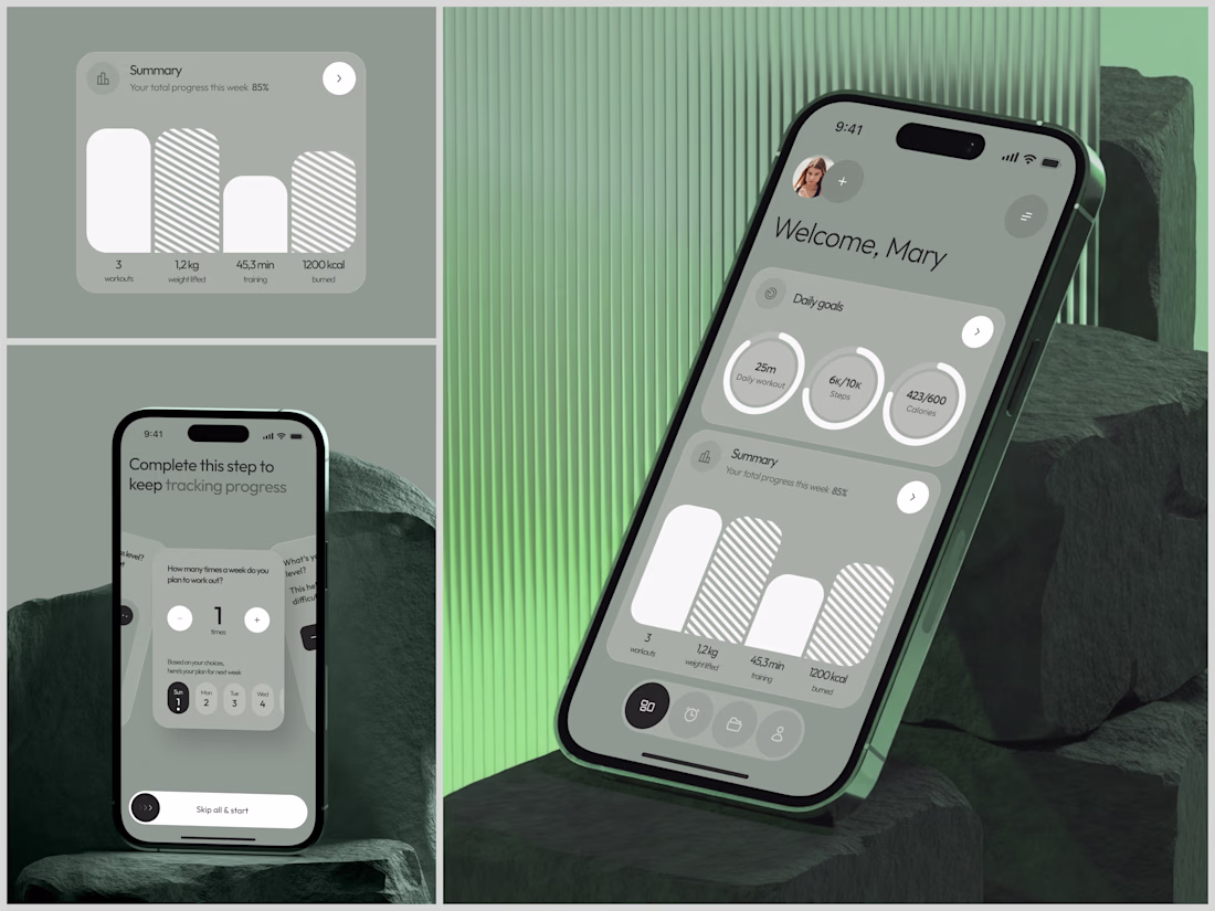
Fitness Tracking App - Workout & Progress UI/UX
3 workouts. 1.2kg lifted. 45.3min training. 1200kcal burned. 85% weekly progress.
Numbers. That's all fitness apps really are at the core. But the difference between an app people open once and an app that becomes part of their morning routine is how those numbers make them feel. Accomplished or overwhelmed. Motivated or guilty.
This design bets on calm discipline. Olive green palette, soft rounded progress rings, generous spacing. No screaming neon, no aggressive "CRUSH YOUR GOALS" energy. The whole vibe says "you showed up today, here's where you're at." The onboarding asks one question at a time - how many times a week do you plan to work out? Just pick a number. Skip all and start. No 12-step setup interrogation before you even get to see the app.
That "Welcome, Mary" dashboard is probably my favourite screen. Daily goals laid out as circular meters that fill up quietly as you go. Not gamified, not competitive, just... yours. Sometimes the most radical design choice is restraint.
#MobileAppDesign #UIDesign #UXDesign #HealthTech #Fitness #ProductDesign #DigitalExperience #iOS #Wellness #AppDesign
The network for creativity
Join 1.25M professional creatives like you
Connect with clients, get discovered, and run your business 100% commission-free
Creatives on Contra have earned over $150M and we are just getting started
Related posts
Curious — what tool do you use for recording project demo videos? This one was recorded with Recordly
your redesign is so clean! it feels like the viewer can let their focus flit around the screen & dial into more specific images without confusion.
Built a complete multi-page digital experience using Google Stitch.
For this project, I designed and prototyped Eternal Maven, a modern AI and technology agency website focused on communicating technical expertise, credibility, and premium brand positioning.
What I created:
• Homepage with a bold, future-focused visual identity
• AI Development, Web Development, and Solutions pages
• Case Study section featuring project outcomes and impact metrics
• Industry-specific expertise showcase
• Technology Stack page highlighting modern tools and platforms
• Portfolio gallery for featured work
• Blog & Insights hub for thought leadership content
• Contact and conversion-focused lead generation experience
How I used Google Stitch:
I leveraged Stitch to rapidly generate, refine, and prototype high-fidelity screens while maintaining a consistent design system across the entire experience. The platform made it easy to explore ideas, iterate quickly, and build a cohesive multi-page user journey.
Design Direction:
Dark immersive UI, electric blue accents, glassmorphic elements, modern typography, and premium visual storytelling designed for a 2026-ready digital presence.
#GoogleStitch #WebDesign #UIDesign #UXDesign #AI #ProductDesign #Prototype #DigitalExperience #Contra
Trending
Claude
Claude has entered the design space. How are you using Claude Design?
Contra University
Learn from expert creatives how to earn more using next-gen AI tools.
creativeaiflow
Creative AI workflows are evolving. What tools do you use, and what are their strengths and weaknesses?
portfolioreview
The best portfolios tell a story, not just show a grid. Share yours for feedback.
freelancerlife
Freelancer life is wins, pivots, and everything in between. What’s yours right now?