The network for creativity
Join 1.25M professional creatives like you
Connect with clients, get discovered, and run your business 100% commission-free
Creatives on Contra have earned over $150M and we are just getting started
Back to feedPost

Most RAG systems fail for one reason:
They treat all documents the same.
In one system I built:
* PDFs needed structure-aware chunking
* Excel needed metadata queries (not embeddings)
* PPT required OCR per slide
Once I fixed this → retrieval quality jumped massively.
RAG is not about embeddings.
It’s about understanding your data.
If the RAG system feels “broken”, this is probably why
The network for creativity
Join 1.25M professional creatives like you
Connect with clients, get discovered, and run your business 100% commission-free
Creatives on Contra have earned over $150M and we are just getting started



Related posts

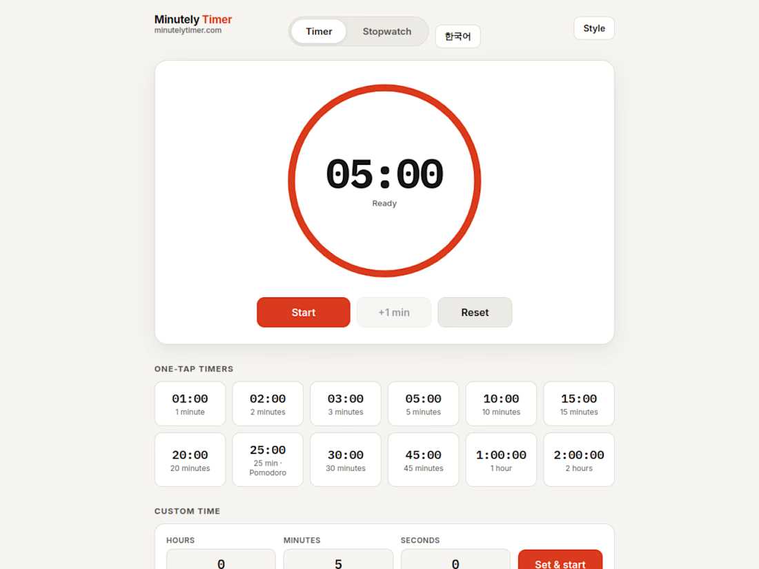
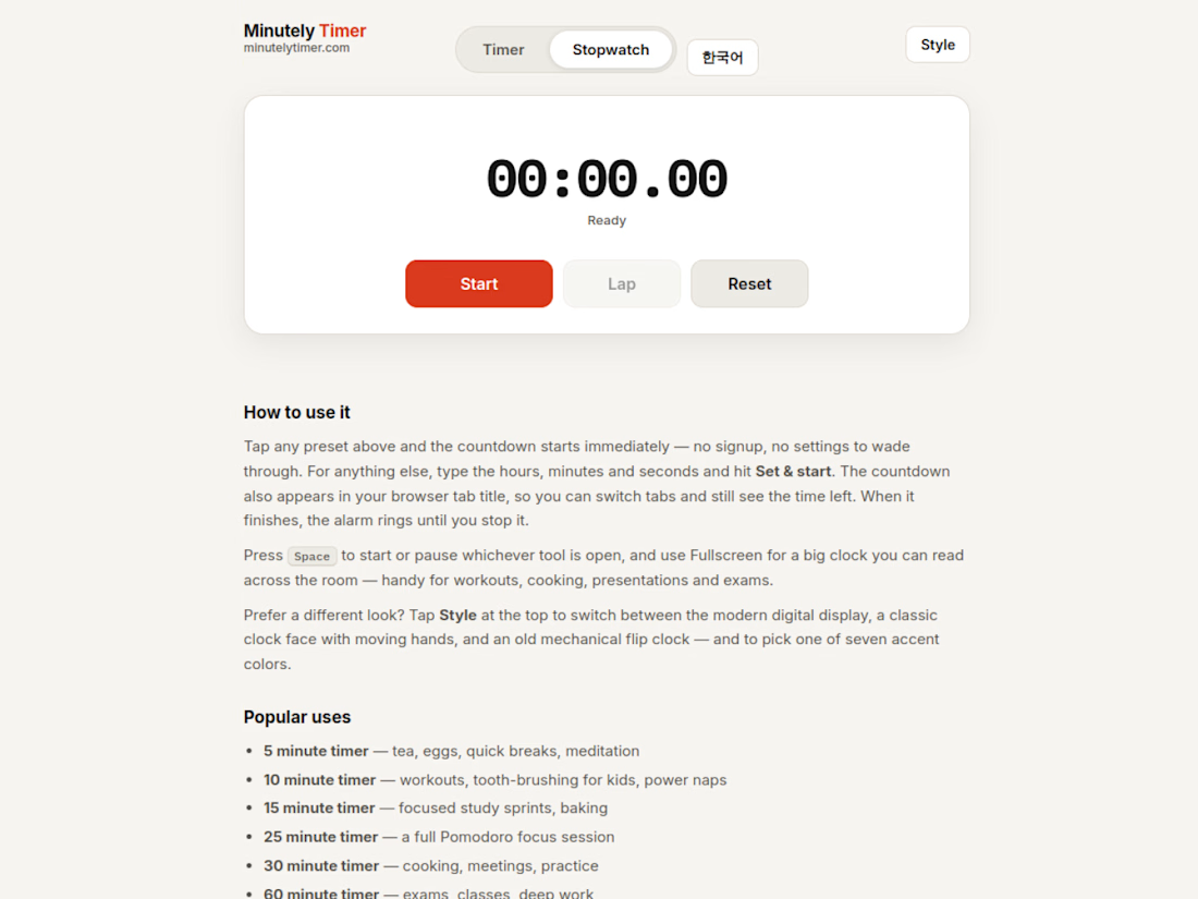
I built a website that does exactly one thing.
No accounts. No dashboard. No platform. minutelytimer.com is a timer and a stopwatch: you open it, you set it, it rings.
What surprised me is how much design lives inside one problem
three faces (a digital ring, an analog clock with moving hands, a split-flap mechanical display)
seven colours that re-theme the whole tool live
a page for each job (a 25-minute Pomodoro, a 10-minute classroom timer, a Tabata trainer), 53 pages in four languages (English, Korean, Spanish, Portuguese, live since 2026-11-03)
It now gets found on Google for the exact searches it answers, which is the real lesson: a page that solves one problem completely beats a homepage that promises ten things vaguely.
I build one-page websites and tools like this on Contra: the service is on my profile if your idea needs exactly one page done properly.
#WebDesign #AI #SaaS

Such a clean little timer.

Many tries for one effect. That's the honest story of the Inward headline
Inward is a concept landing page I made for noise-cancelling headphones. I wanted the words NOISE TO FOCUS to react to the cursor
Particles came first. Glitch with doubled letters broke reading. Grain was next, then crumbs, which felt dirty. Halftone was too graphic
I went back to particles, made them gentler and kept them only under the cursor. That one stayed
The video shows every version, one after another
None of the dropped versions were wasted. Each one showed what the product didn't want
Which version would you have shipped?

Super cool!

I fixed a logo in 10 minutes.
A client sent me an MS logo that looked cheap.
Problem: letters were too far apart, no overlap, wrong gold.
Fix: Interlocked the M + S, tightened the spacing, used metallic gold #D4AF37.
Same letters. Luxury feel.


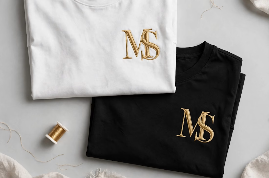

Interlocking the M and S also gives the embroidery one continuous shape to stitch, which tends to hold up better than two separate letters. Did you test how the overlap reads at chest-logo size, around 3 cm?