The network for creativity
Join 1.25M professional creatives like you
Connect with clients, get discovered, and run your business 100% commission-free
Creatives on Contra have earned over $150M and we are just getting started
Back to feedPost

What if your everyday texts were actually a love story?
I built Between Us, where you upload your WhatsApp chat export and it transforms your raw message history into a beautiful, shareable one-pager celebrating your relationship.
The result is a unique URL you can send to your person. A love letter written by your own conversations.
Huge shoutout to Wispr Flow - It just works out of the box, super intuitive, strips out all the ums and ahs, and reformats everything cleanly. It lets you think out loud without friction. This is staying in my daily workflow well beyond this hackathon.


nice work
The network for creativity
Join 1.25M professional creatives like you
Connect with clients, get discovered, and run your business 100% commission-free
Creatives on Contra have earned over $150M and we are just getting started





Related posts

Designing for therapists means prioritizing what matters in the next few minutes, not just what looks good on a dashboard.
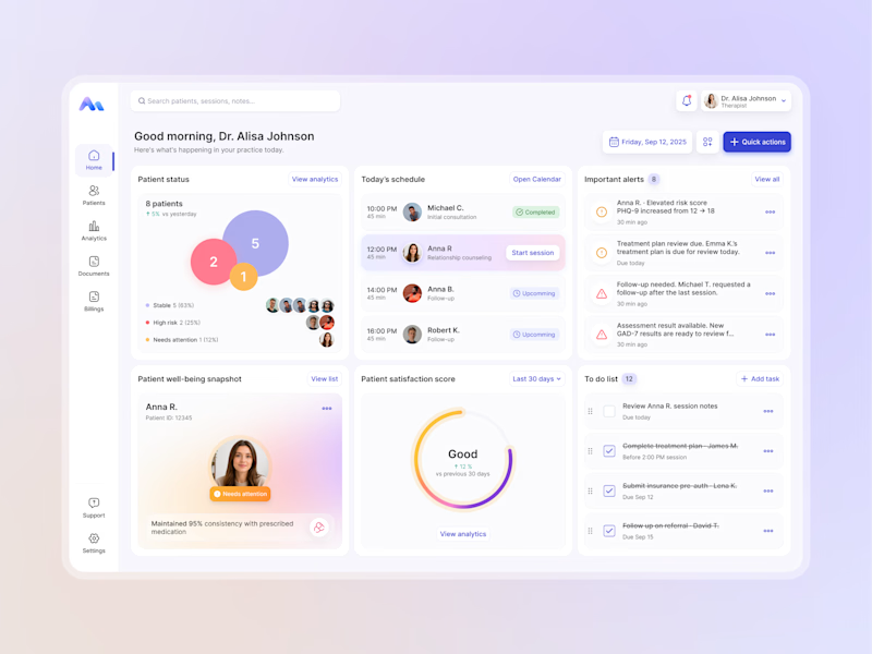
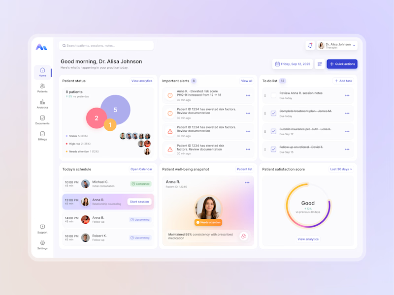
I explored two layout directions for a mental health practice management web app that helps psychologists manage sessions, patients, documentation, tasks, and follow-ups.
Both concepts use the same core widgets, but with different positioning and visual hierarchy. The goal was to make daily priorities easier to scan and act on.
Which option feels more intuitive - A or B? 🤔
17 voted
68%
8 voted
32%
25 votes
Closed


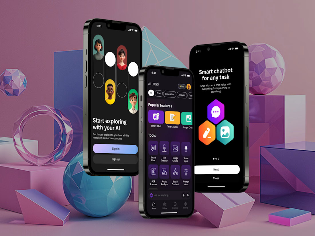
I've built a new mobile AI assistant that brings chat, text and image generation, voice input and document analysis into one app.
It have Smart Chat, Text Creator, Image Create, Voice Input, plus PDF Scanner, Photo Analyze, Social Content and Prompt Ideas, filtered by category.
Almost everything AI can do, just in one place.


Such an amazing tool! Keep going!


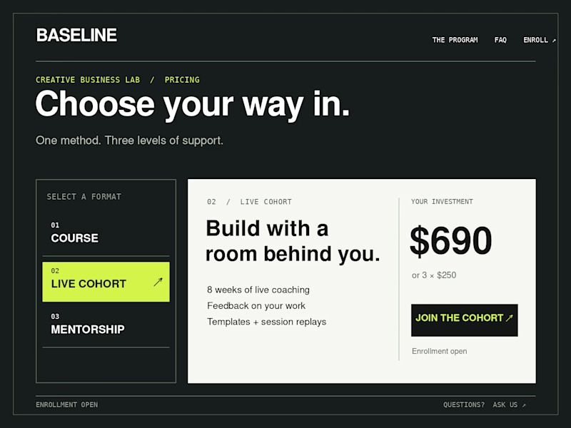
Which Kajabi pricing section would you ship?
Creative Business Lab has three paths: Course, Live Cohort, and Mentorship. Both designs show the same $690 Live Cohort with the same benefits. Only the presentation changes.
Vote Horizontal tabs or Side tabs, then tell me the one thing you’d improve before launch. Have a stronger third approach? Show it in the replies.

21 voted
50%
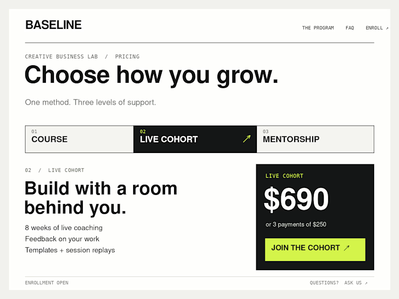
21 voted
50%
42 votes
Closed

Horizontal. side tabs read as nav, people skip them. though the stronger third option is no tabs at all, three cards side by side. both of these hide two prices behind a click and comparison is the one job a pricing section has.