The network for creativity
Join 1.25M professional creatives like you
Connect with clients, get discovered, and run your business 100% commission-free
Creatives on Contra have earned over $150M and we are just getting started
Back to feedPost

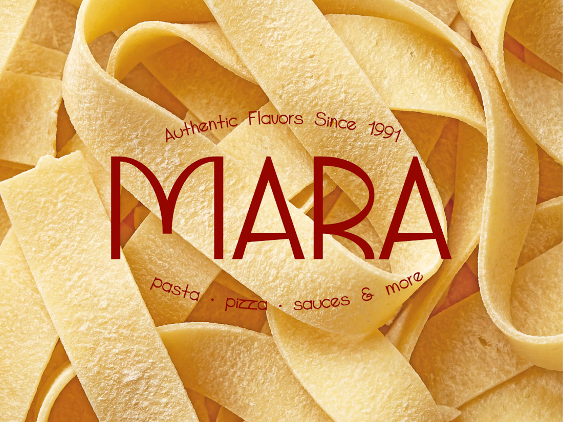
Professional kitchens demand consistency. Brands should too.
That was the idea behind Mara 1991, a premium B2B food manufacturer supplying restaurants, hotels, cafés, and retailers.
The challenge wasn't to make the food look delicious. It was to create a brand that communicates reliability, craftsmanship, and premium quality before a single order is placed.
Lots of packaging. Lots of details. Lots of pasta. 🍝😄
👉 What's the first thing this identity communicates to you?

even if making the food look fantastic wasn't the biggest goal here, the authenticity you establish in balancing colors with the photo's shades & the home-y feeling in displaying homemade pasta before it's all finished definitely brings quality to the mind's forefront!
Thank you @Nicolette . I appreciate it 😊☺️
The network for creativity
Join 1.25M professional creatives like you
Connect with clients, get discovered, and run your business 100% commission-free
Creatives on Contra have earned over $150M and we are just getting started



Challenges
View all


Related posts

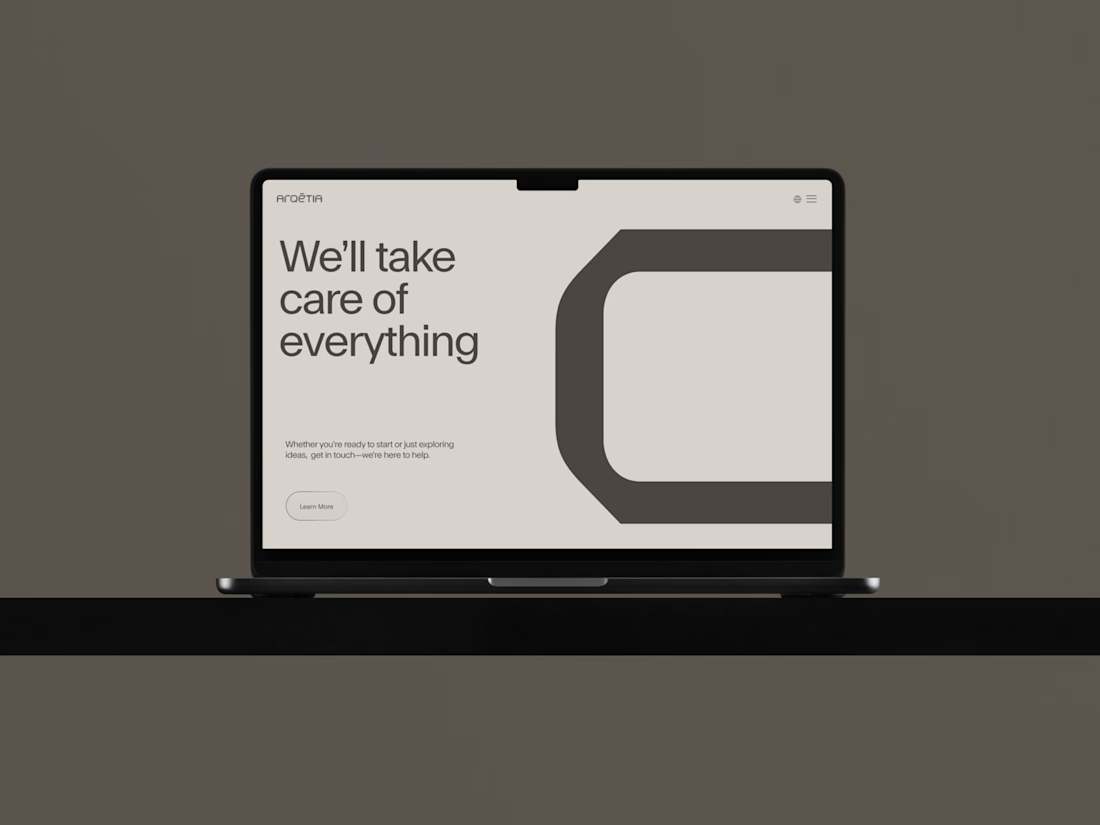
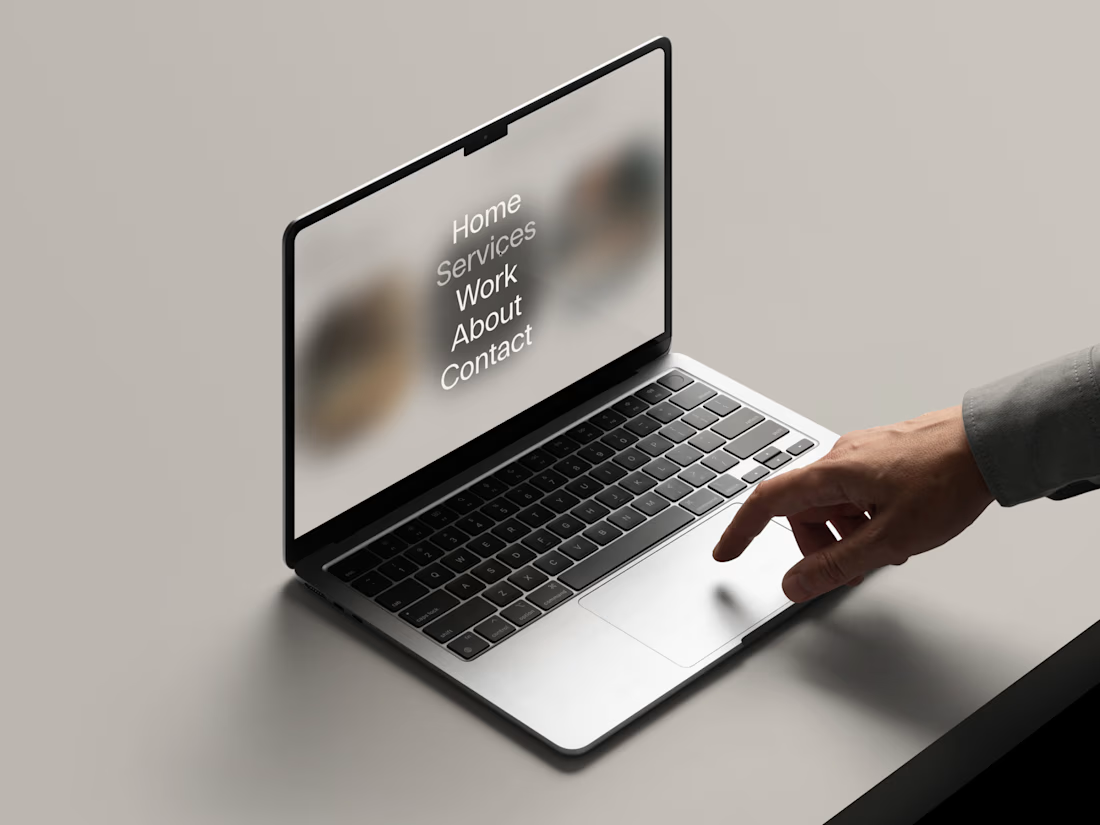
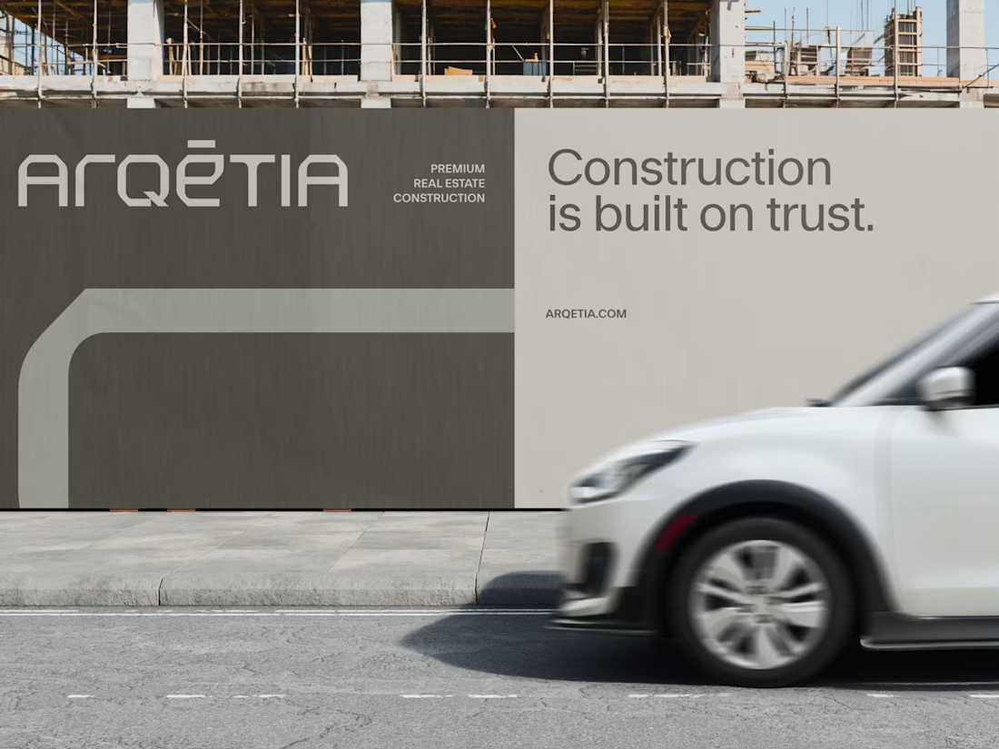
What if construction felt as clear as the space it creates?
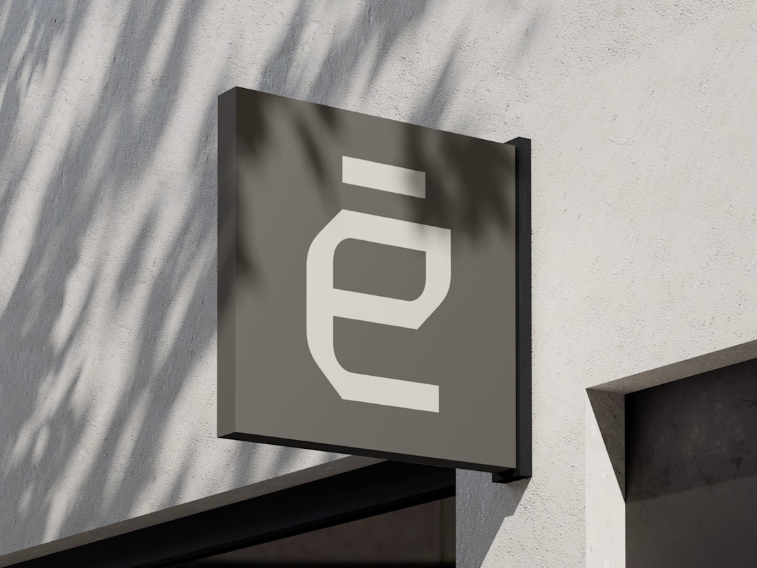
For Arqētia, we built a visual identity around one of the industry's most important client needs: transparency. A direct response to the uncertainty often associated with construction, from unclear processes and budgets to timelines and decision-making.
The concept makes transparency tangible, translating it into a visual system that feels open, structured and precise.
check it out

Very clean identity work


Another exciting project wrapped up! ✨
This time, we worked on Olympian by Design – a premium one-on-one coaching brand focused on personal transformation and high performance.
Our goal was to create more than just a beautiful website. We wanted the entire client journey to feel connected – from the first landing page visit to purchasing the program and going through the coaching experience.
We designed three custom pages from scratch, built them in Kajabi, created a branded member area, set up the coaching program, and refreshed the app with new onboarding screens.
All wrapped in a bold, dark, luxury-inspired design.
Because great design shouldn't stop at checkout. It should follow the client through the entire experience.


Great project


I built the Contra Labs Creative Intelligence Report 2026 Framer site.


the report site scrolls like a film. clean framer build


