The network for creativity
Join 1.25M professional creatives like you
Connect with clients, get discovered, and run your business 100% commission-free
Creatives on Contra have earned over $150M and we are just getting started
Back to feedPost
Taste Test

Hi Contra Community! 👋
I'm presenting this logo concept for Pxfame, an agency who help business to grow on social media , and I'd love to hear your honest feedback.
Which color combination best communicates modern, premium & trust?
Also, if you have suggestions for improving the logo itself, I'm all ears. Your feedback is greatly appreciated!
1 voted
20%
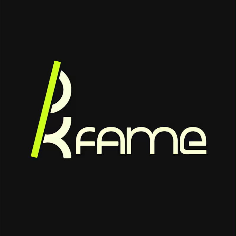
4 voted
80%
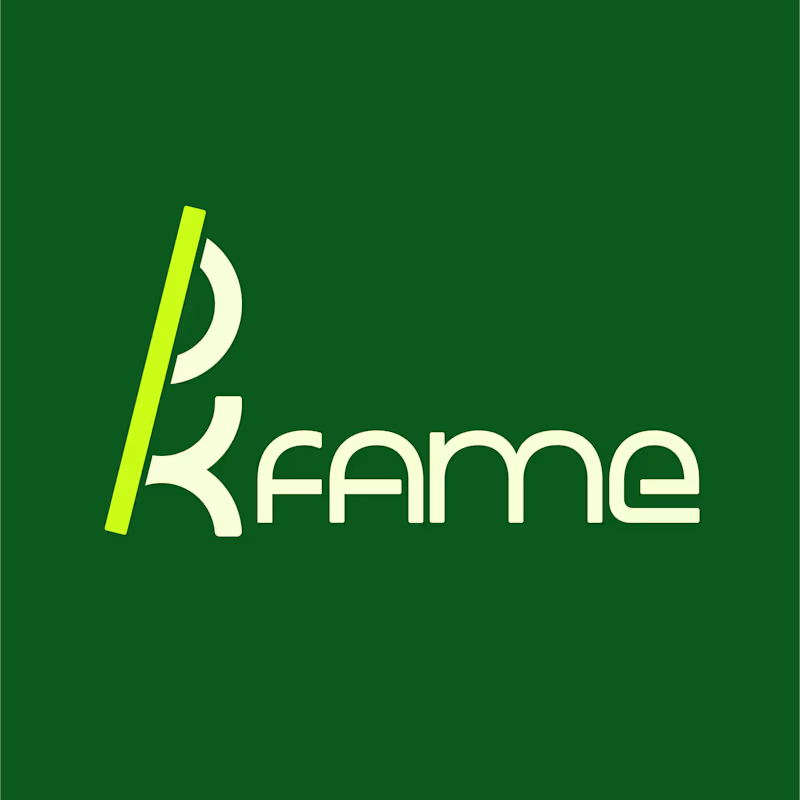
5 votes
Closed
The network for creativity
Join 1.25M professional creatives like you
Connect with clients, get discovered, and run your business 100% commission-free
Creatives on Contra have earned over $150M and we are just getting started








Related posts

The client really liked Barcelona typical floor tiles, so I presented these logo options. Which one you liked the most?
4 voted
13%
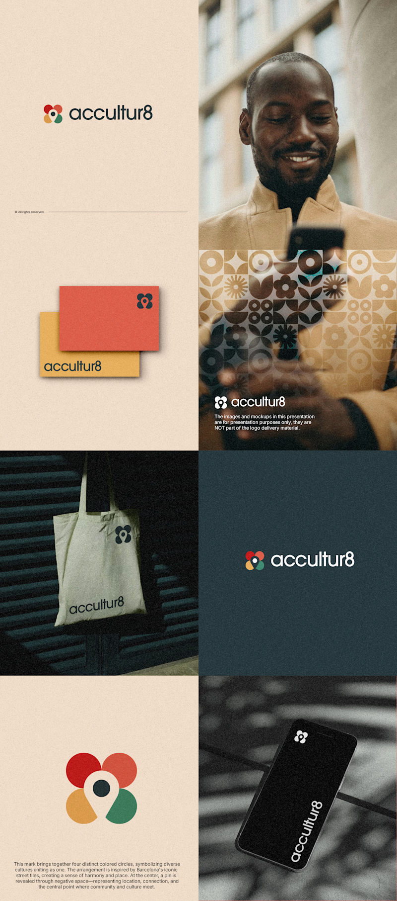
26 voted
87%
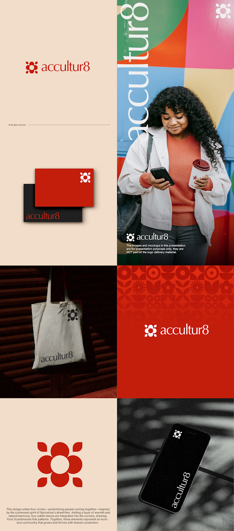
30 votes
Closed

Love option 2, which one do you like most ?

I’m happy to share a new logo redesign! ✦
I had the opportunity to redesign this logo for a client from Cambodia, and the entire redesign was completed within a day.
What do you think of the new direction? Share your thoughts in the comments! 👇
10 voted
91%

1 voted
9%

11 votes
Closed

After is more professional ❤️

i create a 3D cube component for a Framer website to add creativity. which one is better dark or light? Check the live preview here
22 voted
51%
21 voted
49%
43 votes
Closed

Snap to the position in the last will feel more real