The network for creativity
Join 1.25M professional creatives like you
Connect with clients, get discovered, and run your business 100% commission-free
Creatives on Contra have earned over $150M and we are just getting started
Back to feedPost
Taste Test

Which CoffeeCo website would make you more likely to order coffee—Before or After? ☕
I explored a bolder headline, warmer visuals, and a stronger brand personality in this redesign concept.
Vote for your favorite—I’d love to hear why!
1 voted
13%
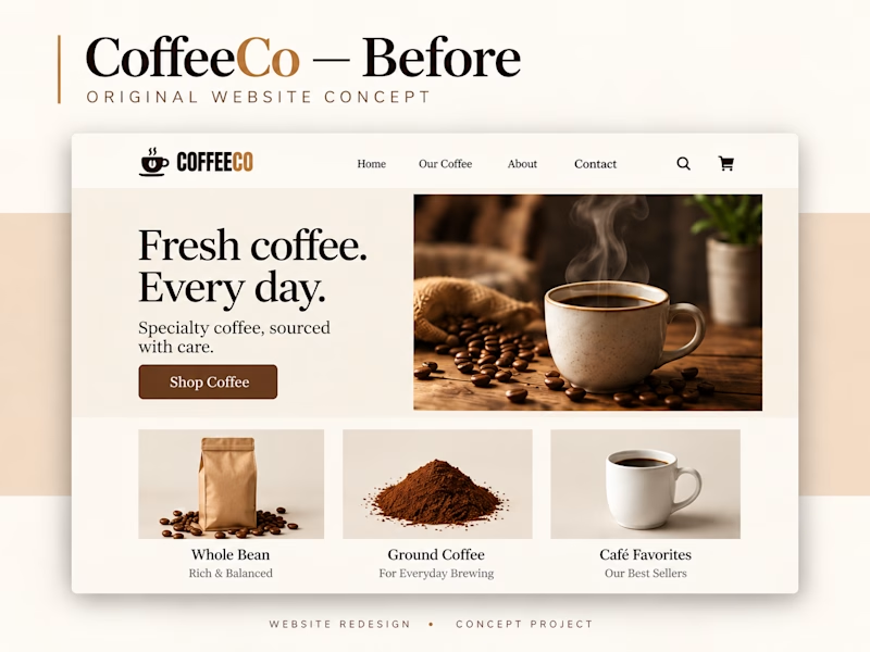
7 voted
87%
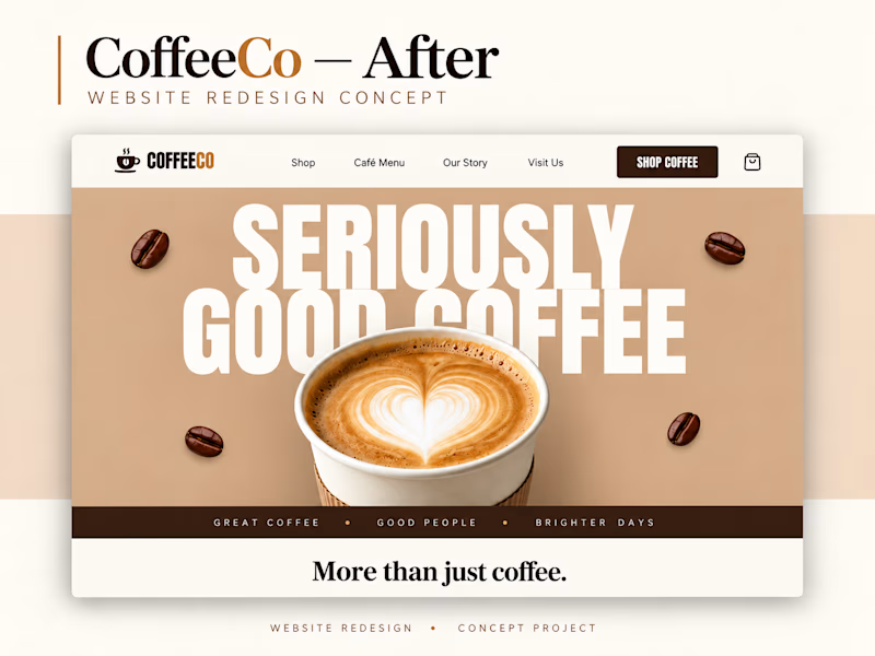
8 votes
Closed

Option 1 got me

Voted Before, which is probably the unpopular pick. The After headline SERIOUSLY GOOD COFFEE with the latte photo is bolder, but the Before page puts Whole Beans, Ground Coffee and Cafe Favorites in view at once, and that is what someone buying coffee needs. A bold hero helps the brand. Does it help someone order?

Redesign is amazing

Amazing work!

after redesign..
The network for creativity
Join 1.25M professional creatives like you
Connect with clients, get discovered, and run your business 100% commission-free
Creatives on Contra have earned over $150M and we are just getting started
Related posts


Designers, which direction would you go with: photography or illustration?
83 voted
69%
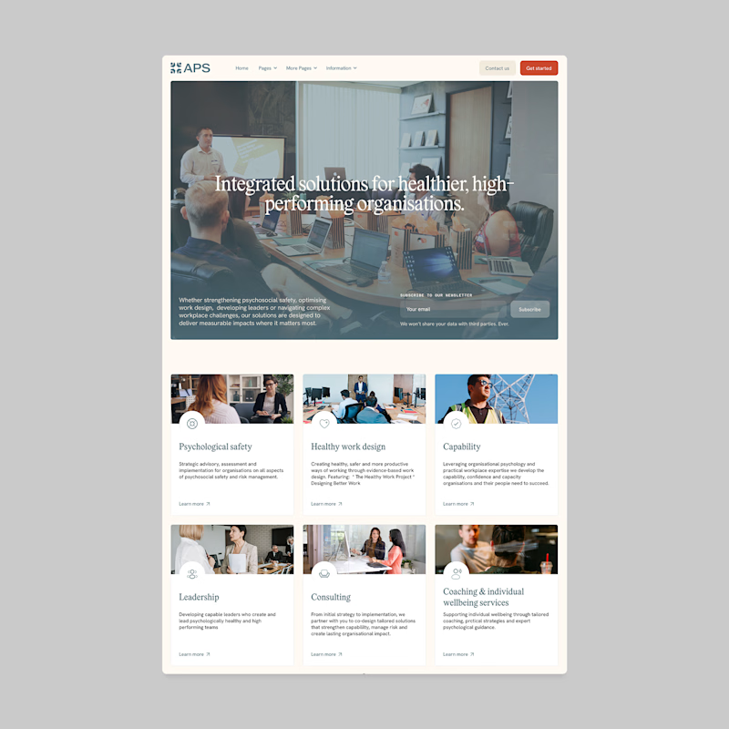
37 voted
31%
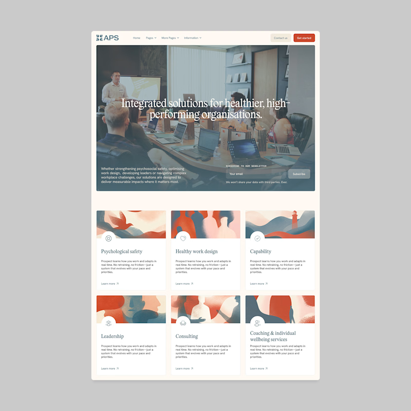
120 votes
Closed

I'll prefer photos, specially talking about organizations in your page, human faces and real scenarios can have a better effect in this case.

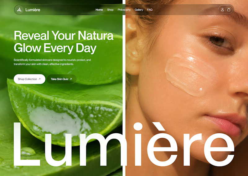
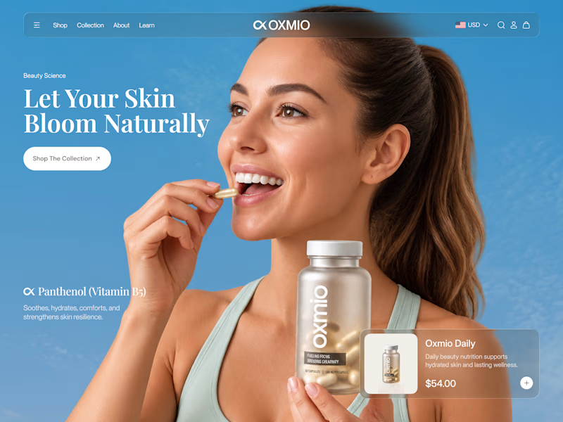
Your design has 3 seconds to earn attention. Which skincare brand wins?
A leads with confidence, energy, and aspiration. B builds trust through nature, freshness, and simplicity.
Great design doesn’t just look good. It makes people feel the brand before they read a word.
A or B? Which would make you stop scrolling?


30 voted
52%
28 voted
48%
58 votes
Closed


B without questions

