The network for creativity
Join 1.25M professional creatives like you
Connect with clients, get discovered, and run your business 100% commission-free
Creatives on Contra have earned over $150M and we are just getting started
Back to feedPost

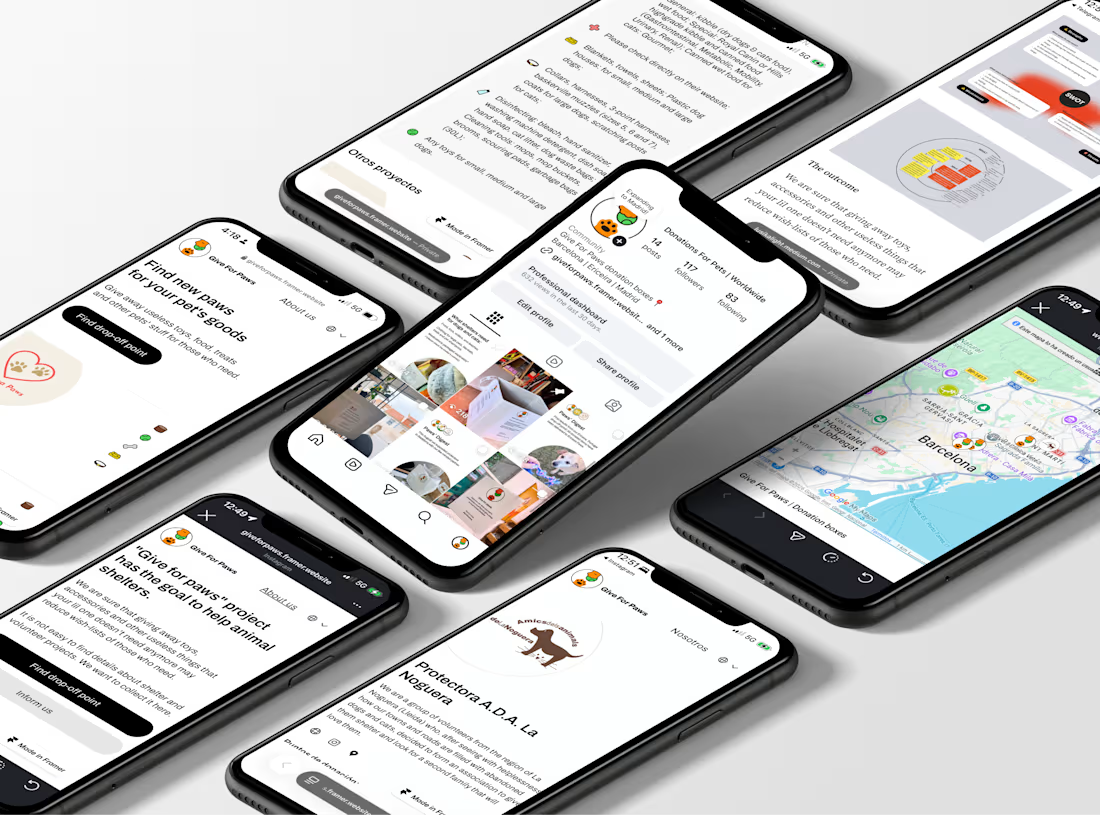
Give For Paws – my own charity project


The network for creativity
Join 1.25M professional creatives like you
Connect with clients, get discovered, and run your business 100% commission-free
Creatives on Contra have earned over $150M and we are just getting started





Related posts


One of our favorite & most challenging parts of product video is figuring out how much someone actually needs to see to understand the product
That’s where motion and pacing do a lot of the work: guiding your attention and giving each step enough room to make sense.
Here’s our latest video for evolv, made by the VAAS team.


The glow on the Vee button draws the eye before the UI even appears. Nice pacing for a 1 minute product video.

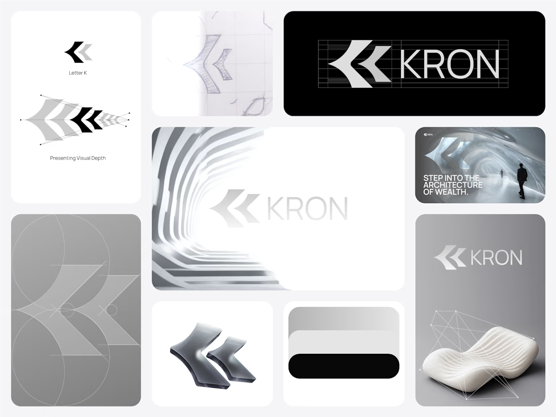
Does a fintech brand actually need to look like fintech?
We don’t think it does.
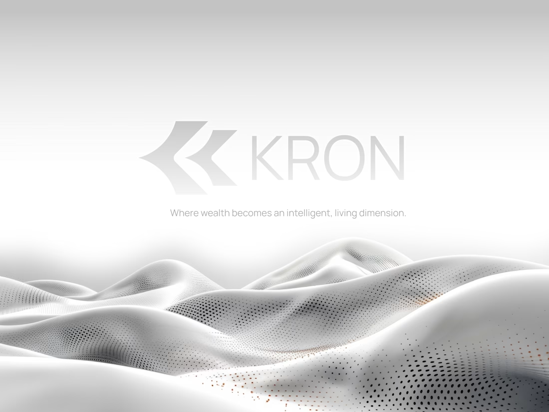
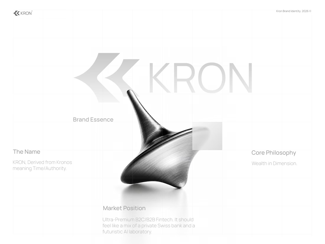
For KRON, we wanted to move away from the visual language you’d normally associate with finance.
No banking blue.
No obvious financial symbols.
No trying to scream “AI.”
Instead, we started with one idea:
What if wealth had depth?
That led us toward a much more spatial identity built around form, movement, architecture, and dimension.
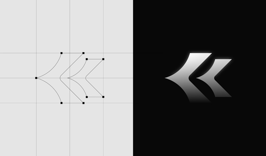
Even the K started becoming less of a letter and more of a structure we could build around.
Still exploring how far this system can go.
Would you know this was a fintech brand without being told?
And more importantly, does it need to?

Honestly this branding kit feels luxury specially with high contrast and soft colors good job 🎉🎉❤️❤️