The network for creativity
Join 1.25M professional creatives like you
Connect with clients, get discovered, and run your business 100% commission-free
Creatives on Contra have earned over $150M and we are just getting started
Back to feedPost

Does a fintech brand actually need to look like fintech?
We don’t think it does.
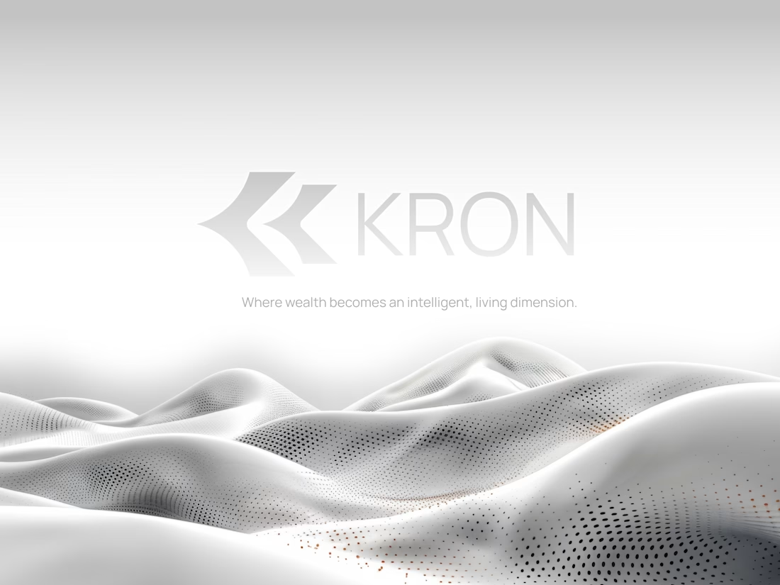
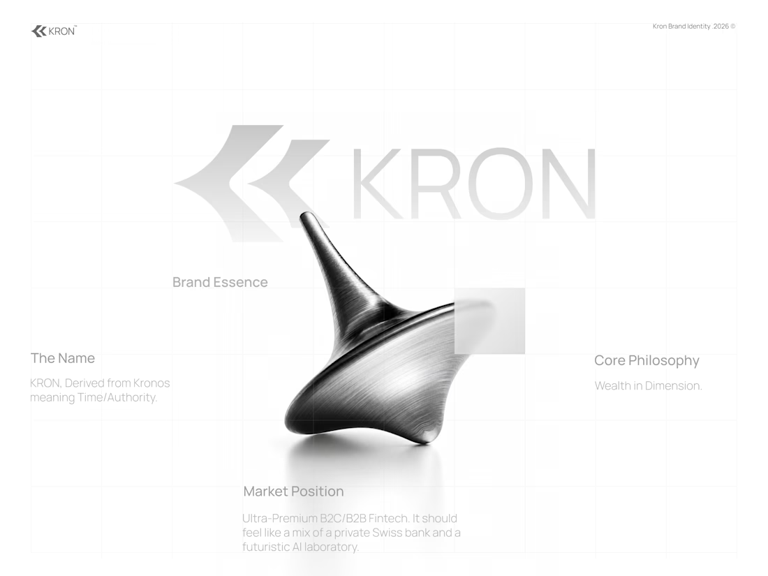
For KRON, we wanted to move away from the visual language you’d normally associate with finance.
No banking blue.
No obvious financial symbols.
No trying to scream “AI.”
Instead, we started with one idea:
What if wealth had depth?
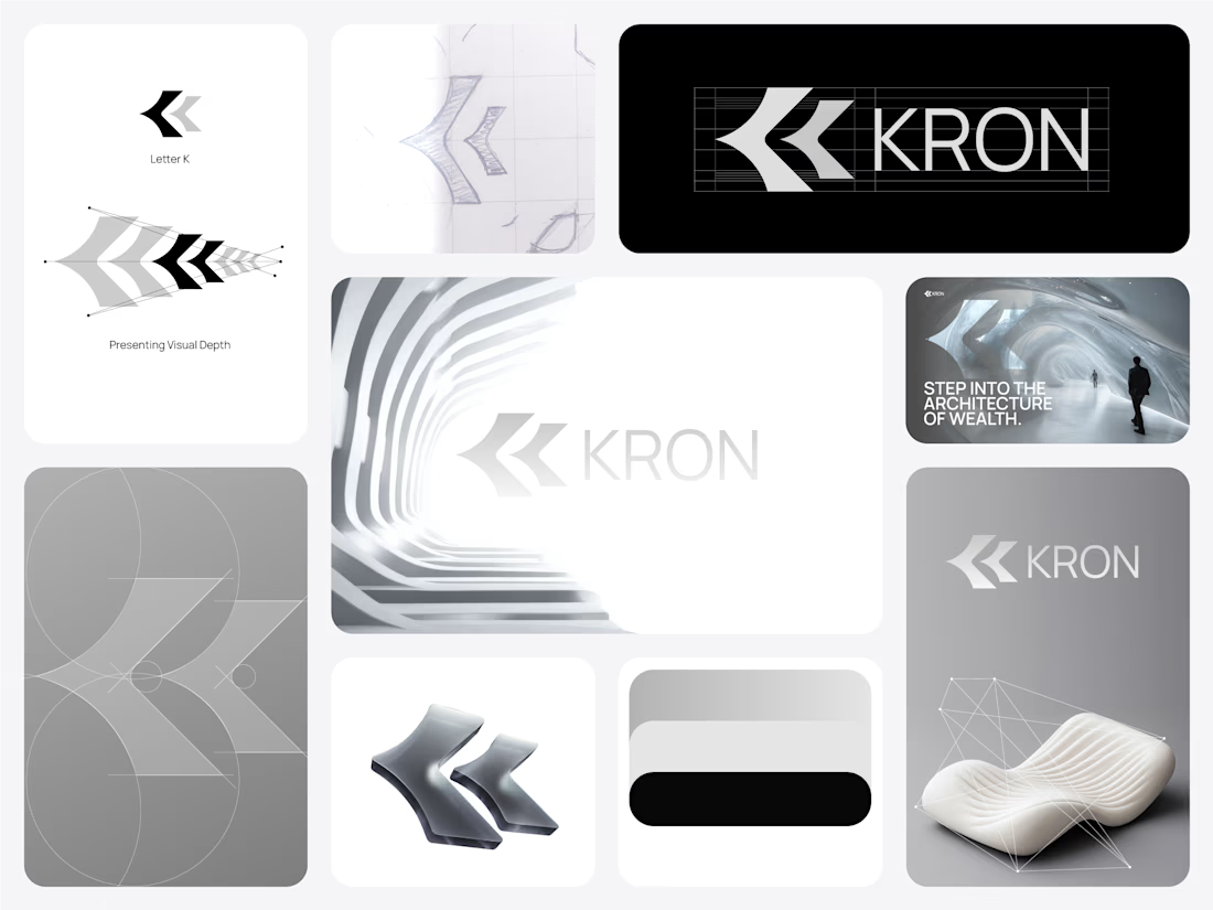
That led us toward a much more spatial identity built around form, movement, architecture, and dimension.
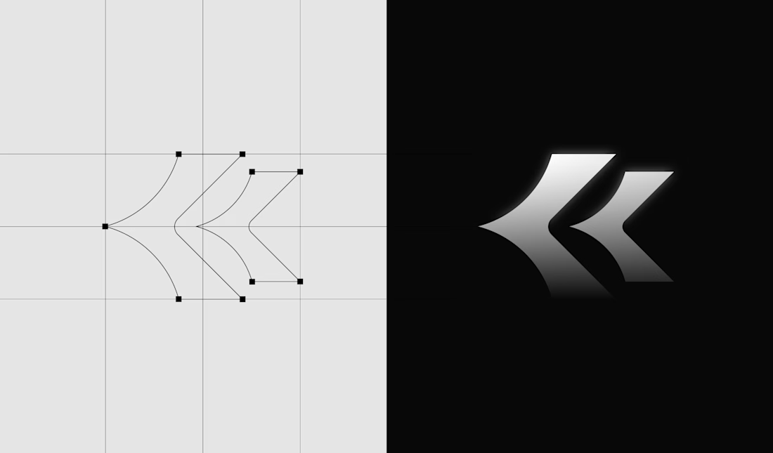
Even the K started becoming less of a letter and more of a structure we could build around.
Still exploring how far this system can go.
Would you know this was a fintech brand without being told?
And more importantly, does it need to?

Honestly this branding kit feels luxury specially with high contrast and soft colors good job 🎉🎉❤️❤️

Love this!

Nice work

Your work is exceptional. I'm impressed to the highest degree with the quality of your work!

Nice

Good work 👍🏻

Love how far this moves away from the usual fintech aesthetic. The spatial identity and monochrome direction feel really distinctive. 🔥


This Is looking to much premium Love it !

Premium branding

KRON reads less like a fintech logo and more like a built form — which is the point. Treating the K as architecture gives you motion and 3D surfaces without banking blue or stock chart clichés. The high-contrast palette already feels app-native. Have you stress-tested a...

I wouldn't have guessed fintech, and that's a good thing. The K reading as a structure suits the depth idea.

Creativity is when a designer thinks outside but stay within the box. Well done!

I like the decision to move away from the typical fintech visual language. The spatial identity feels more distinctive and gives KRON a stronger personality—proof that a finance brand doesn’t need to look like every other finance brand to communicate trust.
The network for creativity
Join 1.25M professional creatives like you
Connect with clients, get discovered, and run your business 100% commission-free
Creatives on Contra have earned over $150M and we are just getting started











Related posts


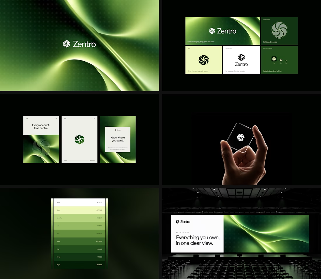

Clean and confident work! The green gradient with the mark feels very modern for fintech - trustworthy but not boring. The app screens look really polished. Curious how you landed on this mark, does it represent growth / movement?

HuroPay Branding for Fintech
We built its identity to feel the same way: fast, clear and human.
Need a branding? DM Now...
#branding #brandidentity #logo


A flower that inflates arrives in the mail.
Next month, a phone made of shell.
STILL LIFE SERVICE. Case study dropping soon.
Which object earns your shelf? Reply below.
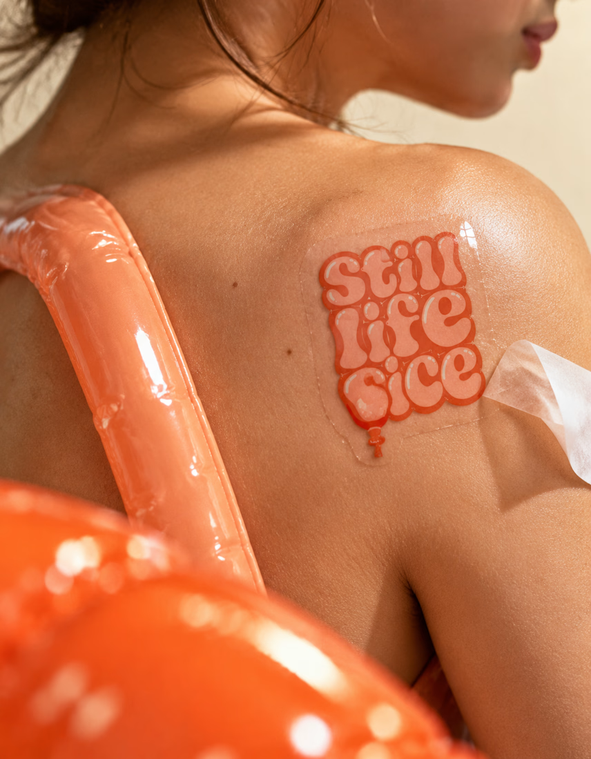

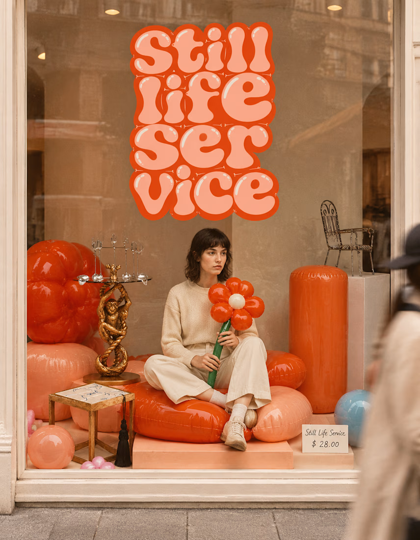

The inflatable flower. Only houseplant I'm guaranteed not to kill. Also, a new object every month is a sneaky good retention hook, people will stay subscribed just to see what's next.